 This past week, my wife and I had the pleasure of celebrating our 10 year anniversary in the land of the rising sun. We visited Tokyo, Kyoto and Osaka, did lots of shopping, lots of walking, took lots of trains, drank a lot of coffee, learned the correct way to say "thank you," and got tattooed. This was also Leroy's first trip back to his birthplace.
Filtering by Category: Just Plain Bad Ass,The Way It Was
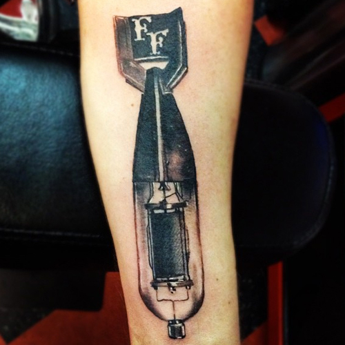
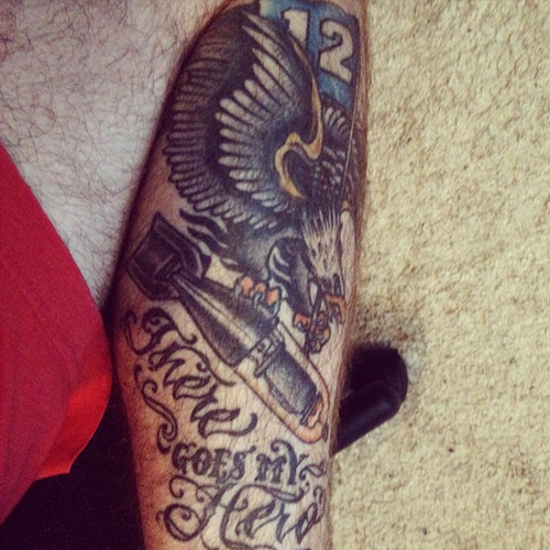
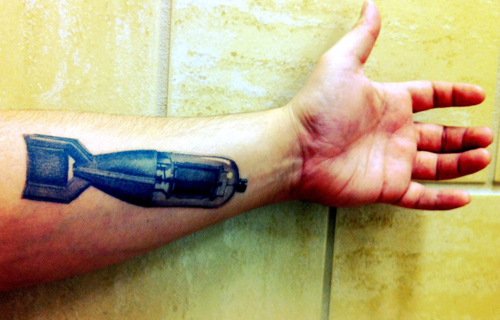
Always fun to see. Two ESP&G tattoos in the wild. Courtesy of KC Lange and Brandon Green.
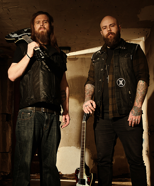 So it's kind of a long story, but when my buddy Vijay, who owns and operates Artist Series Guitar, mentioned that his good friend, Ryan Hurst, would be doing a photo shoot for his custom Demon Hunter and Throwdown guitars, I had to make sure I was there. For years now, people have said I look like Opie, a character that Hurst plays in the always-enthralling Sons Of Anarchy TV show. All of us in Demon Hunter have become huge fans of the show over the years, so this was a really cool opportunity. Oh, and my wife made the dope leather vest Hurst is wearing in the shoot. Checking off that bucket list, one day at a time.
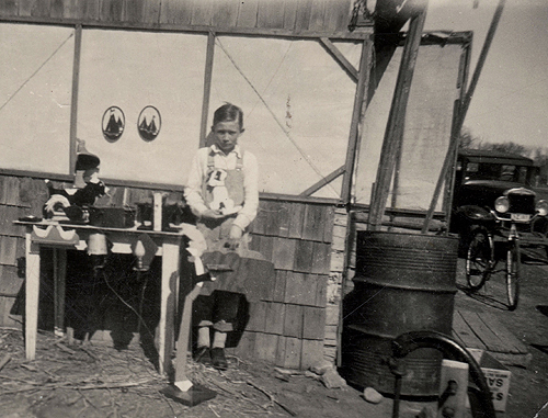
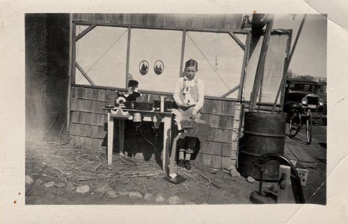 Here's a fun photo of our grandfather, Don Clark (great name, right?) at around 10-12 years old (which should put this at around 1938-1940) with a few home-made wooden toys he had created. Dad got his supreme woodworking chops from this man. Love that Model A-esque rig in the background!
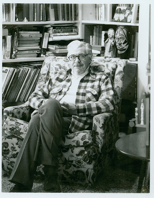 ... Was going through some old files tonight and found this great photo of JF I saved a few years back.
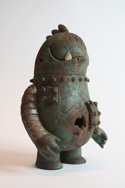
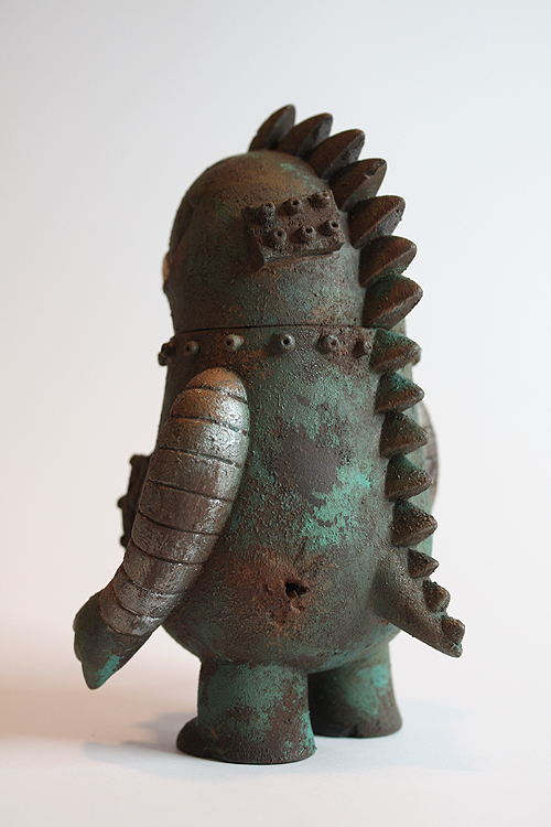
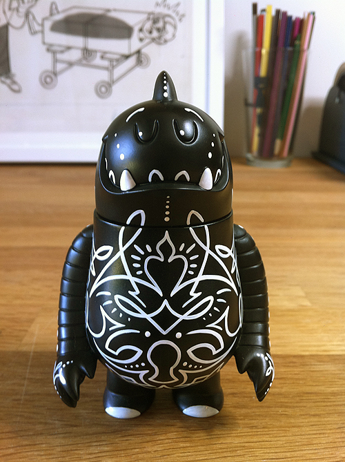
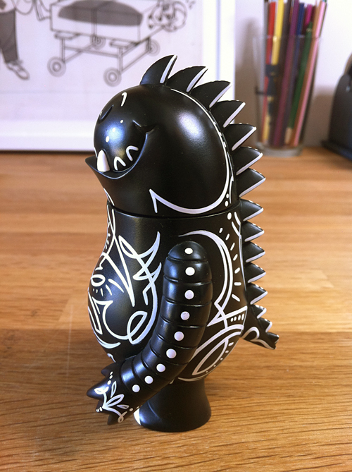
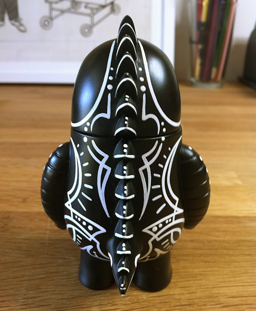
New commission for the shop shelf: Seriously bitchin' war-torn battle-scarred vintage Leroy C. by the talented Dril One. Epic.

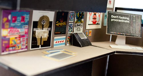
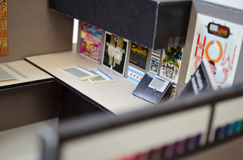
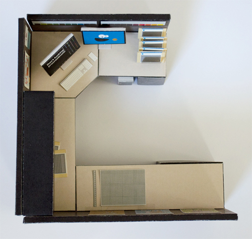
Thought this was just too bitchin' NOT to post. Tommy Perez (who just sent us a paper Leroy C. to construct) created a miniature paper version of his cubicle. And I couldn't help but notice the IC posters. Awesome.
Leroy C. took a little trip to Arizona and came back with some new work, courtesy of the talented Asher Emerson.
 Awesome. Done by Louie Figueroa at Rube’s Tattoo.
Thanks to Josh for the heads up.
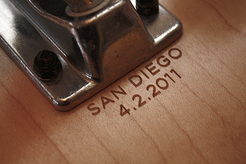
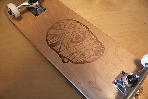
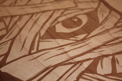
Our buddy Josh surprised us with a nice little gift last Saturday in San Diego. Killer engraving by Garrett Patz.
 Hayley Rader sent us this amazing charcoal drawing of Ryan. I thought it was great and had to share. Don't tell my brother.

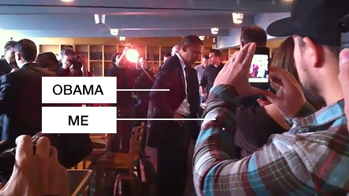
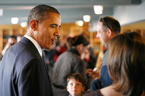
So, instead of trying to explain what happened today ... my good friends at Eight Hour Day have already tackled it. Let's just say we met and shook hands (and had a quick little chit-chat about rainbow sprinkled doughnuts) with the leader of the free world today, all by chance. Because the 3 of us were so in shock and giddy like the Double Rainbow guy, we didn't manage to capture any of us shaking hands with the dude. If anyone out there has photos or video, please contact us! What a surreal day, and a great start to the EHD tour.
Photos by Nathan Strandberg.
 In this series I'm going to try my best not to compare apples to oranges. I understand there are vast differences in technology, ideology, legality, etc between designs of the past and designs of the present. However, I believe there was, is, and will always be a way to almost objectively design something properly. To me, this means a design that is well executed, aesthetically pleasing and properly communicative... in relation to whatever is being "sold."
TWIW, V.2 is in regard to travel advertising. In this case, specifically cruises. Here are my thoughts on the ads in question:
1. I don't even know where to start. How about the copy? Clearly one is simply advertising a specific cruise ship, while the other goes into much more detail about the price, locations, discounts, dates, etc., but that in itself says something about modern advertising's problem with forcing too much information into a single ad. Add to that the tragedy of 5+ arbitrarily used fonts and typesetting that seems to make no sense at all. Except of course for the legal line, which is strategically set in black type over a dark portion of the image. Crafty.
2. We used to marvel at things like the massive Cunard cruise ship, shown above. But as technology and engineering progress, we're less interested in how we'll be getting to our destination and more interested in where it's taking us (and how much it will cost). But aren't these ads for the cruise itself? If you just want to go to The Bahamas, you can fly there in a fraction of the time. This is about the experience of the cruise. And as you can see in the more recent ad, the actual cruise ship has become an afterthought; a footnote.
3. As for the imagery, we're faced with the obvious difference between professional designer and someone with a personal computer. Before the computer we relied on professionals to do the job of advertising. They were skilled in their craft. They knew type and composition and cohesion and color. They designed because they were good at it. I know I'm stating the obvious here, (and there's a heaping helping of irony as I sit here and type this) but it's a bit of a bummer that the computer has turned every civilized human into a jack-of-all-trades.
4. In the end, one is clearly worth framing and displaying in your home, and the other is sure to end up in a trash bin. I refuse to believe that we collect things that are "vintage" purely based on nostalgia. The bottom line is that, in most cases, that old stuff is flat out better than the garbage that we see today.
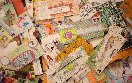 Well, thanks to you guys - our Lil' Happy Invisible Creature S.A.S.E. Club was a success. We are still counting envelopes, but it looks like we received 200+ submissions. We can honestly say that you guys made our trip to the post office something to actually look forward to (and subsequently brought smiles and fun comments from USPS employees - which usually isn't the norm), so our mission has officially been accomplished. Now it's time for us to return the favor. Since we received so many envelopes (and the shop has been busy), we're running a tad later than we had planned. But like we said when we launched this, have patience. It will arrive.
Since this was so fun, we'll be making this an annual tradition each summer. Thanks again, everyone.
 I had the idea a while back to post about the perils of modern design, specifically in regard to rebranding, the evolution of a particular design and things of that nature. I've decided to finally pull the trigger and go for it. As my brother has begun posting a series dedicated to our grandfather, I thought this might be the right time. After all... the time period in which our grandfather was designing will often be the era in which my postings will refer to.
"The Way It Was" will be a study (and occasional pseudo-rant) about a particular design of the past, and a directly (or at least somewhat) related piece from recent years.
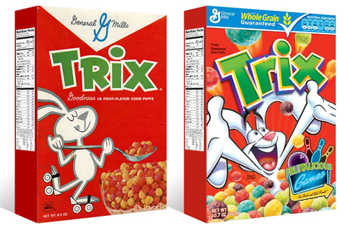
TWIW #001 is based on an email conversation I had with a few like-minded friends a couple of years ago. The subject in this case is a box of Trix cereal. Target had announced that it was re-issuing old General Mills cereal box designs for a limited time, (God bless design-savvy corporations) and in being reminded of that classic old box design, I couldn't help but dissect the modern design and suppose what it's trying to tell today's consumer. Here are my thoughts:
1. The logo, once simple and bold, is now 3-dimensional, has a white stroke, yellow bevel, and emboss. ALL of which have gradients. Somehow this "pops" more.
2. Since brand loyalty is dead, the nice big General Mills logo at the top of the box (which I'm sure used to assure people of the reliability and integrity of the product) is replaced by a very small GM logo, overpowered by a "whole grain guarantee" and a list of other nutritional values. Not that nutrition is anything to shrug at, but let's be real- this is Trix.
3. The cereal itself isn't enough anymore, so there has to be added incentive to buy. In this case, there's an ad for "fruitalicious" games on the back of the box.
4. The fun-loving bunny on cute roller skates is replaced by (honestly) what seems to be an INSANE rabbit, literally throwing Trix at you.
5. Lastly, and probably most importantly, the modern box has a disclaimer sentence that reads something like "cereal shown not actual size," because people are so stupid (or assumed to be so stupid) that they can't comprehend that the 1" macro-lens-photographed meteor puffs on the front of the box are bigger than they actually are.
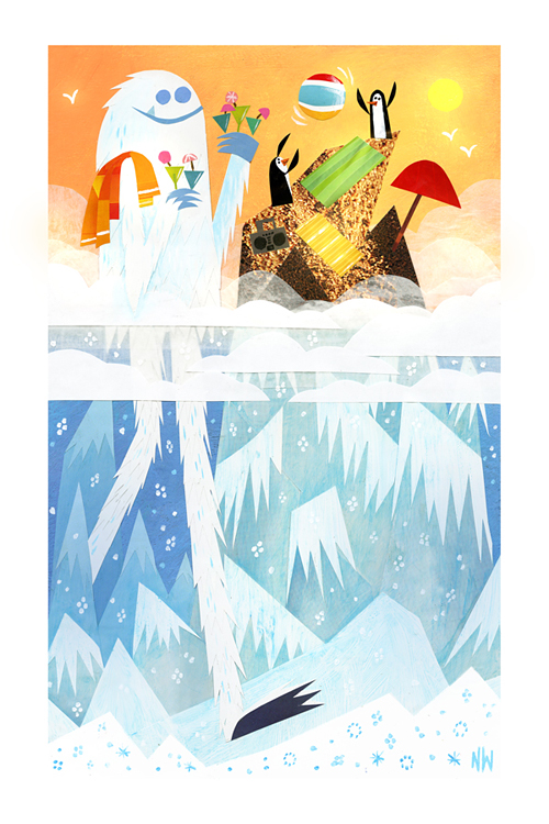
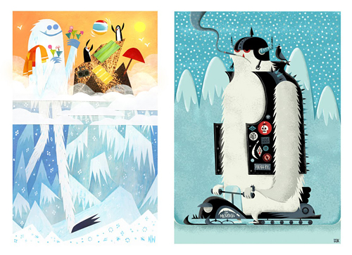 I first met Nate Wragg shortly after I stumbled upon his brilliant work for the film Ratatouille. Namely the 'Your Friend The Rat' short and his great books that were inspired by the film. Many of you are familiar with his fun illustrations and epic character work for Pixar and now DreamWorks. We began chatting as we seemed to share an obvious affinity for all kinds of misc. critters. Namely Sasquatch and the elusive Yeti. It was only natural that a trade was in order.
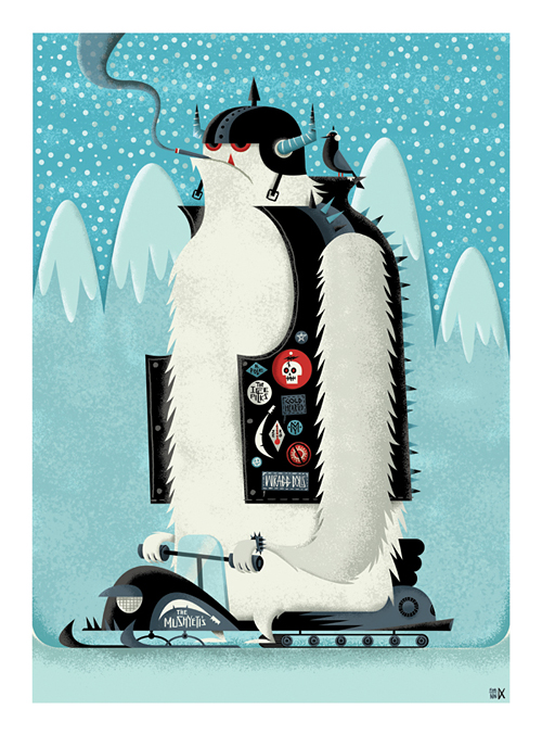
It took me weeks to nail down an idea, but decided that a 'biker Yeti' may be a funny prospect. I quickly started sketching and 'Freddy Mushyeti' was born. He may look a bit menacing, but I guarantee he's harmless. As for the rest of the 'Mushyeti's' crew, I can't exactly say the same.
Nate had the idea that we'd just surprise each other with the Yeti's and ship off the framed pieces without a clue as to what we'd be receiving. It was a great idea and I can't tell you how cool it was to unwrap. I think I may have even injured the UPS man as I ripped it out of his hands. I absolutely love it.
Next year: Swap Of The Sasquatch.
Nate's Yeti: 'A Break from the Snow' / 10" x 16" / Acrylic & Paper Collage / 2010 My Yeti: 'Freddy Mushyeti' / 17" x 23" / Digital / 2010
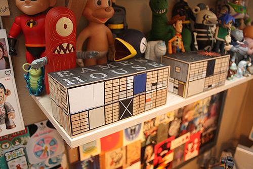 Charles and Ray just moved in. Thanks House.
We received a pretty fun gift from our pal Aaron Horkey today. In fact, it was so fun - I had to show you some of the finer points. His incredible attention to detail and obvious pride in his craft is inspiring. Thanks for the love, sir.
 So, our dad is pretty cool. Cool for many reasons, but right now especially because he just launched Curtis Clark Guitars, his new blog showcasing his amazing (if we may say so ourselves) hand-crafted acoustic guitars. Dad's an incredibly gifted woodworker, so naturally we were pretty excited when he decided to become a luthier. We're proud of you, pops! Oh, you can also follow him on Twitter.