 Heyo! It's hot and you need T-Shirts! All adult and kids sizes of last year's T's are on sale for $15. We don't have a ton left, so grab them while you can (and help us make room for the new IC wearables coming soon). Tell the world!
Filtering by Category: Fashion,The Way It Was
Heyo! It's hot and you need T-Shirts! All adult and kids sizes of last year's T's are on sale for $15. We don't have a ton left, so grab them while you can (and help us make room for the new IC wearables coming soon). Tell the world!
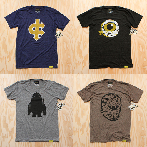
 Back To School? Naw, forget that. It's an endless summer. Soft inks printed on American Apparel Tri-Blend T's. Ships on or before September 18th. Grab them all here.
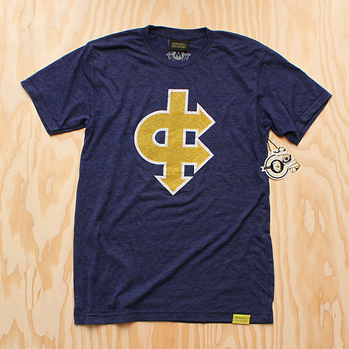
Spirit Of '77 printed on Tri-Indigo Blue.
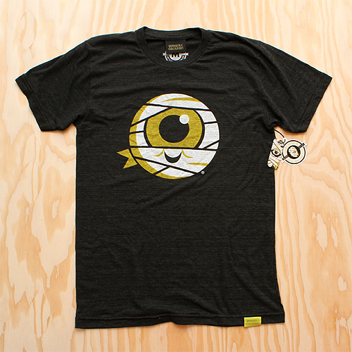
Mummy Jr. printed on Tri-Black.
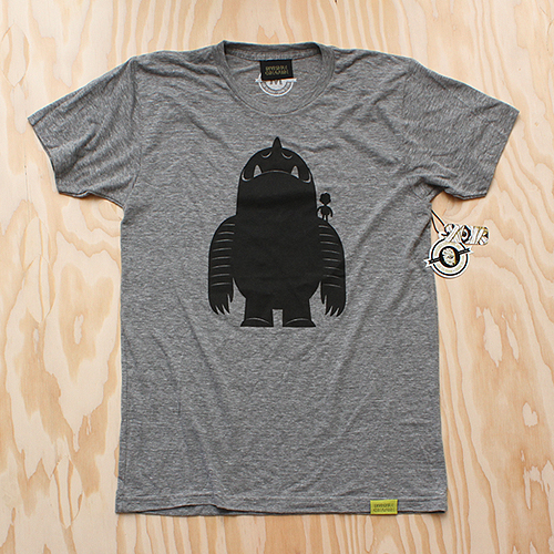
Leroy's Boy printed on Athletic Gray.
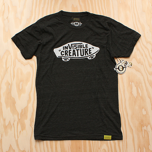
Respect printed on Tri-Black.
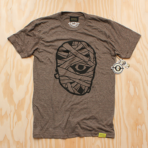
Mummy Classic printed on Tri-Coffee.
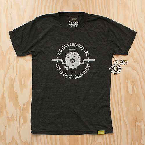
Live To Draw printed on Tri-Black.
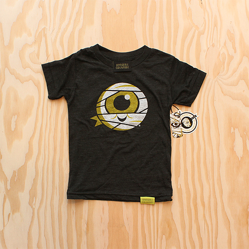
Mummy Jr. (Kids Sizes!) printed on Tri-Black.
 In this series I'm going to try my best not to compare apples to oranges. I understand there are vast differences in technology, ideology, legality, etc between designs of the past and designs of the present. However, I believe there was, is, and will always be a way to almost objectively design something properly. To me, this means a design that is well executed, aesthetically pleasing and properly communicative... in relation to whatever is being "sold."
TWIW, V.2 is in regard to travel advertising. In this case, specifically cruises. Here are my thoughts on the ads in question:
1. I don't even know where to start. How about the copy? Clearly one is simply advertising a specific cruise ship, while the other goes into much more detail about the price, locations, discounts, dates, etc., but that in itself says something about modern advertising's problem with forcing too much information into a single ad. Add to that the tragedy of 5+ arbitrarily used fonts and typesetting that seems to make no sense at all. Except of course for the legal line, which is strategically set in black type over a dark portion of the image. Crafty.
2. We used to marvel at things like the massive Cunard cruise ship, shown above. But as technology and engineering progress, we're less interested in how we'll be getting to our destination and more interested in where it's taking us (and how much it will cost). But aren't these ads for the cruise itself? If you just want to go to The Bahamas, you can fly there in a fraction of the time. This is about the experience of the cruise. And as you can see in the more recent ad, the actual cruise ship has become an afterthought; a footnote.
3. As for the imagery, we're faced with the obvious difference between professional designer and someone with a personal computer. Before the computer we relied on professionals to do the job of advertising. They were skilled in their craft. They knew type and composition and cohesion and color. They designed because they were good at it. I know I'm stating the obvious here, (and there's a heaping helping of irony as I sit here and type this) but it's a bit of a bummer that the computer has turned every civilized human into a jack-of-all-trades.
4. In the end, one is clearly worth framing and displaying in your home, and the other is sure to end up in a trash bin. I refuse to believe that we collect things that are "vintage" purely based on nostalgia. The bottom line is that, in most cases, that old stuff is flat out better than the garbage that we see today.
 I had the idea a while back to post about the perils of modern design, specifically in regard to rebranding, the evolution of a particular design and things of that nature. I've decided to finally pull the trigger and go for it. As my brother has begun posting a series dedicated to our grandfather, I thought this might be the right time. After all... the time period in which our grandfather was designing will often be the era in which my postings will refer to.
"The Way It Was" will be a study (and occasional pseudo-rant) about a particular design of the past, and a directly (or at least somewhat) related piece from recent years.
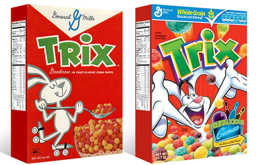
TWIW #001 is based on an email conversation I had with a few like-minded friends a couple of years ago. The subject in this case is a box of Trix cereal. Target had announced that it was re-issuing old General Mills cereal box designs for a limited time, (God bless design-savvy corporations) and in being reminded of that classic old box design, I couldn't help but dissect the modern design and suppose what it's trying to tell today's consumer. Here are my thoughts:
1. The logo, once simple and bold, is now 3-dimensional, has a white stroke, yellow bevel, and emboss. ALL of which have gradients. Somehow this "pops" more.
2. Since brand loyalty is dead, the nice big General Mills logo at the top of the box (which I'm sure used to assure people of the reliability and integrity of the product) is replaced by a very small GM logo, overpowered by a "whole grain guarantee" and a list of other nutritional values. Not that nutrition is anything to shrug at, but let's be real- this is Trix.
3. The cereal itself isn't enough anymore, so there has to be added incentive to buy. In this case, there's an ad for "fruitalicious" games on the back of the box.
4. The fun-loving bunny on cute roller skates is replaced by (honestly) what seems to be an INSANE rabbit, literally throwing Trix at you.
5. Lastly, and probably most importantly, the modern box has a disclaimer sentence that reads something like "cereal shown not actual size," because people are so stupid (or assumed to be so stupid) that they can't comprehend that the 1" macro-lens-photographed meteor puffs on the front of the box are bigger than they actually are.
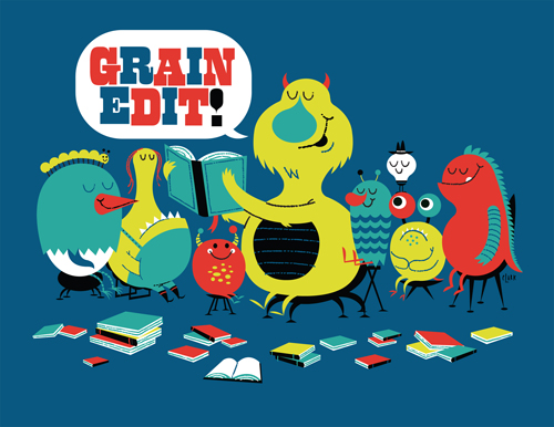 Grain Edit (Dave Cuzner and crew) have been very generous to us over the years - responsible for putting our work in front of many fresh faces. So when they asked if we'd like to create GE's first ever T-shirt design, we quickly obliged. As many of you know, Dave has quite the book collection (we've been known to collect a few over here as well), so the idea of a few critters lending an ear to a story about our favorite blog seemed quite fitting. And with today's announcement from The Times, the story seems that much sweeter.
 When Nonsek asked us if we'd like to open an IC artist channel, we took a gander at their current roster and quickly said "mmmmkay". If you haven't played around with their super-cool custom T-shirt remix madness, do yourself a favor and check it out. Infinite options! And now you can choose shirt colors and even lock layers that you dig.
You know what I'm thinking? This could make a REALLY great gift. Just sayin' ...
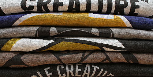
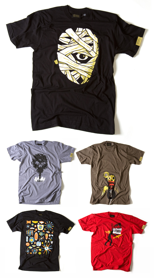 It's been a long time coming. We are pleased to announce our new line of t-shirts on sale now at Feed The Creature. All shirts are printed on fitted American Apparel T's, with custom IC collar and sleeve tags. 7 designs available in men's sizes S-XL*. Merry Christmas!
* Children and Women's sizes coming soon!
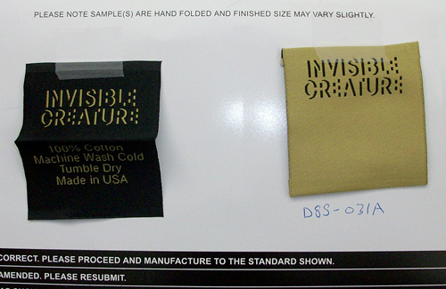 Official proof that IC gear is actually happening. Woo-hoo!
Stay tuned ...