 Here's a look at the recently completed cover for August Burns Red's new album, Rescue & Restore. The album will be available June 25th on CD, double gatefold vinyl, and limited edition vinyl box set. Pre-orders available soon! We had an absolute blast putting this together. Thanks to JB and the guys for their trust and letting us run crazy with it.
Filtering by Category: Metal,Bum Out
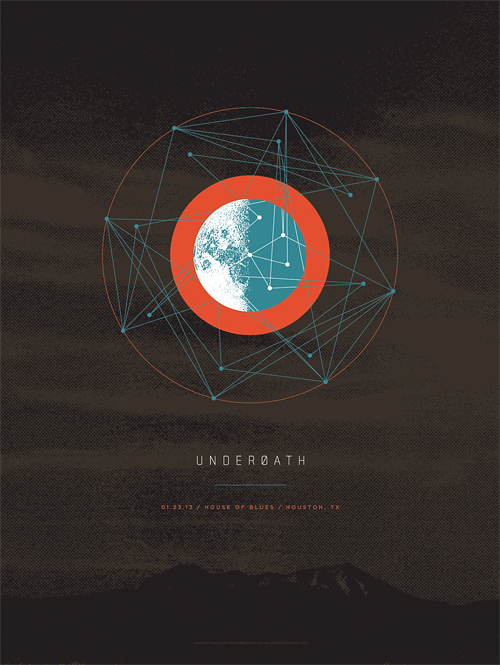 Our friends in Underøath asked us to contribute a design dedicated to one show of their upcoming farewell tour. This design (for both poster and t-shirt) specifically commemorates the Houston, TX date of the tour. If you have a chance, don't miss seeing this band for the last time, and be sure to check out all of the final tour designs created by friends of the band here.
 To commemorate Demon Hunter's ten years, we've created a silkscreen poster featuring imagery from all six studio albums. This is a limited pressing of 100, signed by Ryan Clark (me), and is available in the store now. Order by December 20th for holiday arrival! (orders for this poster do NOT include IC Holiday Giveaway print)
 Check out the cover we just wrapped up for Sold State newcomers The Overseer.
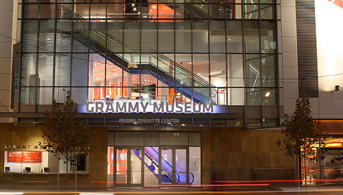 We're honored to have our work featured in The Grammy Museum's new installation "The History Of Heavy Metal", opening April 11th. The exhibit opening coincides with The Golden Gods and will feature numerous album covers from our early years within the heavy music genre. The show will be up for one year and definitely worth checking out.
 So it's kind of a long story, but when my buddy Vijay, who owns and operates Artist Series Guitar, mentioned that his good friend, Ryan Hurst, would be doing a photo shoot for his custom Demon Hunter and Throwdown guitars, I had to make sure I was there. For years now, people have said I look like Opie, a character that Hurst plays in the always-enthralling Sons Of Anarchy TV show. All of us in Demon Hunter have become huge fans of the show over the years, so this was a really cool opportunity. Oh, and my wife made the dope leather vest Hurst is wearing in the shoot. Checking off that bucket list, one day at a time.

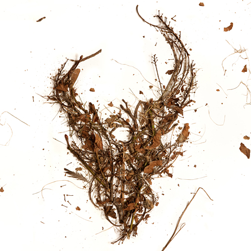 Here is the cover for an upcoming Demon Hunter release featuring the first 3 albums in one package. The 3 disc set will be available everywhere March 8th. If you've had trouble finding these older releases in a store near you, here's the chance to get them all (and cheaply). As always, the DH demon skull graces the cover, this time made from the trees of my back yard. I gathered up some fallen branches and leaves, constructed the logo on a large sheet of white paper, and Jerad Knudson shot the photo.
 We just wrapped up the artwork for our friends, The Famine, and after an interesting photo shoot of blowing black body paint on a total stranger through a straw, I'm glad to say I'm pleased with the outcome. Be afraid.
 In this series I'm going to try my best not to compare apples to oranges. I understand there are vast differences in technology, ideology, legality, etc between designs of the past and designs of the present. However, I believe there was, is, and will always be a way to almost objectively design something properly. To me, this means a design that is well executed, aesthetically pleasing and properly communicative... in relation to whatever is being "sold."
TWIW, V.2 is in regard to travel advertising. In this case, specifically cruises. Here are my thoughts on the ads in question:
1. I don't even know where to start. How about the copy? Clearly one is simply advertising a specific cruise ship, while the other goes into much more detail about the price, locations, discounts, dates, etc., but that in itself says something about modern advertising's problem with forcing too much information into a single ad. Add to that the tragedy of 5+ arbitrarily used fonts and typesetting that seems to make no sense at all. Except of course for the legal line, which is strategically set in black type over a dark portion of the image. Crafty.
2. We used to marvel at things like the massive Cunard cruise ship, shown above. But as technology and engineering progress, we're less interested in how we'll be getting to our destination and more interested in where it's taking us (and how much it will cost). But aren't these ads for the cruise itself? If you just want to go to The Bahamas, you can fly there in a fraction of the time. This is about the experience of the cruise. And as you can see in the more recent ad, the actual cruise ship has become an afterthought; a footnote.
3. As for the imagery, we're faced with the obvious difference between professional designer and someone with a personal computer. Before the computer we relied on professionals to do the job of advertising. They were skilled in their craft. They knew type and composition and cohesion and color. They designed because they were good at it. I know I'm stating the obvious here, (and there's a heaping helping of irony as I sit here and type this) but it's a bit of a bummer that the computer has turned every civilized human into a jack-of-all-trades.
4. In the end, one is clearly worth framing and displaying in your home, and the other is sure to end up in a trash bin. I refuse to believe that we collect things that are "vintage" purely based on nostalgia. The bottom line is that, in most cases, that old stuff is flat out better than the garbage that we see today.
 As They Sleep is a new band on Solid State Records, bringing some much needed brutality to the masses. This is the album cover that we recently completed for their upcoming release titled Dynasty. We again enlisted photographic/set design whiz Jerad Knudson to help us see the vision through, and we couldn't be happier with the results. Apparently the model is a homeless man that sells newspapers near Jerad's house in Seattle's Capital Hill neighborhood.
 I had the idea a while back to post about the perils of modern design, specifically in regard to rebranding, the evolution of a particular design and things of that nature. I've decided to finally pull the trigger and go for it. As my brother has begun posting a series dedicated to our grandfather, I thought this might be the right time. After all... the time period in which our grandfather was designing will often be the era in which my postings will refer to.
"The Way It Was" will be a study (and occasional pseudo-rant) about a particular design of the past, and a directly (or at least somewhat) related piece from recent years.
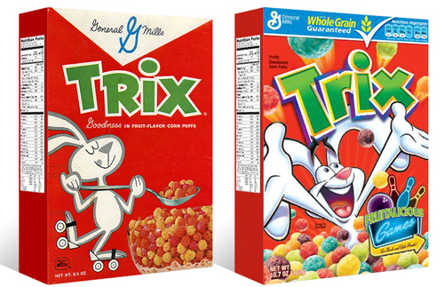
TWIW #001 is based on an email conversation I had with a few like-minded friends a couple of years ago. The subject in this case is a box of Trix cereal. Target had announced that it was re-issuing old General Mills cereal box designs for a limited time, (God bless design-savvy corporations) and in being reminded of that classic old box design, I couldn't help but dissect the modern design and suppose what it's trying to tell today's consumer. Here are my thoughts:
1. The logo, once simple and bold, is now 3-dimensional, has a white stroke, yellow bevel, and emboss. ALL of which have gradients. Somehow this "pops" more.
2. Since brand loyalty is dead, the nice big General Mills logo at the top of the box (which I'm sure used to assure people of the reliability and integrity of the product) is replaced by a very small GM logo, overpowered by a "whole grain guarantee" and a list of other nutritional values. Not that nutrition is anything to shrug at, but let's be real- this is Trix.
3. The cereal itself isn't enough anymore, so there has to be added incentive to buy. In this case, there's an ad for "fruitalicious" games on the back of the box.
4. The fun-loving bunny on cute roller skates is replaced by (honestly) what seems to be an INSANE rabbit, literally throwing Trix at you.
5. Lastly, and probably most importantly, the modern box has a disclaimer sentence that reads something like "cereal shown not actual size," because people are so stupid (or assumed to be so stupid) that they can't comprehend that the 1" macro-lens-photographed meteor puffs on the front of the box are bigger than they actually are.
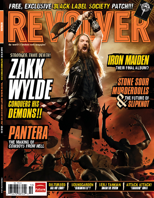
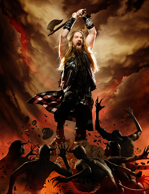
Check out your local newsstands now for the new issue of Revolver Magazine, featuring Zakk Wylde. We did the photo-illustration work for the cover and the feature, which meant many hours of cutting out little demon people to create the elaborate scenes. The cover image itself pays homage to recently deceased Frank Frazetta's classic artwork.
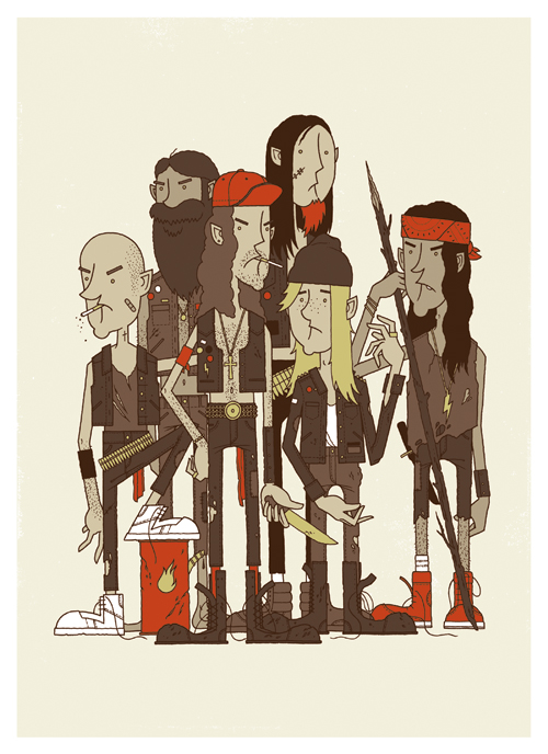 It's the Rowdy Boys Heavy Metal Club! These ruffians may look a little troubled, but they're good kids... just don't tell them you think Inside The Torn Apart is the best Napalm Death album. The brand new 16" x 22" Giclee print is available in the store now.
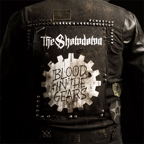 Check out the cover we recently finished for our buddies The Showdown. The new record, Blood In The Gears, has a very gritty, Southern, biker sound to it, so that's exactly what we went for. That's me in the jacket, and there's no Photoshop magic here- we had the back patch made just for the cover. Ride to live...
 Here's the cover for new Solid State band, To Speak Of Wolves' debut release. Hands are still tough for me. I probably drew 15 pairs of hands before I felt like I got it right...
 We just launched a pre-order for the new Demon Hunter record, The World Is A Thorn. Go here to see the different bundles being offered. The deluxe edition box is filled with goodies and there are some extra odds and ends that you can add for dirt cheap. Oh, and the music's not too shabby either.


Just wrapped up both (regular & special edition) packages for the new DevilDriver record. I'm a big fan of the band, so it was an honor to work with Dez and the guys.
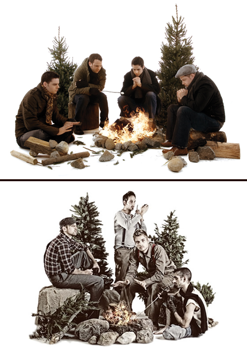 Four guys in outdoor clothing- check. Rocks and various debris- check. 2 staggered pine trees- check. Campfire- check. One guy warming his hands, one guy roasting a marshmallow- check. White seamless backdrop- check. Congrats- you've successfully ripped off our Fair artwork! Your Dave Hill photo treatment needs some work though.
 Check out our new post over at Headbangers Blog, in which we explain the process of creating imagery for the April, 2009 issue of Revolver magazine, featuring metal heavyweights Lamb Of God. Feel the wrath!