 US folks: Place your holiday orders by Wednesday, December 18th to insure delivery before Christmas. We won't be shipping between Dec. 19th-January 6th.
Filtering by Category: Holiday,Bum Out
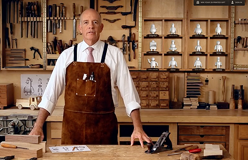
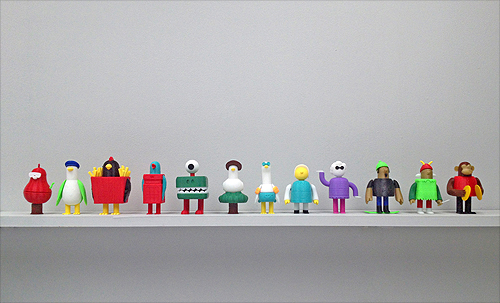
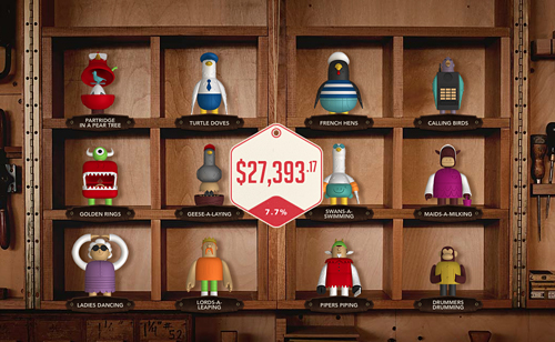
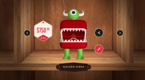
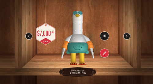
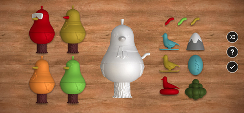
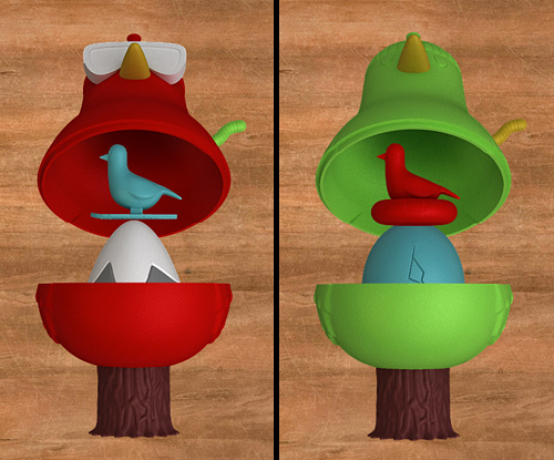
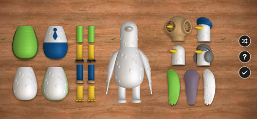
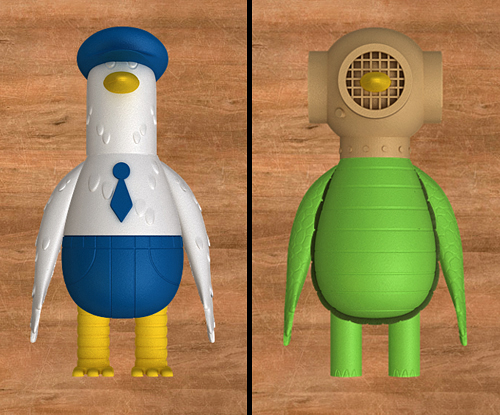
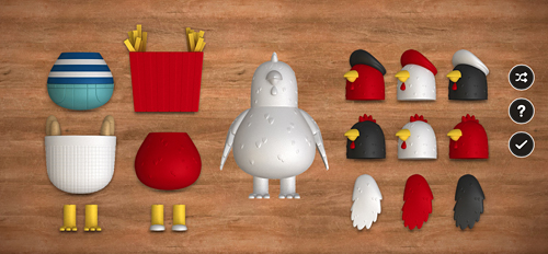
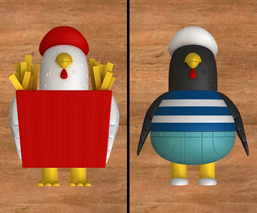
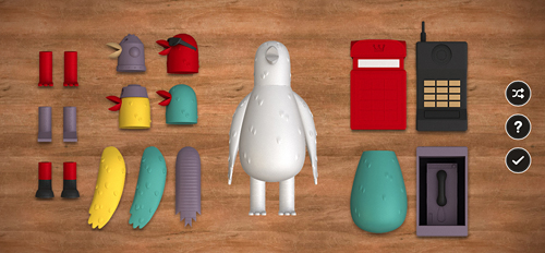
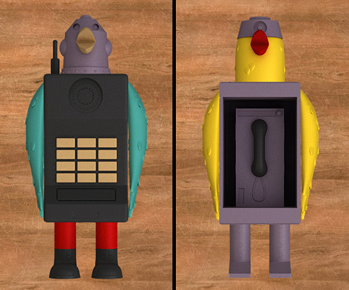
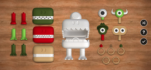
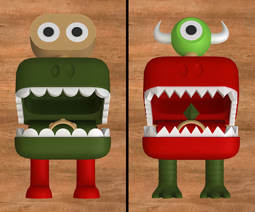
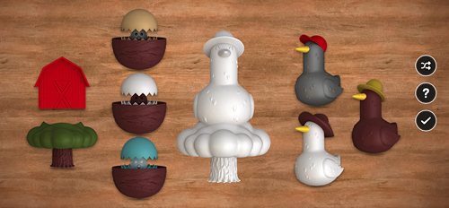
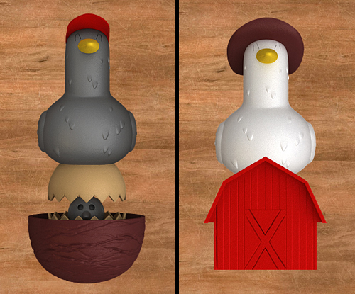
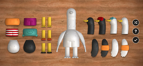
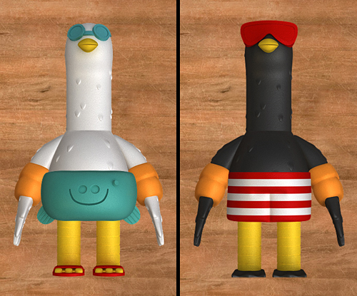
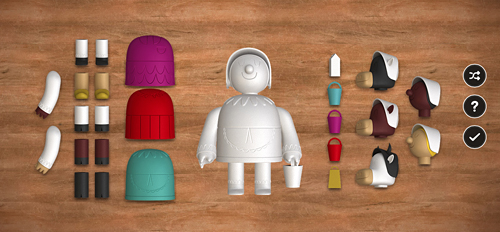
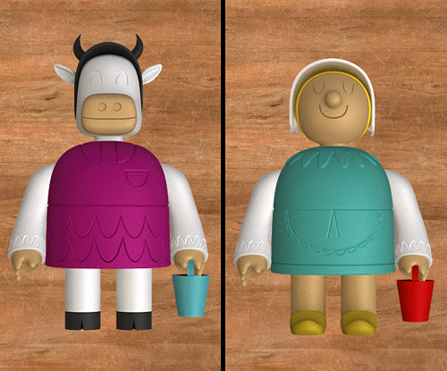
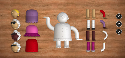
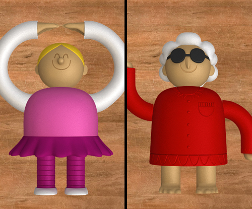
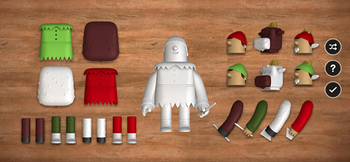
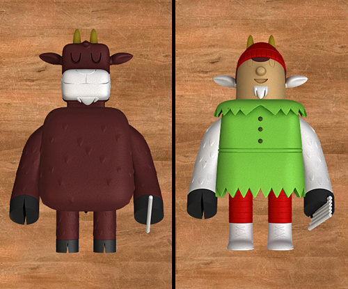
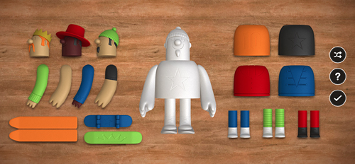
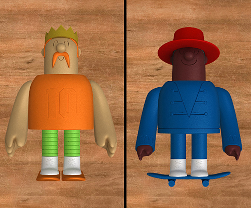
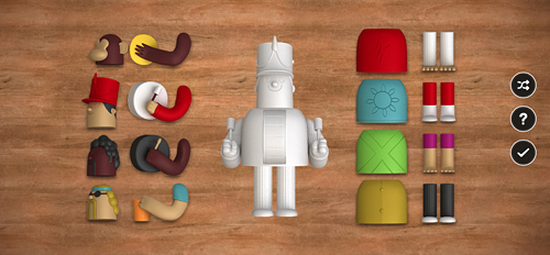
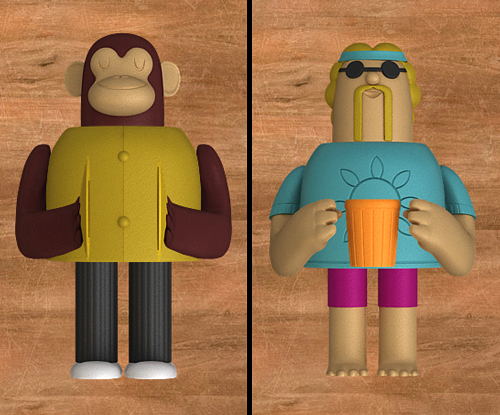
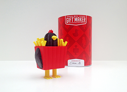
We are excited to announce the launch of a fun new project we just finished up with the kind folks at Deutsch NY. Deutsch commissioned IC to create 12 unique character toy designs based on the classic song "The Twelve Days Of Christmas" for PNC's infamous annual PNC Christmas Price Index. Beyond the task of creating 12 original characters based on the song, we also designed multiple interchangeable parts for each character - over 100 pieces in total. Partridge In A Pear Tree, Turtledove, French Hen, Calling Birds, Golden Rings, Geese-a-Laying, Swans-a-Swimming, Maids-a-Milking, Ladies Dancing, Lords-a-Leaping, Pipers Piping and Drummers Drumming.
The PNC Christmas Price Index site is loads of fun and allows you to create your own toy by selecting various heads, legs, arms, bodies and accessories. When you are done creating your character, PNC calculates the total cost of what your selection would be in 2013, as well as how much it has gone up or down since 2012.
But the coolest part? For 12 days, PNC is selecting 24 lucky winners per day to receive a 3D-printed gift in time for the holidays! Using Makerbot desktop printers, winners will be chosen randomly and selected each day. The more gifts you build, the more chances you have to win. Read more about that here.
We had so much fun with this project, now it's your turn!
More about PNC Bank's Christmas Price Index:
The PNC Christmas Price Index® shows the current cost for one set of each of the gifts given in the song “The Twelve Days of Christmas.”
It began 30 years ago when the chief economist at PNC Bank decided to figure out how much it would cost to buy each of the gifts. Little did he know, he was starting a holiday tradition that continues to this day.
The PNC Christmas Price Index® is similar to the Consumer Price Index, which measures changes in prices of goods and services like housing, food, clothing, transportation and more that reflect the spending habits of the average American.
The goods and services in the PNC Christmas Price Index® are far more whimsical. And most years, the price changes closely mirror those in the Consumer Price Index. It’s a fun way to measure consumer spending and trends in the economy. So even if “pipers piping” or “geese-a-laying” didn’t make your gift list, you can still learn a lot by checking out how their prices have gone up and down over the years.
Deutsch Credits:
Partner/ Chief Creative Officer: Kerry Keenan SVP, Group Creative Director: Jeremy Bernstein Senior Copywriter: Matt Moyer VP, Creative Director: Qian Qian EVP/Director of Integrated Production: Joe Calabrese SVP/Director of Digital Production: Suzanne Molinaro VP/Executive Digital Producer: Jennifer McBride Senior Art Producer: Hillary Jackson Producer: Jillian Cornette
Production Companies:
MediaMonks (creative digital production) Invisible Creature (toy design & packaging) 3D Printer Experience (3D printing the toys) ShootersNYC (intro/outro video production) Director/DP: Craig Needleman Executive Producer: Jim Huie Senior Editor: Anthony Marinelli Account Director: Amy Sweeney
 To commemorate Demon Hunter's ten years, we've created a silkscreen poster featuring imagery from all six studio albums. This is a limited pressing of 100, signed by Ryan Clark (me), and is available in the store now. Order by December 20th for holiday arrival! (orders for this poster do NOT include IC Holiday Giveaway print)
 As we celebrate IC's 6 year anniversary, we are thankful for 2012 (our bestest year yet!) and the amazing projects we've had the pleasure of working on. So we thought we'd spread the joy a little by creating "The Lookout", a sequel (of sorts) to 2010's Snowballer print. With every purchase over $25, we'll be sending out a signed 11" x 14" giclee print until December 20th, which also happens to be our last day of shipping before Christmas.
Special note - International orders: Due to shipping costs, we are only able to send "The Lookout" with poster and print orders. Offer doesn't apply to T-shirt or toy orders. Sorry!
We'll have the set of 2 available to purchase after the holidays. Go in peace!
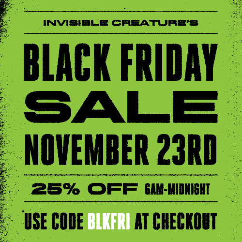 Mark your calendars. This Friday from 6AM-Midnight PST. Use code BLKFRI at checkout.
 This past week, my wife and I had the pleasure of celebrating our 10 year anniversary in the land of the rising sun. We visited Tokyo, Kyoto and Osaka, did lots of shopping, lots of walking, took lots of trains, drank a lot of coffee, learned the correct way to say "thank you," and got tattooed. This was also Leroy's first trip back to his birthplace.
 Wow, we're 5. Officially out of the toddler bed but still able to pee in the yard. Not bad. It's been an incredible journey thus far ... thanks to our amazing clients and you (of course). To celebrate the holidays as well as our half-decade, we're offering free shipping on all US orders through December as well as a new 5" x 5" mini-print (with any Leroy C. figure purchase) to hang next to the awkward family photo of that one acquaintance from high school that still sends you Christmas cards. You know the one I'm talking about.
Thank you so much. And seriously, we can't wait to see what happens in the next five ...

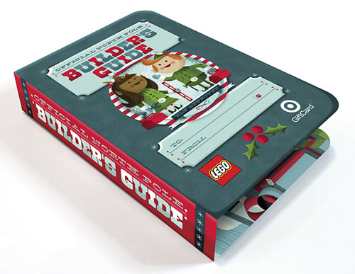
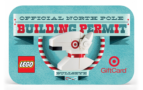
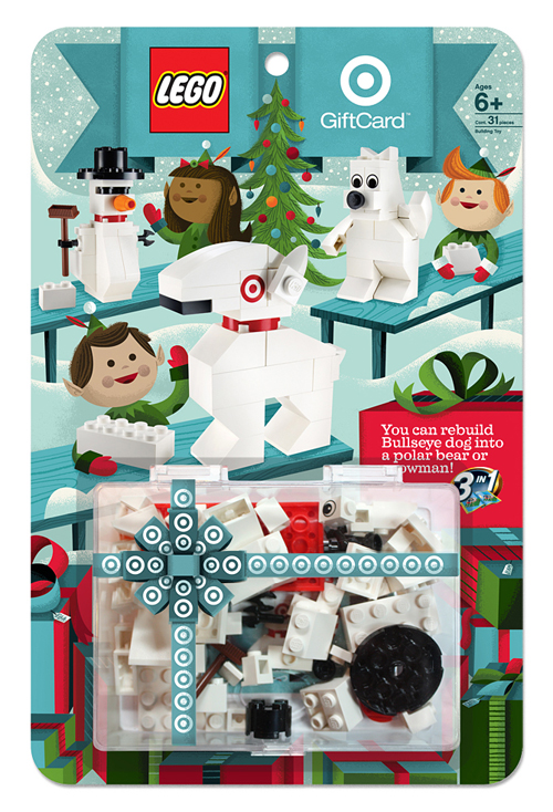 Ahhhh, our favorite time of year is back. The two Frank's (Sinatra & Capra), Yuletide logs, eggnogs, and Lord Of The Rings DVD extras in our pajamas. And of course, the great seasonal goodies at Target. We were lucky enough to work on two fun stocking stuffers this Holiday season. Last year, the LEGO Build A Bullseye set was such a hit, we were asked to come back for round two. And to make the kids (and us) even more ecstatic, you can create a polar bear and snowman in addition to Bullseye dog. It all folds up into a gift-able size for that special someone. Sequels are supposed to be better, right?
And the gifts keep coming ... We were also asked to design and illustrate a super-fun (and addicting) interactive game featuring our favorite pooch. The big idea: Can you pat the dogs as quickly as they light up without losing your cool? Oh, and each level gets more and more insane as you continue to play. Lights, barking, action. Find them both in-store or online now.
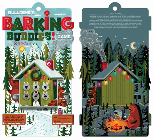
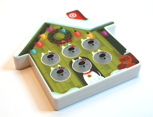

Art direction: Brian Holt, Rob Weaver and Ted Halbur. Once again, extra special thanks to the team at Target.
 In this series I'm going to try my best not to compare apples to oranges. I understand there are vast differences in technology, ideology, legality, etc between designs of the past and designs of the present. However, I believe there was, is, and will always be a way to almost objectively design something properly. To me, this means a design that is well executed, aesthetically pleasing and properly communicative... in relation to whatever is being "sold."
TWIW, V.2 is in regard to travel advertising. In this case, specifically cruises. Here are my thoughts on the ads in question:
1. I don't even know where to start. How about the copy? Clearly one is simply advertising a specific cruise ship, while the other goes into much more detail about the price, locations, discounts, dates, etc., but that in itself says something about modern advertising's problem with forcing too much information into a single ad. Add to that the tragedy of 5+ arbitrarily used fonts and typesetting that seems to make no sense at all. Except of course for the legal line, which is strategically set in black type over a dark portion of the image. Crafty.
2. We used to marvel at things like the massive Cunard cruise ship, shown above. But as technology and engineering progress, we're less interested in how we'll be getting to our destination and more interested in where it's taking us (and how much it will cost). But aren't these ads for the cruise itself? If you just want to go to The Bahamas, you can fly there in a fraction of the time. This is about the experience of the cruise. And as you can see in the more recent ad, the actual cruise ship has become an afterthought; a footnote.
3. As for the imagery, we're faced with the obvious difference between professional designer and someone with a personal computer. Before the computer we relied on professionals to do the job of advertising. They were skilled in their craft. They knew type and composition and cohesion and color. They designed because they were good at it. I know I'm stating the obvious here, (and there's a heaping helping of irony as I sit here and type this) but it's a bit of a bummer that the computer has turned every civilized human into a jack-of-all-trades.
4. In the end, one is clearly worth framing and displaying in your home, and the other is sure to end up in a trash bin. I refuse to believe that we collect things that are "vintage" purely based on nostalgia. The bottom line is that, in most cases, that old stuff is flat out better than the garbage that we see today.
 I had the idea a while back to post about the perils of modern design, specifically in regard to rebranding, the evolution of a particular design and things of that nature. I've decided to finally pull the trigger and go for it. As my brother has begun posting a series dedicated to our grandfather, I thought this might be the right time. After all... the time period in which our grandfather was designing will often be the era in which my postings will refer to.
"The Way It Was" will be a study (and occasional pseudo-rant) about a particular design of the past, and a directly (or at least somewhat) related piece from recent years.
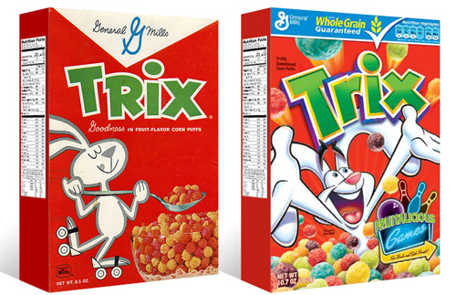
TWIW #001 is based on an email conversation I had with a few like-minded friends a couple of years ago. The subject in this case is a box of Trix cereal. Target had announced that it was re-issuing old General Mills cereal box designs for a limited time, (God bless design-savvy corporations) and in being reminded of that classic old box design, I couldn't help but dissect the modern design and suppose what it's trying to tell today's consumer. Here are my thoughts:
1. The logo, once simple and bold, is now 3-dimensional, has a white stroke, yellow bevel, and emboss. ALL of which have gradients. Somehow this "pops" more.
2. Since brand loyalty is dead, the nice big General Mills logo at the top of the box (which I'm sure used to assure people of the reliability and integrity of the product) is replaced by a very small GM logo, overpowered by a "whole grain guarantee" and a list of other nutritional values. Not that nutrition is anything to shrug at, but let's be real- this is Trix.
3. The cereal itself isn't enough anymore, so there has to be added incentive to buy. In this case, there's an ad for "fruitalicious" games on the back of the box.
4. The fun-loving bunny on cute roller skates is replaced by (honestly) what seems to be an INSANE rabbit, literally throwing Trix at you.
5. Lastly, and probably most importantly, the modern box has a disclaimer sentence that reads something like "cereal shown not actual size," because people are so stupid (or assumed to be so stupid) that they can't comprehend that the 1" macro-lens-photographed meteor puffs on the front of the box are bigger than they actually are.
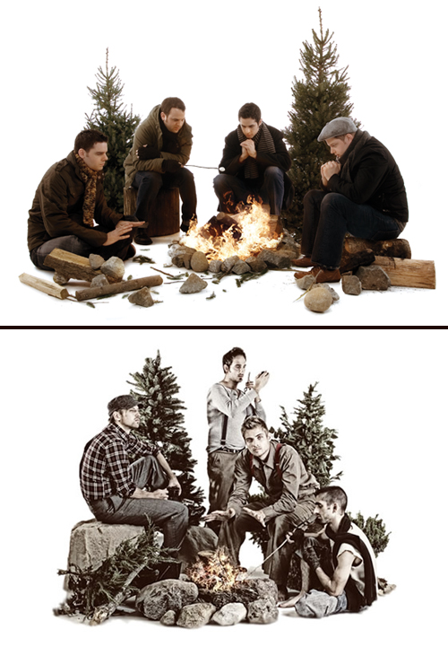 Four guys in outdoor clothing- check. Rocks and various debris- check. 2 staggered pine trees- check. Campfire- check. One guy warming his hands, one guy roasting a marshmallow- check. White seamless backdrop- check. Congrats- you've successfully ripped off our Fair artwork! Your Dave Hill photo treatment needs some work though.
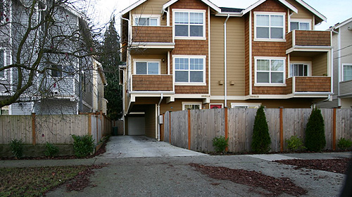 Build has an excellent rant, I mean blog about the current "nostalgic faux-crapsman" town homes popping up everywhere around Seattle. This was just a topic of conversation amongst friends last week, it's good to see we're not alone.
They also posted a link to a Seattle Times article regarding the same issue.