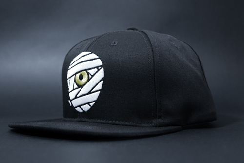
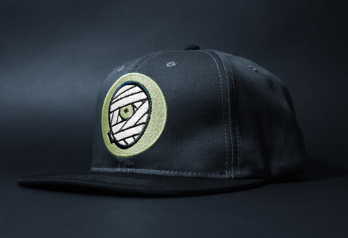
Our new polytwill snapbacks are finally here! Grab 'em while you can.
Filtering by Category: Bum Out,New Store Goodies
Our new polytwill snapbacks are finally here! Grab 'em while you can.
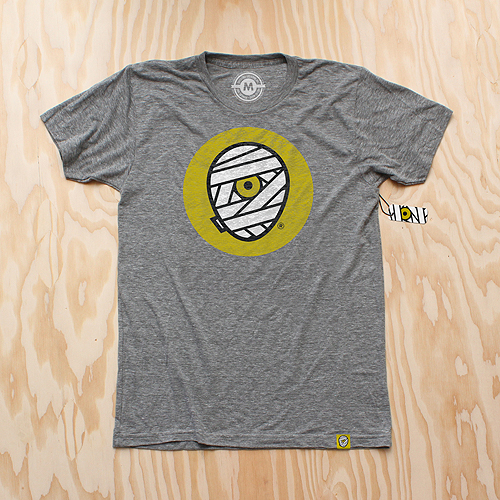
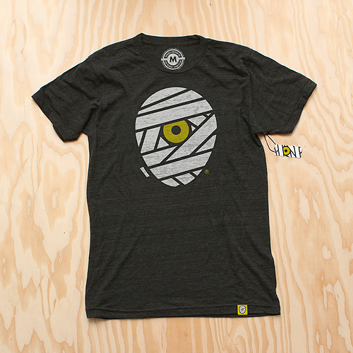
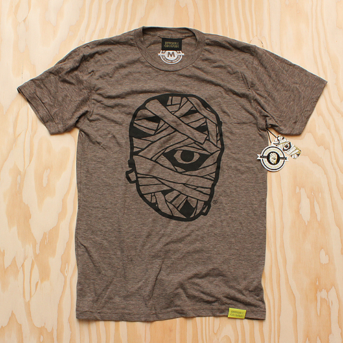
 As we enter into our seventh year here at IC, we've decided to give our iconic mummy mark an upgrade.
The reenvisioning of our logomark is something we have been considering for some time. With a consciousness for particularly small uses (social media icons, products, packaging, clothing tags, etc.) we sought out for a bold, timeless mark that stands strong in every possible scenario. With a handful of new projects/products on the horizon, we decided that now is the time.

The original mark I created in 2006 was inspired by skateboard graphics and other pop art from our coming of age. Although it feels somewhat classic in its own right, the detailed style has proved to be limiting over the years.

Our goal was to create a simpler, more streamlined version of our classic "cyclops mummy," keeping its overall concept (and hopefully its recognizability) in tact, but modernized and with a broader range of usability.
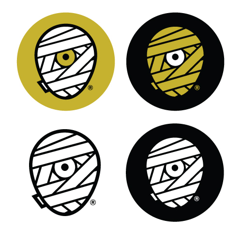
We explored a variety of shapes for the head itself - a perfect circle, a rectangle with rounded corners, etc. In the end, it was imperative that it truly convey a head shape, so we landed on what we refer to as the "egg."
Aside from the logo's core theme, we also knew we'd be sticking with our classic color scheme. It feels as integral to our brand as the mark itself, and allows us to maintain our focus. Another benefit of this new mark is our ability to explore varying combinations of these colors depending on its use. The solid white or yellow wrap will be the primary marks, while the shaded versions - with white highlights on the yellow wrap, and yellow lowlights on the white wrap, give us more detailed options as well.
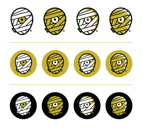
A minor but important detail was the small piece of wrap peeking around the backside of the mummy head. It's a subtle inclusion, but it truly helps the read. It was necessary that this piece be included, but without jeopardizing the true center of the new mark.
You'll also notice the inclusion of an ® mark. With the recent registration of our brand name and identity, it's time to make it official.
And of course, we celebrate this momentous occasion with some swag. New T-Shirts are available for pre-order (shipping mid-late September) as well as new silk-screened die-cut stickers.
 To commemorate Demon Hunter's ten years, we've created a silkscreen poster featuring imagery from all six studio albums. This is a limited pressing of 100, signed by Ryan Clark (me), and is available in the store now. Order by December 20th for holiday arrival! (orders for this poster do NOT include IC Holiday Giveaway print)
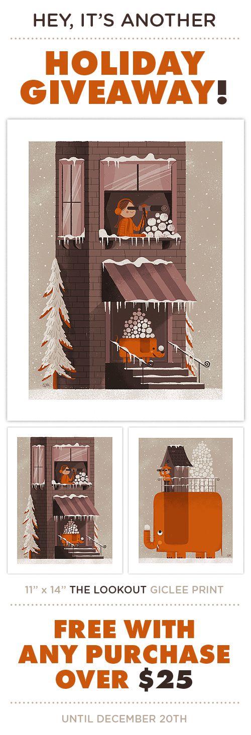 As we celebrate IC's 6 year anniversary, we are thankful for 2012 (our bestest year yet!) and the amazing projects we've had the pleasure of working on. So we thought we'd spread the joy a little by creating "The Lookout", a sequel (of sorts) to 2010's Snowballer print. With every purchase over $25, we'll be sending out a signed 11" x 14" giclee print until December 20th, which also happens to be our last day of shipping before Christmas.
Special note - International orders: Due to shipping costs, we are only able to send "The Lookout" with poster and print orders. Offer doesn't apply to T-shirt or toy orders. Sorry!
We'll have the set of 2 available to purchase after the holidays. Go in peace!
 Back To School? Naw, forget that. It's an endless summer. Soft inks printed on American Apparel Tri-Blend T's. Ships on or before September 18th. Grab them all here.
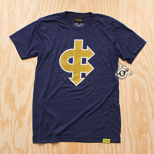
Spirit Of '77 printed on Tri-Indigo Blue.
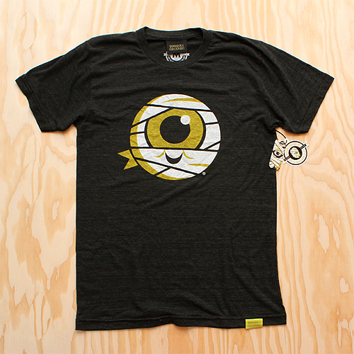
Mummy Jr. printed on Tri-Black.
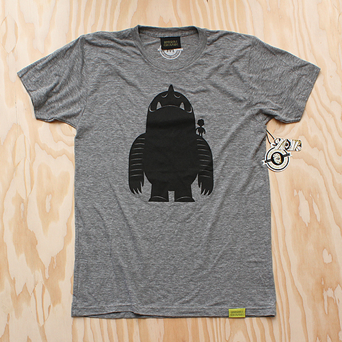
Leroy's Boy printed on Athletic Gray.
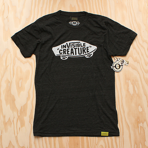
Respect printed on Tri-Black.
Mummy Classic printed on Tri-Coffee.
Live To Draw printed on Tri-Black.
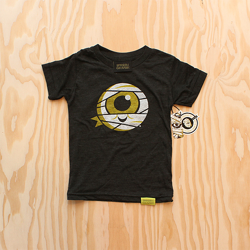
Mummy Jr. (Kids Sizes!) printed on Tri-Black.
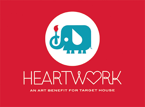 We're extremely excited to launch Heartwork 2012. Featuring limited prints by Lab Partners, Jessica Hische, Julia Rothman, Aesthetic Apparatus, Nate Wragg, Gina Triplett, Meg Hunt, Jason Munn & IC. Each edition is extremely limited (only 10 prints available from each artist) so grab they while you can.
We’re honored to be part of this project and thankful for everyone who donated their time and talent.
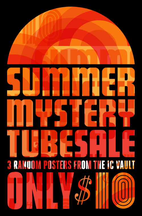 Scratch & dent. Overstock. Printing errors. Old posters. We got 'em and we need to get rid of 'em. For the remainder of the summer (or until we run out of stock) we'll be stuffing tubes full of posters and prints for a measly $10. Unfortunately we can't list which posters and prints we'll be including in the sale as we just have so many to choose from. Most have slight blemishes or some sort of minor printing error, while others have just been sitting on the shelves for awhile.
The risk? You may just hate every band listed on the posters your receive. The payoff? Your walls aren't that picky. Act now!
 Now sticking/shipping.
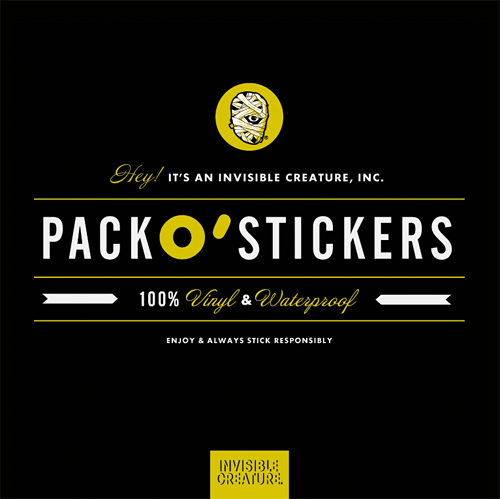
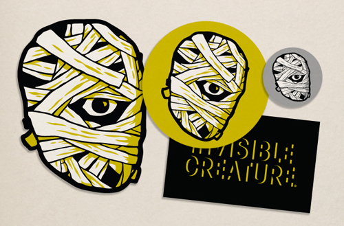 Ruin your mom's van. Assorted vinyl IC stickers finally added to the shop.
 Ahhh, the first day of pre-school. Today was a biggie for my son - definitely a few tears. Continuing tradition, here's a quick drawing I stuffed in his lunchbox to ease his first day jitters. Also in the shop for $12.
 Time flies. Today is my little girl's first day of first grade. Just like last year, I decided to make her a quick treat for her lunchbox. Many of you asked for prints last time, so we added an 8.5" x 11" print to the shop for $12. All proceeds benefit her lunch fund ... and I'm happy to report that there were less tears this year ...
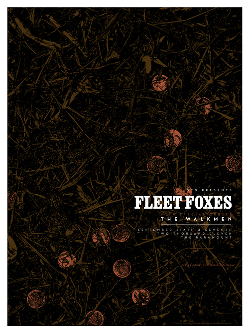 Here's a glimpse at our poster for 2 upcoming Fleet Foxes shows here in Seattle. The concept comes from a song called "The Shrine" (from their latest record, Helplessness Blues) where the lyrics speak of an old dried-up fountain filled with forgotten pennies. In this case, the pennies are actually metallic copper ink. In the store soon!
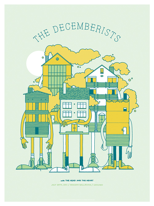 Here's a look at the poster we recently created for the Chicago date of The Decemberists' current tour. Looks like Chicago has some rough neighborhoods. Available in the store now!
 Get him while you can ...


We recently completed posters for 2 events serendipitously taking place on the same night (January 22nd), albeit across the nation from one another. Aziz Ansari will be knocking the socks off of a presumably packed house at Carnegie Hall, while I'll be here in Seattle, in awe of White Lies and all of their glory. The Aziz poster is 5 colors, and White Lies is 2 colors, both of which feature metallic silver ink. In the store now!
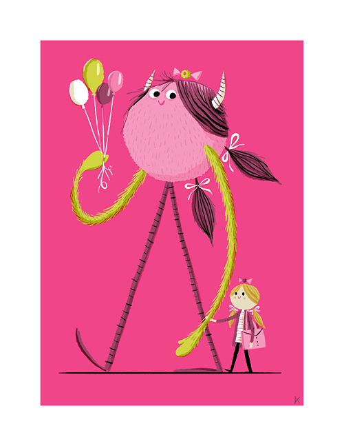
 It's been another fantastic year at IC, so we thought we'd share the love a bit. With any purchase over $30 until December 21st, you'll receive our new 11" x 14" Giclee print 'Snowballer'. Inspired by our recent snowmageddon experience here in Seattle, we thought it would be pretty neat to have a large orange pachyderm friend on our side in case that looming snowball fight with the bratty neighborhood kids does indeed happen. Tell your friends.
 In this series I'm going to try my best not to compare apples to oranges. I understand there are vast differences in technology, ideology, legality, etc between designs of the past and designs of the present. However, I believe there was, is, and will always be a way to almost objectively design something properly. To me, this means a design that is well executed, aesthetically pleasing and properly communicative... in relation to whatever is being "sold."
TWIW, V.2 is in regard to travel advertising. In this case, specifically cruises. Here are my thoughts on the ads in question:
1. I don't even know where to start. How about the copy? Clearly one is simply advertising a specific cruise ship, while the other goes into much more detail about the price, locations, discounts, dates, etc., but that in itself says something about modern advertising's problem with forcing too much information into a single ad. Add to that the tragedy of 5+ arbitrarily used fonts and typesetting that seems to make no sense at all. Except of course for the legal line, which is strategically set in black type over a dark portion of the image. Crafty.
2. We used to marvel at things like the massive Cunard cruise ship, shown above. But as technology and engineering progress, we're less interested in how we'll be getting to our destination and more interested in where it's taking us (and how much it will cost). But aren't these ads for the cruise itself? If you just want to go to The Bahamas, you can fly there in a fraction of the time. This is about the experience of the cruise. And as you can see in the more recent ad, the actual cruise ship has become an afterthought; a footnote.
3. As for the imagery, we're faced with the obvious difference between professional designer and someone with a personal computer. Before the computer we relied on professionals to do the job of advertising. They were skilled in their craft. They knew type and composition and cohesion and color. They designed because they were good at it. I know I'm stating the obvious here, (and there's a heaping helping of irony as I sit here and type this) but it's a bit of a bummer that the computer has turned every civilized human into a jack-of-all-trades.
4. In the end, one is clearly worth framing and displaying in your home, and the other is sure to end up in a trash bin. I refuse to believe that we collect things that are "vintage" purely based on nostalgia. The bottom line is that, in most cases, that old stuff is flat out better than the garbage that we see today.
 I had the idea a while back to post about the perils of modern design, specifically in regard to rebranding, the evolution of a particular design and things of that nature. I've decided to finally pull the trigger and go for it. As my brother has begun posting a series dedicated to our grandfather, I thought this might be the right time. After all... the time period in which our grandfather was designing will often be the era in which my postings will refer to.
"The Way It Was" will be a study (and occasional pseudo-rant) about a particular design of the past, and a directly (or at least somewhat) related piece from recent years.
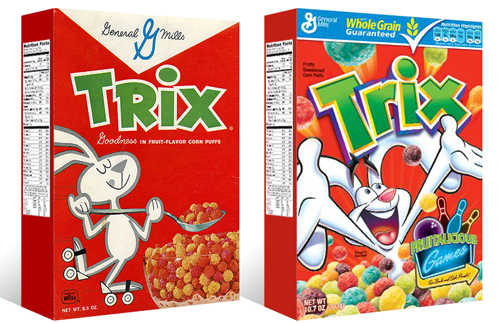
TWIW #001 is based on an email conversation I had with a few like-minded friends a couple of years ago. The subject in this case is a box of Trix cereal. Target had announced that it was re-issuing old General Mills cereal box designs for a limited time, (God bless design-savvy corporations) and in being reminded of that classic old box design, I couldn't help but dissect the modern design and suppose what it's trying to tell today's consumer. Here are my thoughts:
1. The logo, once simple and bold, is now 3-dimensional, has a white stroke, yellow bevel, and emboss. ALL of which have gradients. Somehow this "pops" more.
2. Since brand loyalty is dead, the nice big General Mills logo at the top of the box (which I'm sure used to assure people of the reliability and integrity of the product) is replaced by a very small GM logo, overpowered by a "whole grain guarantee" and a list of other nutritional values. Not that nutrition is anything to shrug at, but let's be real- this is Trix.
3. The cereal itself isn't enough anymore, so there has to be added incentive to buy. In this case, there's an ad for "fruitalicious" games on the back of the box.
4. The fun-loving bunny on cute roller skates is replaced by (honestly) what seems to be an INSANE rabbit, literally throwing Trix at you.
5. Lastly, and probably most importantly, the modern box has a disclaimer sentence that reads something like "cereal shown not actual size," because people are so stupid (or assumed to be so stupid) that they can't comprehend that the 1" macro-lens-photographed meteor puffs on the front of the box are bigger than they actually are.
 Our Conan O'Brien and My Morning Jacket posters have been added to the shop.