We're guilty. Guilty of relying on the quick and easy method of using social networking to update folks on what we're up to. You can see the cobwebs on this very site. I don't think we've updated our work section in over a year. But I can feel it in the air ... 2015 will be the return of the blog and long-form reading on the web. No? Well, we're going to attempt that when we can. Personally, I miss it. I miss putting together (and reading) content that you could spend more than 2 seconds staring at. We'll continue to Insta-tweet, but I don't want to rely on that ... To be honest though, we have been busy. Very thankful for that. But, now is a perfect time to wipe the dust off the site and let you guys know what we've been up to for the last 9 months - and we also want to share some new things we've got cooking.
1. Thanks to the VSCO Artist Iniative, our first documentary film about artists (specifically what drives us and connects us all) begins production in July! We will be hitting 6 cities and interviewing numerous artists from many different industries and walks of life. We're excited to tell this story ... more on that here. We'll be documenting and journaling the entire experience on our VSCO Grid.
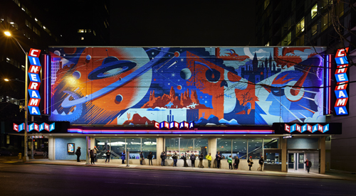
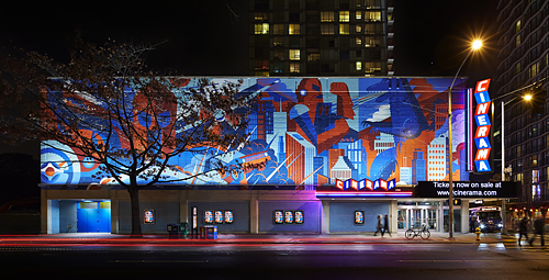
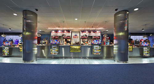
2. Last fall, we had the opportunity of a lifetime come our way: To re-imagine the historic Cinerama Theatre in Downtown Seattle - our favorite movie destination since we landed here in 2001. We created 2 massive murals that completely altered the corner of 4th Avenue and Lenora Street. The mural art made its way into a re-brand of the theatre, inside and out. We are currently working on our short film, 'Re-Imagining Cinerama' that takes a closer look at Cinerama's grand re-opening last November - and the art that went into it. We'll also have prints of the mural (and more Cinerama art we created) for sale when we launch the film this summer. Photos above by Benjamin Benschnieder.
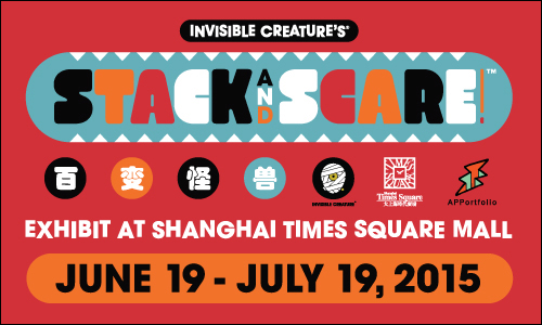
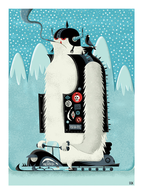
3. Stack And Scare! is coming to Shanghai in a massive way. The Shanghai Times Square Mall will feature a large Stack And Scare! exhibit next month. Giant sculptures, play areas, toys, posters, etc. Curated by APPortfolio. We are very excited for this - much more info coming soon.
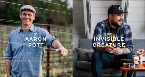
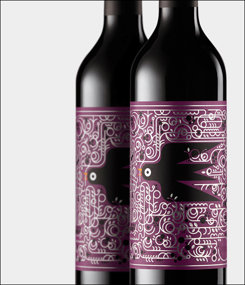
4. Wine Meets Design. We are thrilled to be the inaugural designers partnered up with the talented winemaker Aaron Pott for Bare Bottle's first release. We were first approached for this project a few years back from our friends Katie and Nathan at Eight Hour Day. We've had a blast working with them, Marta & Josh Harding - and Corey Miller, the man who dreamed this extremely cool idea up. A quick bio from their site -
Bare Bottle curates the pairing of winemakers + designers and provides them with a blank canvas through which to create. Each unique collaboration opens a window into our makers' creative processes, their inspirations, and their worlds.
The dedication to craft, quality and presentation comes across so clear with Bare Bottle. If you love wine ... and design ... it's worth every penny. I was floored when I saw the finished shipped piece ...
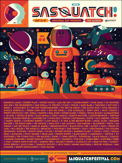
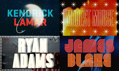
5. Blast Off! After a 2-year hiatus, we are back with our good friends at Sasquatch! Music Festival. We had the pleasure of creating all of the Festival art, merchandise and even the Lineup Video this year. As per usual, the lineup is amazing (Kendrick!) and happens to be going on THIS weekend. We'll have an in-depth look into all of the assets we created (including another collaboration with Ebbets Field Flannels and Theo Chocolate) soon ...
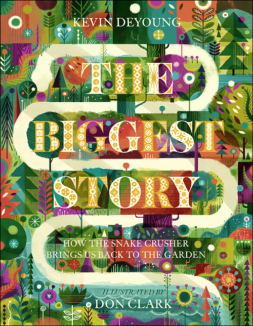
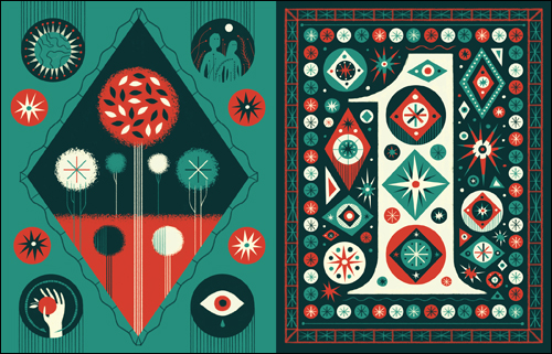
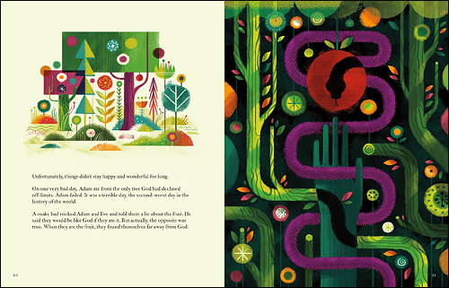
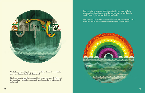
6. The amazing opportunity to illustrate my first Children's Book came up last September. We had gotten book offers in the past, but nothing quite felt right and some of the projects just plain fizzled out. When our friends at Crossway approached me about a Bible Story by Kevin DeYoung, it was a big decision. In the end, It was a project I wanted to personally see done right ... and one that I wanted to see on the shelves myself. The Biggest Story was the most intense project I've worked on to date, and also the most fulfilling - in ways I could never have imagined. I cannot thank Josh Dennis and Crossway enough for allowing me to run with my vision and aesthetic for Kevin's beautifully-written book. The Biggest Story is hardbound, 10 chapters and 132 pages. Available in August and up for pre-order on Amazon now. Below are a few sample spreads from the first two chapters.


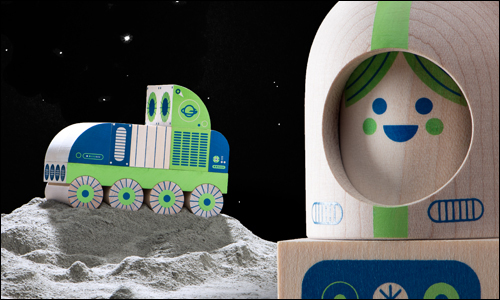
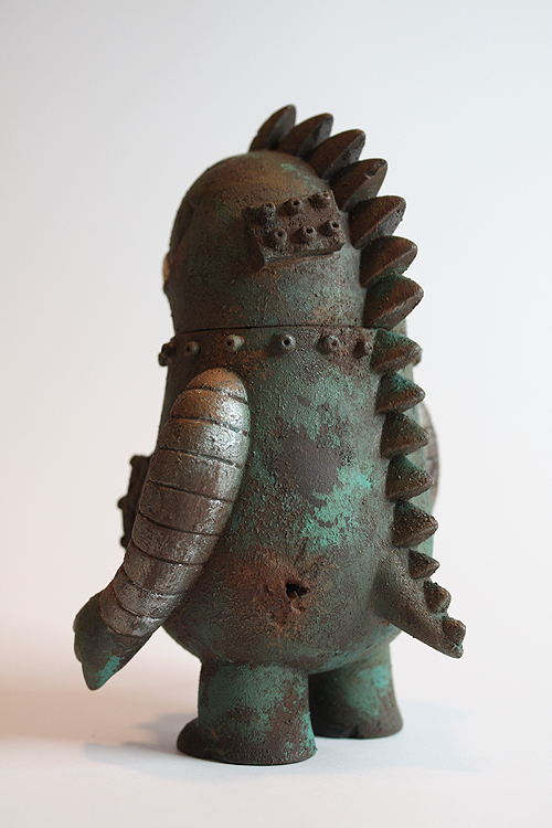
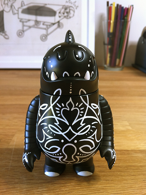
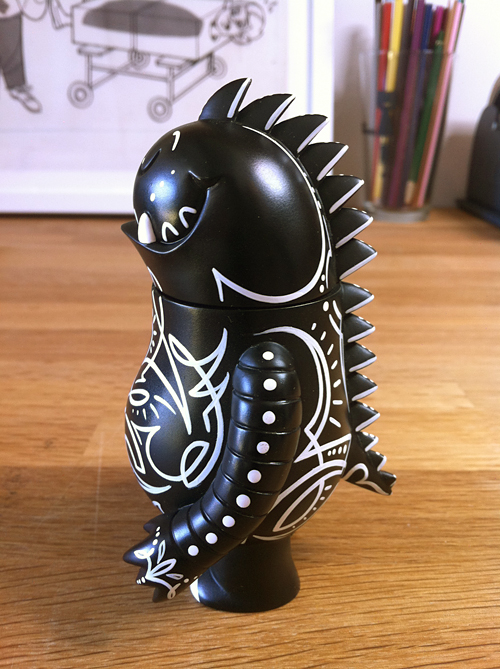
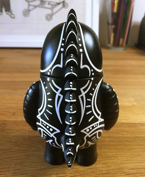
7. Our Odd Galaxy wooden toy line with Uncle Goose is finally in full production mode and will be released in the next few months. There will be 3 products to start: Cosmo Kid, Moon Rover and Lunar Rocket, each sold separately - but of course much more fun when you own all 3. We have some fun OG launch (get it?) projects that will be released around the same time, including a window display at our favorite space store ...
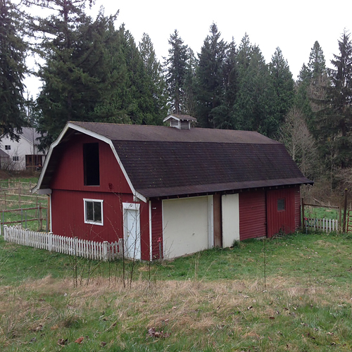
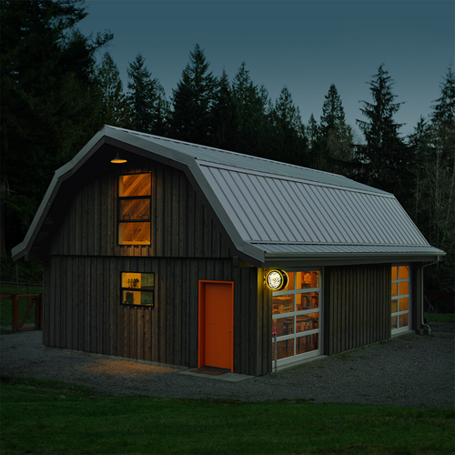
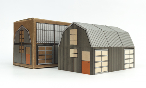
8. Two years ago, we bought a 10-acre ranch, turned a 50-year old barn into our studio and then made a toy out of it. OK, so that's the short version. We'll have a nice process post on this (way over-budget and panic-attack inducing) project on our new ... well, see #10. For now, you can check out some great photos of the shop by Joshua Harding over at Bare Bottle.
9. Last, but not least, we are finally working on a new website. One that we will update. One that will work nicely on your phone thing you carry with you. We promise.
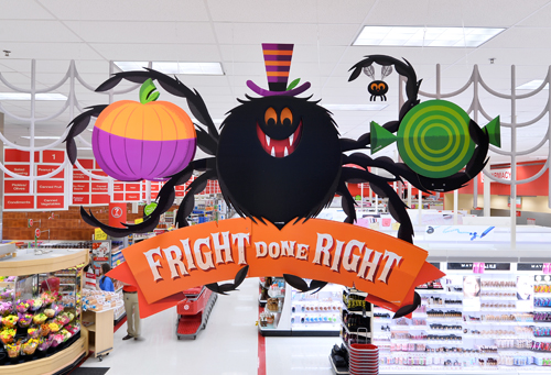
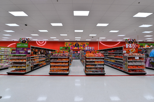
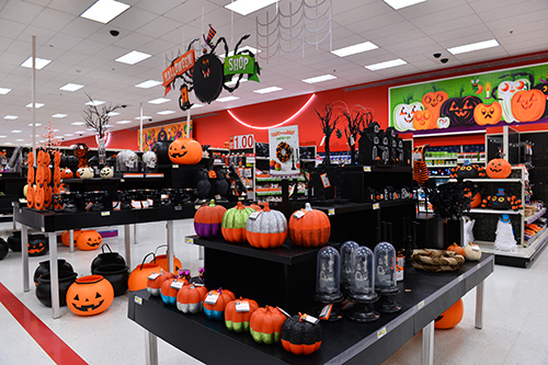
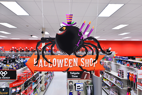
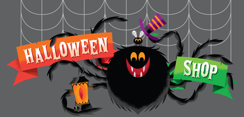
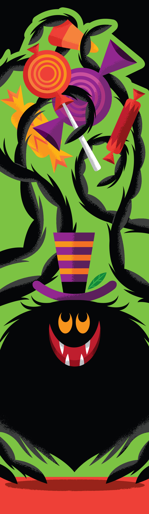
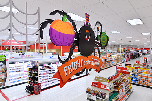
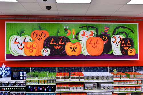
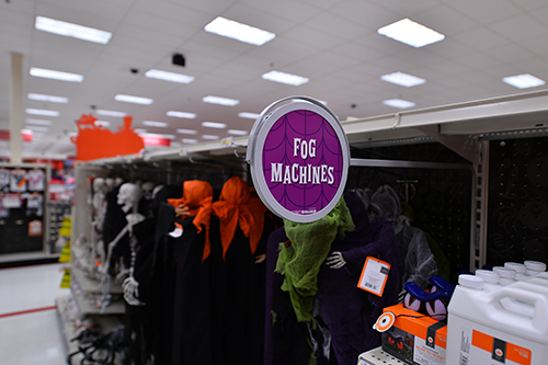
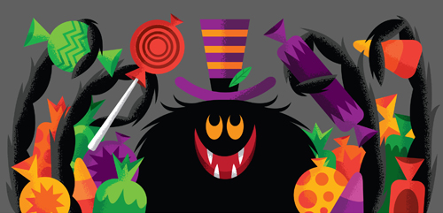
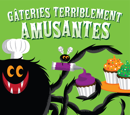
 Trick or treat! We were tasked with an amazing opportunity earlier this year: Designing and illustrating the Halloween seasonal art for our favorite clients over at the
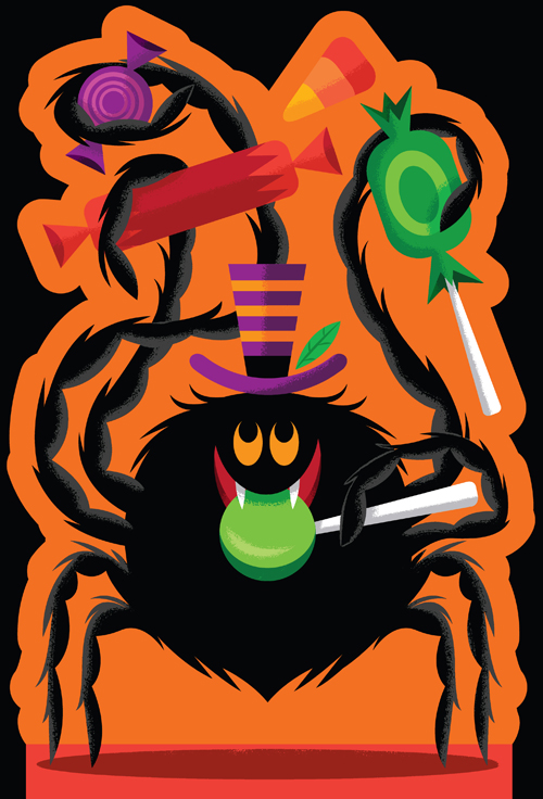


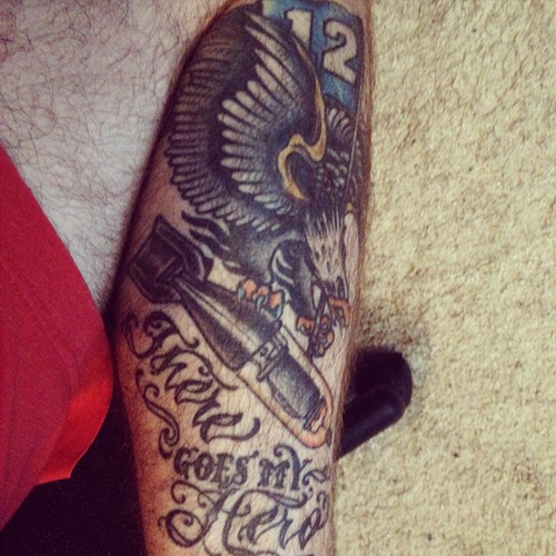
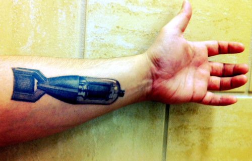
 This past week, my wife and I had the pleasure of celebrating our 10 year anniversary in the land of the rising sun. We visited Tokyo, Kyoto and Osaka, did lots of shopping, lots of walking, took lots of trains, drank a lot of coffee, learned the correct way to say "thank you," and got tattooed. This was also Leroy's first trip back to his birthplace.
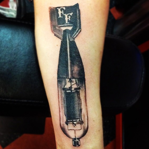
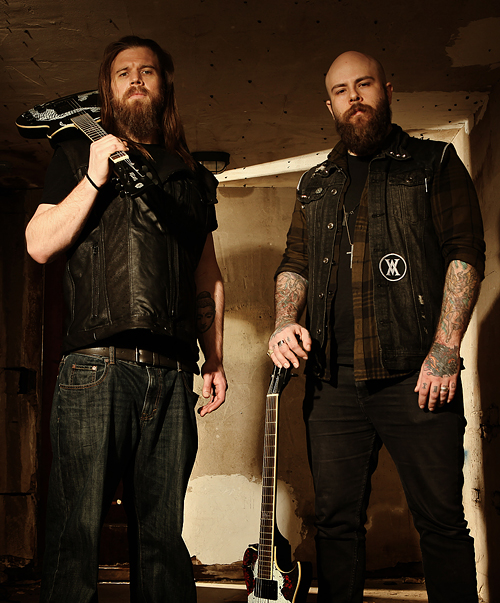 So it's kind of a long story, but when my buddy Vijay, who owns and operates
 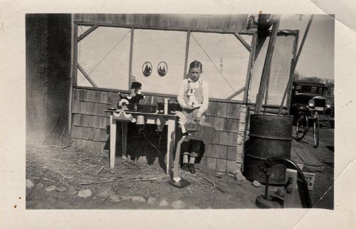 Here's a fun photo of our grandfather, Don Clark (great name, right?) at around 10-12 years old (which should put this at around 1938-1940) with a few home-made wooden toys he had created.
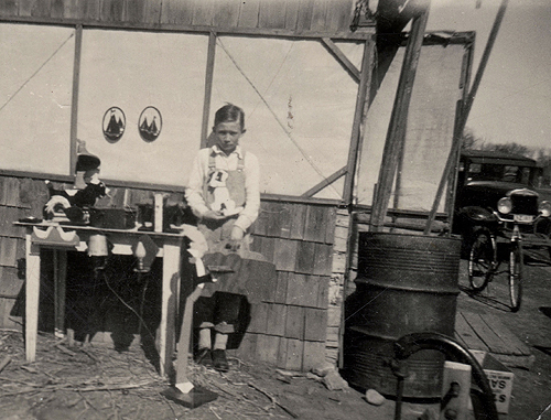
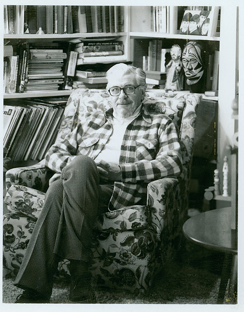 ... Was going through some old files tonight and found this great photo of
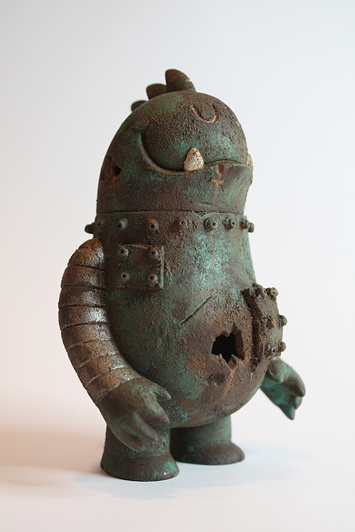

 Hayley Rader sent us this amazing charcoal drawing of Ryan. I thought it was great and had to share. Don't tell my brother.
 In this series I'm going to try my best not to compare apples to oranges. I understand there are vast differences in technology, ideology, legality, etc between designs of the past and designs of the present. However, I believe there was, is, and will always be a way to almost objectively design something properly. To me, this means a design that is well executed, aesthetically pleasing and properly communicative... in relation to whatever is being "sold."
 Well, thanks to you guys - our
 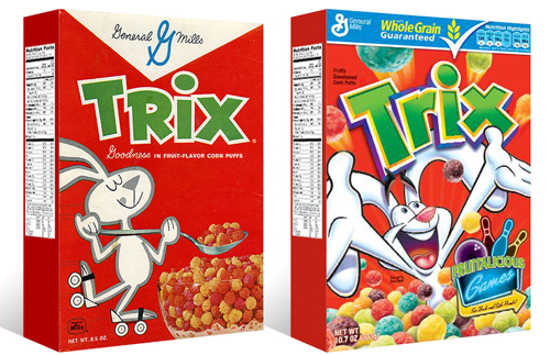 I had the idea a while back to post about the perils of modern design, specifically in regard to rebranding, the evolution of a particular design and things of that nature. I've decided to finally pull the trigger and go for it. As my brother has begun posting a series dedicated to our grandfather, I thought this might be the right time. After all... the time period in which our grandfather was designing will often be the era in which my postings will refer to.
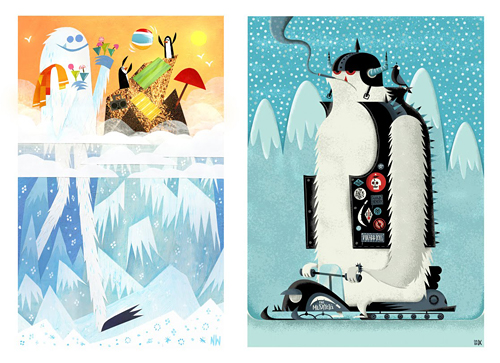 I first met
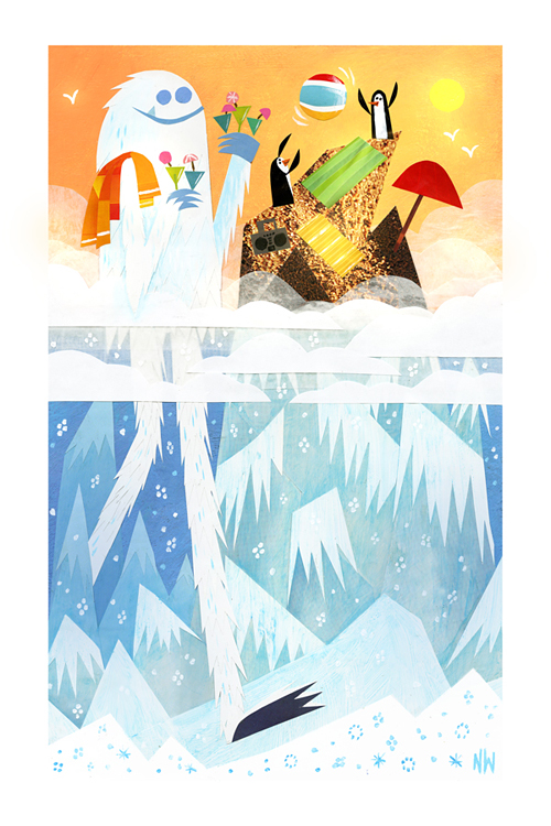
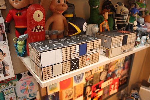 Charles and Ray just moved in. Thanks