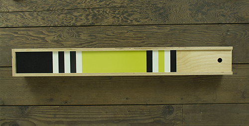
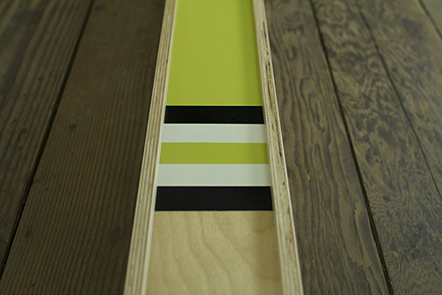
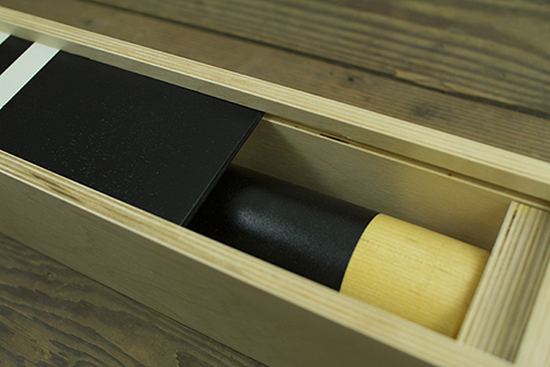
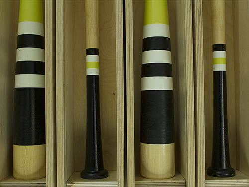
It's been busy here at IC, to say the least, and we haven't been updating the blog as often as we'd like. To make up for lost time, here are a handful of new albums we've been working on over the past 6 months. Enjoy.

WovenWar
I've been friends with these guys ever since we toured together in 2010, but never had the chance to work with them on a design level. I couldn't be more pleased with how smoothly everything went. We knew we wanted a cover image that centered around an icon, and the WW mark is something that came to mind instantly after our first conversation. As always, I loved working in simple black and white. Each image is comprised of abstract painted shapes to convey a ink-blot/rorschach vibe. Pre-order the physical package here.
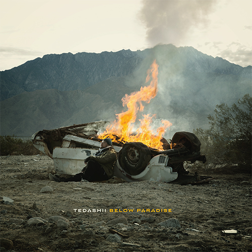
Tedashii Below Paradise
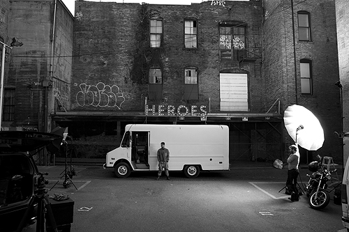
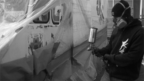
Taking a page from the late, great Storm Thorgerson book of "doing it for real," we ventured out into the high desert of Southern California in early 2014 to create this album cover. Caleb Kuhl did a killer job on the photos, Neil Visel was particularly handy with the forklift, and I put too much lighter fluid on the car and we had to call the fire department. Apparently they saw the smoke from a neighboring county. Oops. Grab the physical album here.
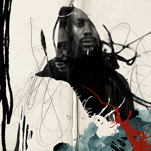
Propaganda Crimson Cord
Our pal Prop gave us free reign on his (amazing) new album - we wanted the packaging concept to feel as organic and layered as his music. What may look like paint drips and splatters are (mostly) images of his iconic dreadlocks. Our goal was to blend his soul into the art as much as possible - which was inspired by the album title and album concept. Grab the physical album here.
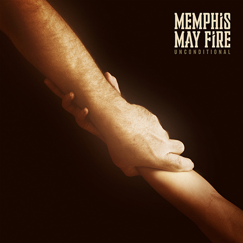
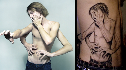
Memphis May Fire Unconditional
The guys in MMF came to me with this concept, which I thought was great - that of the bond between father and child. Since my dad happened to be coming to town around this time, I thought it would be a great opportunity to photograph his arm for this cover... and I was able to talk one of my brother's children into giving us a "hand" as well. Grab the physical album here.

The Atlas Moth The Old Believer
I’ve always enjoyed creating imagery that is “more than meets the eye.” I also love concepts that allow for some real hands-on interaction. Ideas like this have kept music packaging exciting for me through the years. When The Atlas Moth came to me with a concept that would change the cover image when wet, I thought there was no way we'd get the necessary approval to make it happen. Thanks to the folks at Profound Lore, who, in rare fashion, believe in going the extra mile in the name of artistic endeavor, this amazing idea is something you can now hold (and drench) for yourself. Above are both "before" and "after" versions of the cover. Grab the physical album here.
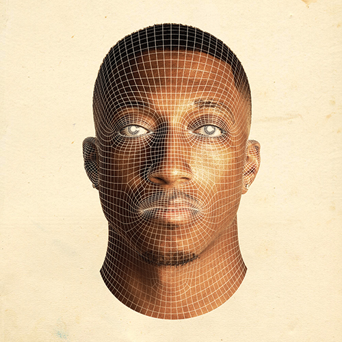
Lecrae Anomaly
One of our favorite clients, Lecrae (and his label - Reach Records), asked us to work on the follow-up to his last album Gravity, which we had the pleasure of working on in 2012. We enlisted the help of our friends at Shinbone Creative to create Crae's likeness in 3D wireframe (spot gloss varnish!) form for the cover. The physical packaging will def. be worth checking out. Pre-order that here.

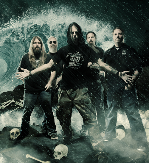
Killer Be Killed
Working with an entire band of metal visionaries isn't something I get to do every day. Needless to say, I jumped at the chance. The aesthetic that we really bonded over, and seemed fitting for this project, was that of crusty, gritty, photocopied punk. The real fringe - Discharge, Man Is The Bastard, Doom, Crass, etc. It was a blast getting to work in a style that I love, for awesome guys that totally get it. Grab the physical album here.


Grieves Winter & The Wolves
Another album cover that's more than meets the eye. We worked with Grieves to create something really special for 2011's Together/Apart, and we knew we wanted to do something amazing for this record as well. The actual cover (top image here) features a die cut hole right in the center, where a standing Grieves shows through. When the cover is opened, we see that he's surrounded by wolves. Careful out there, buddy. Grab the physical album here.
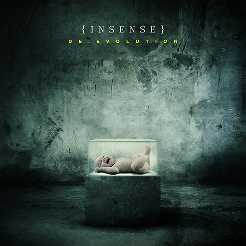
Insense De:Evolution
I had the pleasure of touring with these guys in Europe during the spring of 2012. We spoke a bit on the road about working together for the artwork on their new record, and I'm stoked that we were able to make it happen. Not to worry - no babies were harmed in the making of this cover. Grab the physical album here.


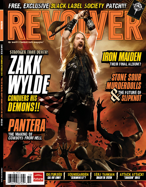
 Here's our cover for
  Check out the cover we just wrapped up for

 Check out our new post over at
 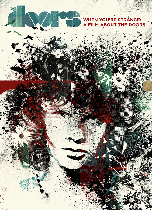 Here is a cover that we did for a documentary about
  Here's the cover for
  Just finishing up the artwork for new
 Here is our cover for Unconsecrated, the new album from Australia's
 Stunning Adobe Photography Shop work by