Long before music and design (and almost everything else), there was ... baseball.
In the eighties it was our hometown pride and joy - The Bend Bucks - who would later become the Portland Rockies. The Bucks were a single A farm club for the (now) Anaheim Angels. We'd love to hit the games with Dad and grab autographs from the retired major leaguers who were acting coaches for the team. $5 tickets and cheap popcorn didn't hurt either.
Between Bucks games, the best movie ever created, our own little league games (where I told all my teammates that I was related to this guy), watching the Braves (lose) every waking moment on TBS and our unhealthy addiction to baseball cards (wish we still had this), there was time for little else. In 1989, our family moved to Sacramento and our love of the game got even stronger - thanks to the Giants and these guys across the bay. RIP Candlestick Park.
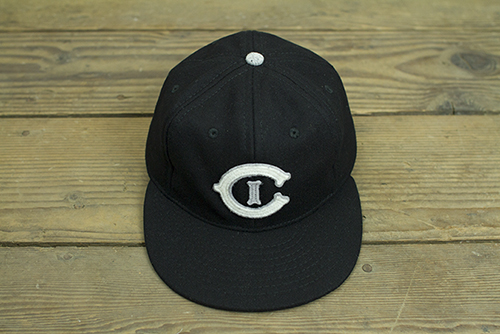
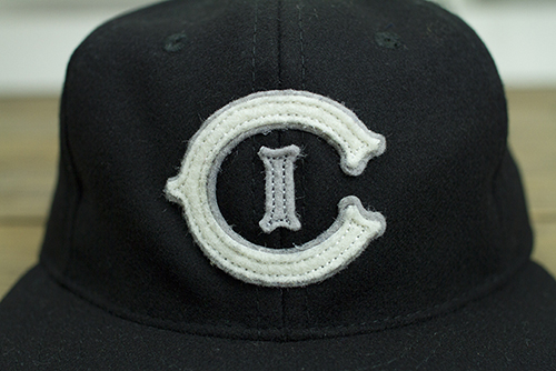
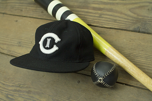
Fast forward 25 years later. After visiting the beautiful new Ebbets Field Flannels storefront in Seattle a few months back, we came up with a crazy idea to fuse a few of our old passions into one: Baseball, art and ... people. People who are making really cool things in the world of baseball - and beyond. We even commissioned our Humble Beast bros in Portland to create some knickerbocker-era music to bring it all together. After coming up with a dream team list (and it was hard to stop at 6), we had our roster.
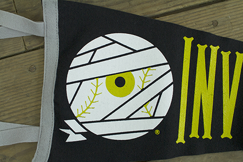
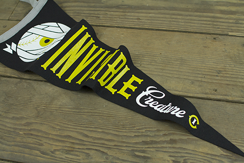
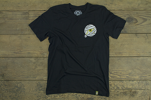
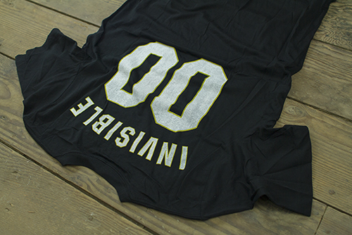
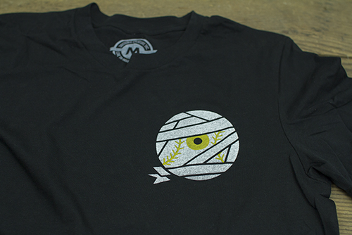
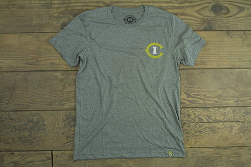
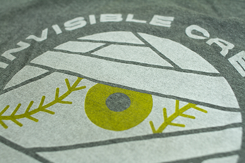
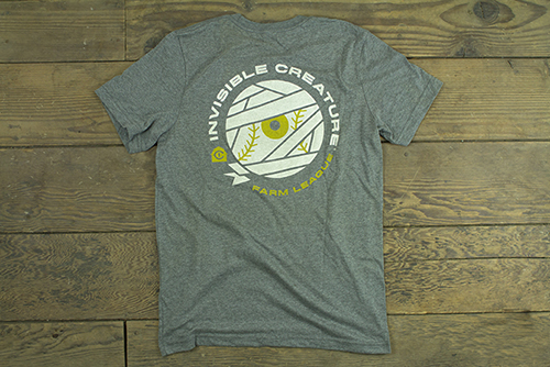
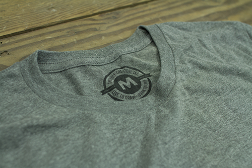
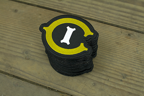
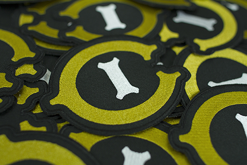
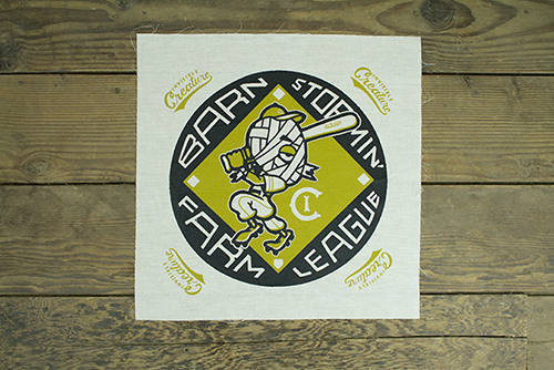
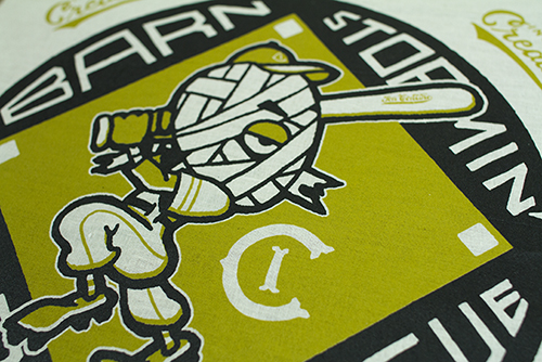
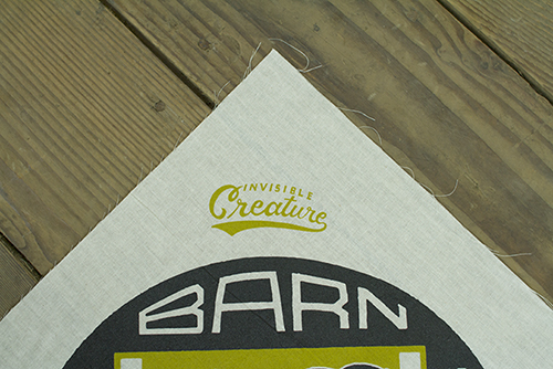
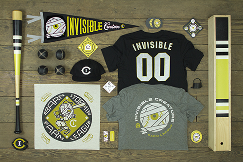
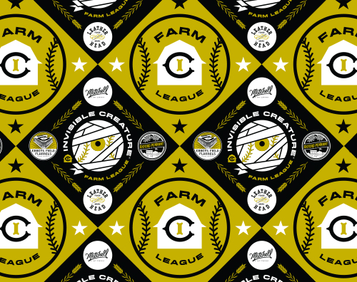
Enter: Invisible Creature Farm League.
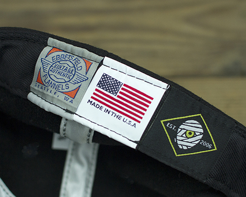
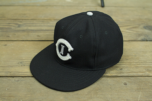
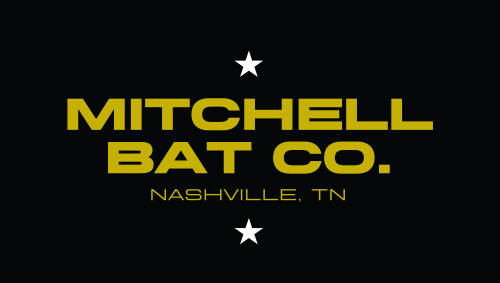
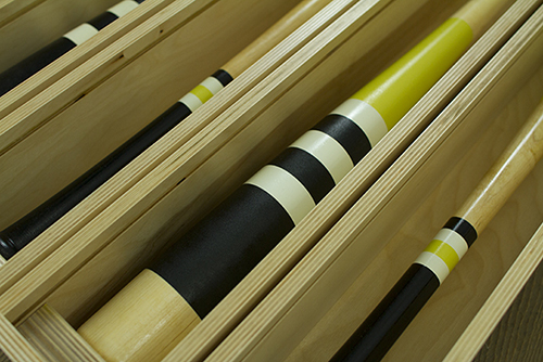
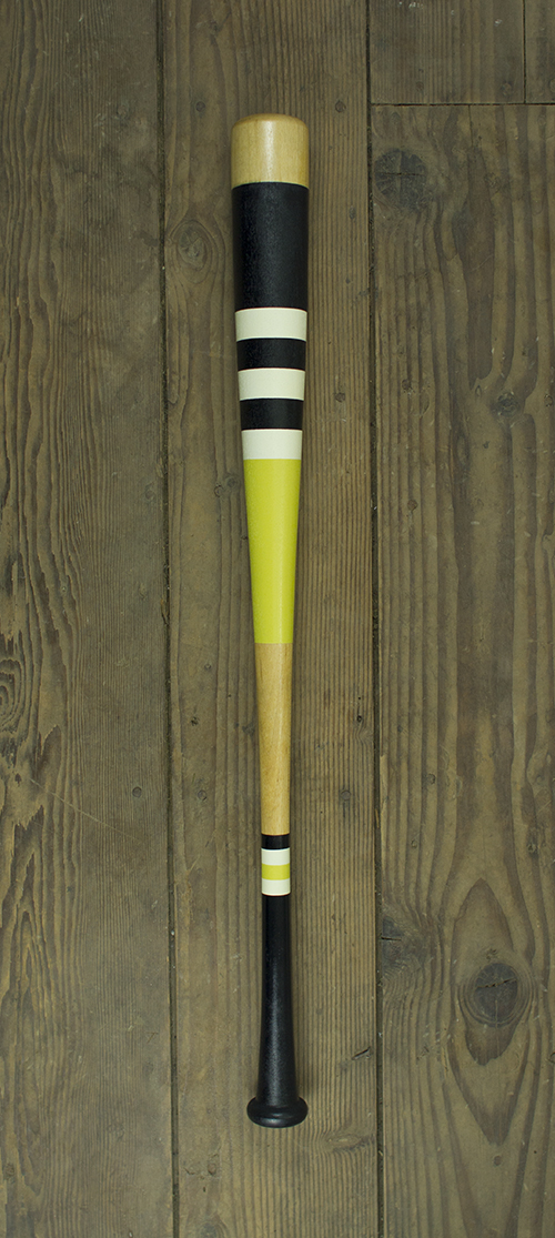
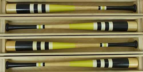
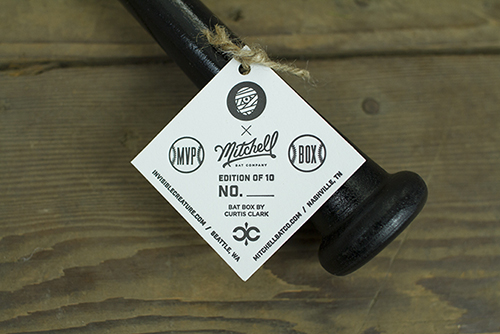
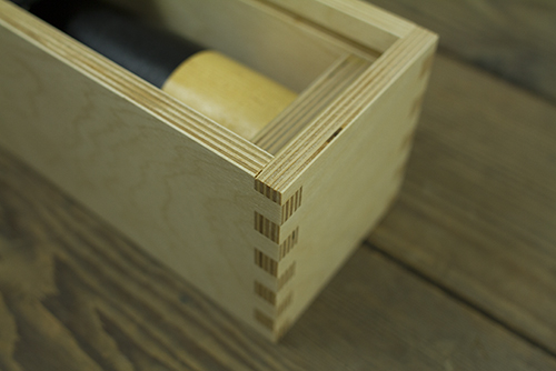
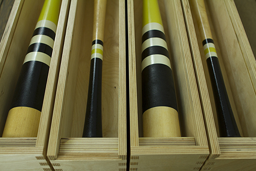
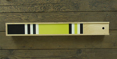
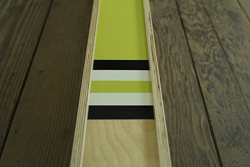
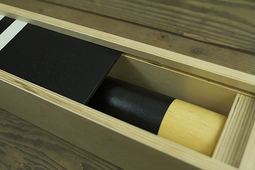
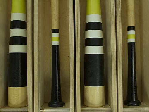
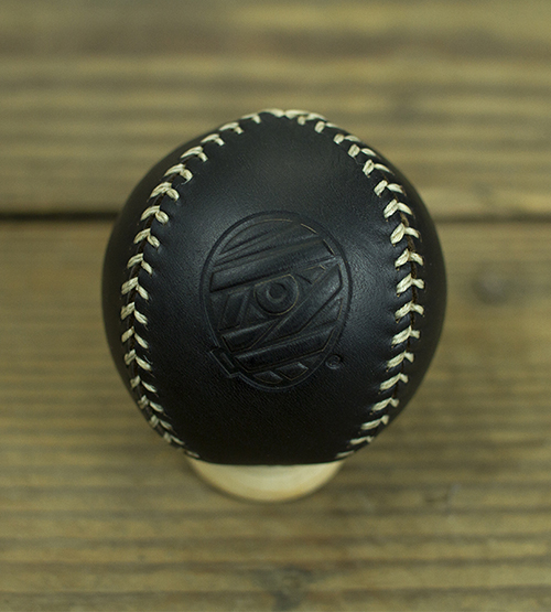
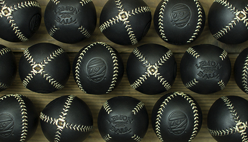
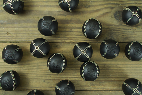
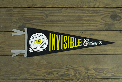
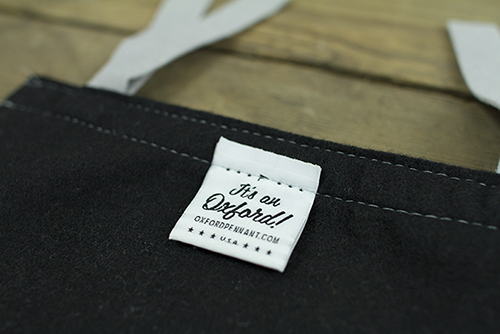
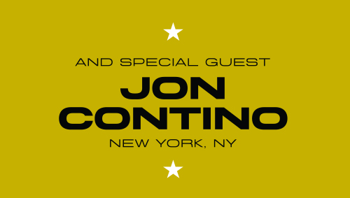
We've partnered with Ebbets Field Flannels from Seattle, Mitchell Bat Co. from Nashville, Leather Head Sports from New Jersey, Oxford Pennant from New York, Curtis Clark Woodworks (or, Dad) from California and the uber-talented and undisputed aesthetic king of baseball himself, Jon Contino from New York to bring you IC inspired game gear for your closet, wall, shelf, desk ... and even the field.
Have a look around our rookie season and click some stuff. A HUGE thanks to all of our collaborators for an amazing experience. We hope you enjoy ...


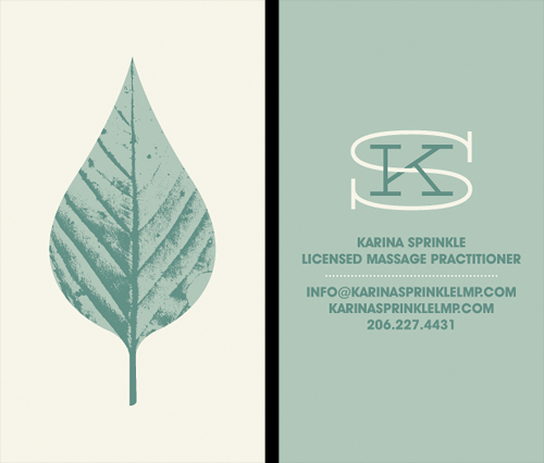 Our longtime friend, Karina Sprinkle, asked us to create the identity for her new massage practice. The idea was to convey a sense of calmness and peace, but steer away from typical massage related imagery (hands, Papyrus font). The leaf seemed like an appropriate direction, given their often medicinal qualities, and it also gives a little love to the great PNW. Here's a look at the business card.
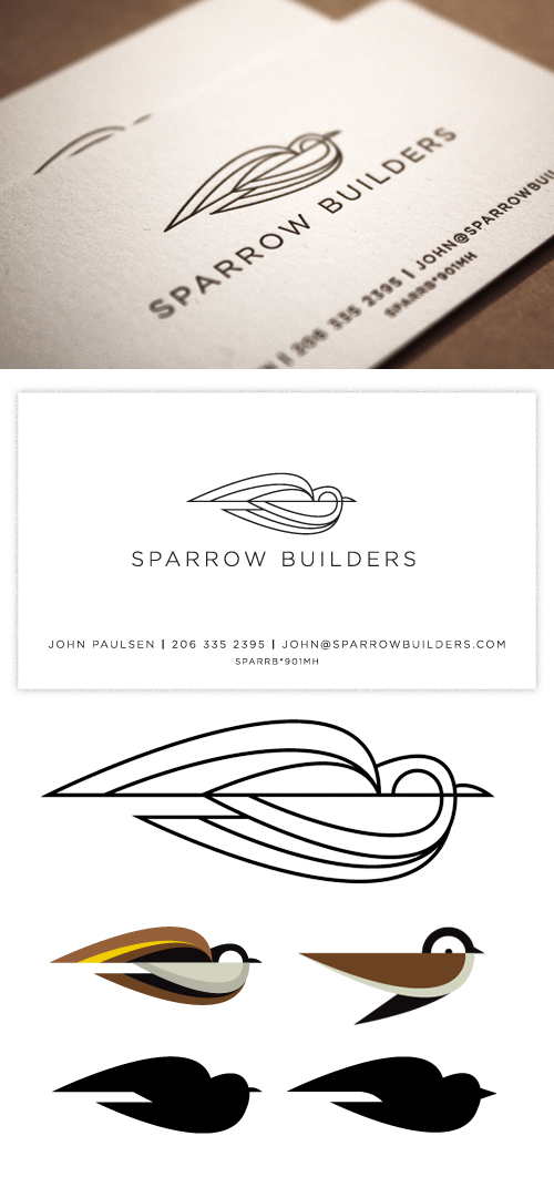 We recently just wrapped a fun logo/business card project for