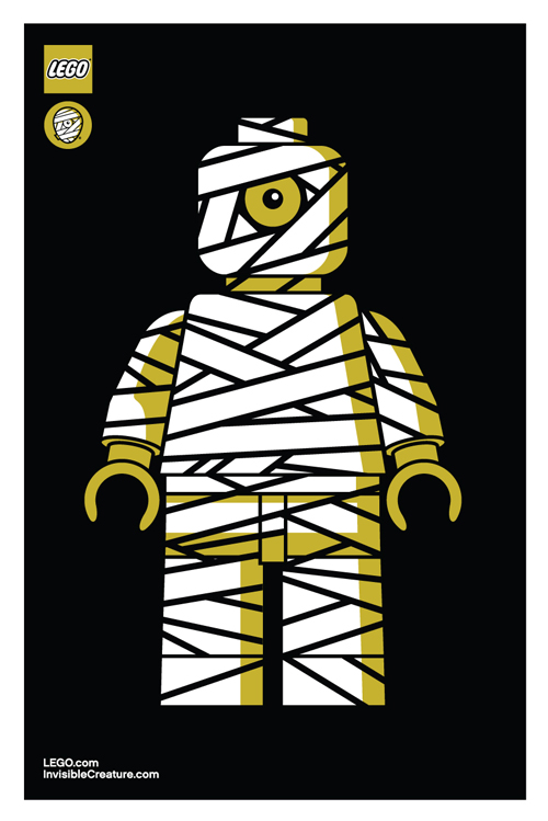
 As we enter into our seventh year here at IC, we've decided to give our iconic mummy mark an upgrade.
The reenvisioning of our logomark is something we have been considering for some time. With a consciousness for particularly small uses (social media icons, products, packaging, clothing tags, etc.) we sought out for a bold, timeless mark that stands strong in every possible scenario. With a handful of new projects/products on the horizon, we decided that now is the time.

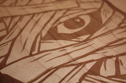
The original mark I created in 2006 was inspired by skateboard graphics and other pop art from our coming of age. Although it feels somewhat classic in its own right, the detailed style has proved to be limiting over the years.

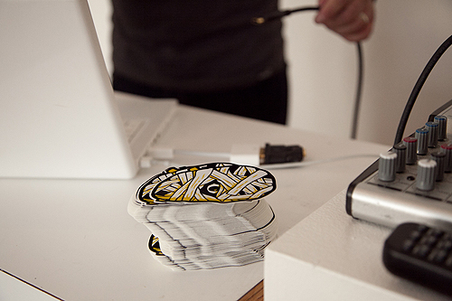
Our goal was to create a simpler, more streamlined version of our classic "cyclops mummy," keeping its overall concept (and hopefully its recognizability) in tact, but modernized and with a broader range of usability.
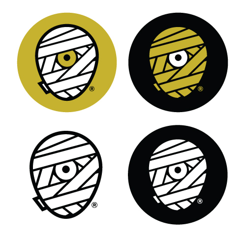
We explored a variety of shapes for the head itself - a perfect circle, a rectangle with rounded corners, etc. In the end, it was imperative that it truly convey a head shape, so we landed on what we refer to as the "egg."
Aside from the logo's core theme, we also knew we'd be sticking with our classic color scheme. It feels as integral to our brand as the mark itself, and allows us to maintain our focus. Another benefit of this new mark is our ability to explore varying combinations of these colors depending on its use. The solid white or yellow wrap will be the primary marks, while the shaded versions - with white highlights on the yellow wrap, and yellow lowlights on the white wrap, give us more detailed options as well.
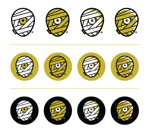
A minor but important detail was the small piece of wrap peeking around the backside of the mummy head. It's a subtle inclusion, but it truly helps the read. It was necessary that this piece be included, but without jeopardizing the true center of the new mark.
You'll also notice the inclusion of an ® mark. With the recent registration of our brand name and identity, it's time to make it official.
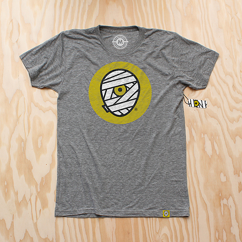
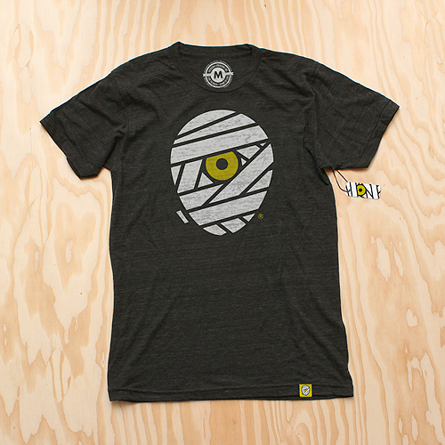
And of course, we celebrate this momentous occasion with some swag. New T-Shirts are available for pre-order (shipping mid-late September) as well as new silk-screened die-cut stickers.
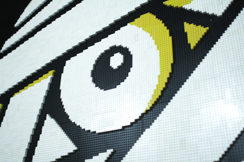
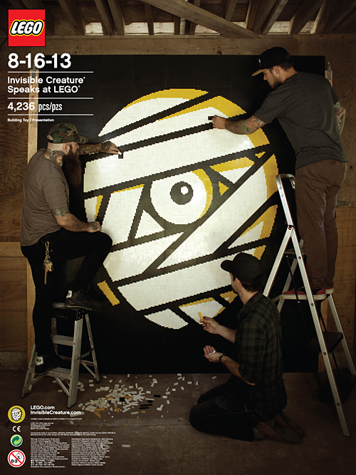 We had the great privilege and honor of speaking at LEGO's internal Design Camp last week - a day away from the office for the creative team in beautiful Enfield, Connecticut. Scott Decoteau, along with the talented and generous crew at LEGO, were gracious hosts during our time in New England. Highlights of the trip included the LEGO HQ tour (wow), dangerously delicious indian food, bowling and sharing sentimental stories about the infamous drawstring denim LEGO bag.
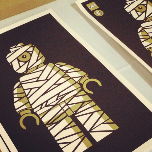


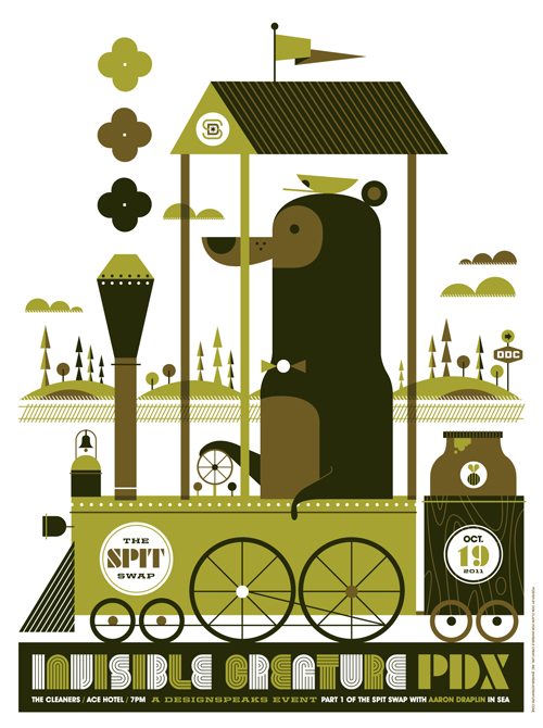 We'll have 100 of these 3-color silk-screened posters for sale at our
  It's 100% official and tickets are now
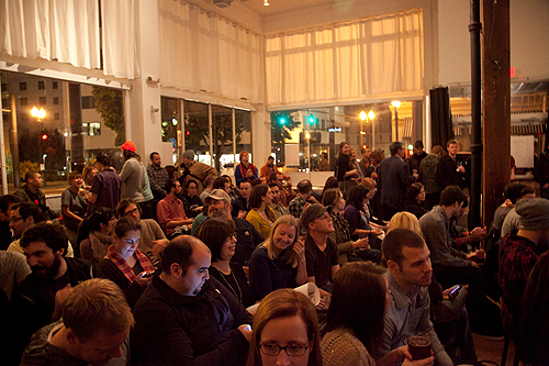
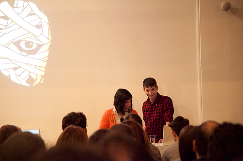
 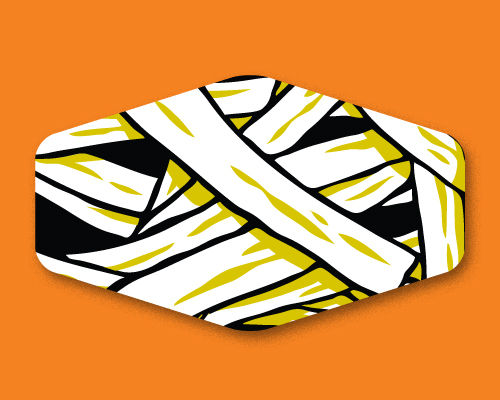 Something awesome is unraveling. IC vs.
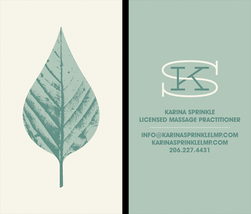 Our longtime friend, Karina Sprinkle, asked us to create the identity for her new massage practice. The idea was to convey a sense of calmness and peace, but steer away from typical massage related imagery (hands, Papyrus font). The leaf seemed like an appropriate direction, given their often medicinal qualities, and it also gives a little love to the great PNW. Here's a look at the business card.
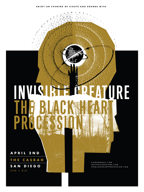 Last year, our buddy
 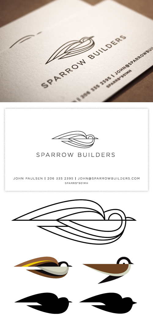 We recently just wrapped a fun logo/business card project for