 I had the pleasure of answering a few questions for Meghan over at The Creative Unconscious. Thanks for the opportunity Meghan!
Filtering by Category: IC Feature,New Store Goodies
Our new polytwill snapbacks are finally here! Grab 'em while you can.
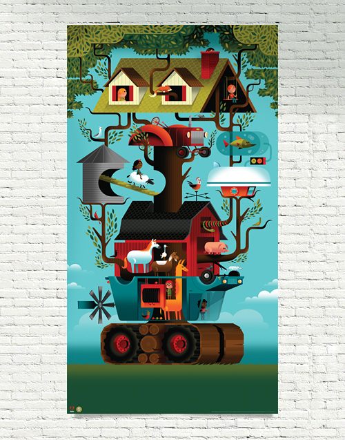
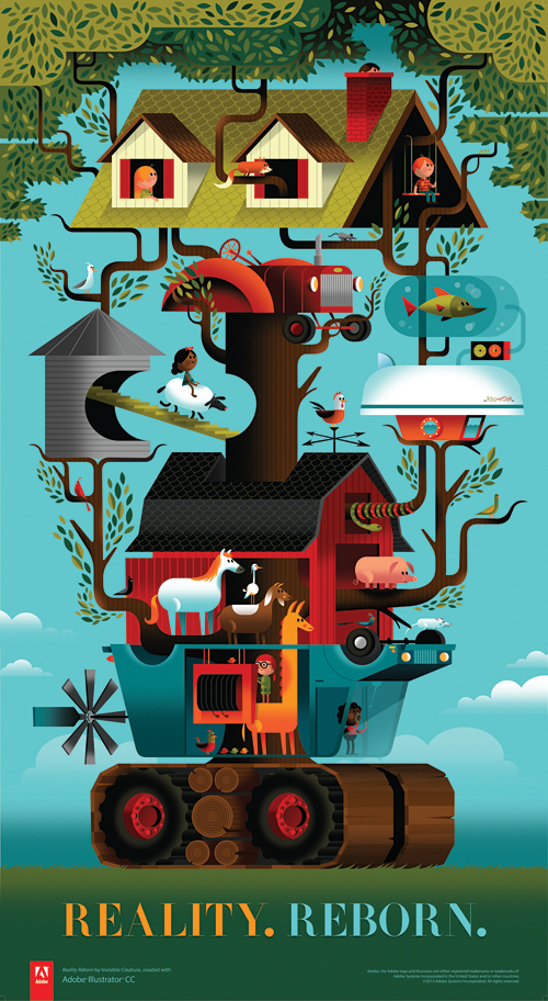 Last year we received a call from our favorite software company, asking us if we'd like to preview the soon-to-be-released Illustrator CC. The one caveat was that we had to create whatever we wanted and document how we did it. Our answer? A resounding 'Awesome!' and "Uh-oh, what are we going to create?" There were no guidelines, save for a few key words: Modern, fearless and reborn. Adobe's theme for the new release.
Since we had just recently bought a farm outside of the city, we were in the thick of having our normal lives turned upside down - yet at the same time, we were having a blast with our new lifestyle. 'Reality. Reborn.' is inspired by that personal transition ... blended together nicely with the amazing new features of Illustrator CC and Adobe's willingness to give us carte blanche on creative direction.
We've been using Adobe's products for almost 20 years now and rely extensively on their tools to create our projects. Huge thanks to Terry Hemphill and the Adobe team for asking us to do this. We had a lot of fun with CC's great new features.
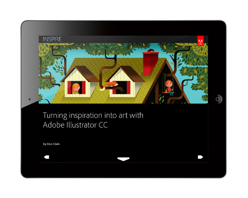
Without further ado, download Adobe's awesome iPad magazine, Inspire to check it all out - or read it online. And to top it all off, grab the mega-huge uber-limited 25" x 46" poster in our shop now.
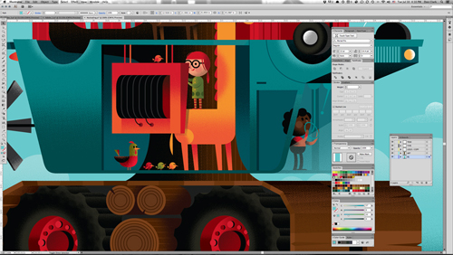
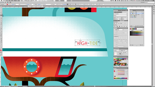
Read about how we went from sketch phase to final color blocking ... and how our process always evolves as we work.
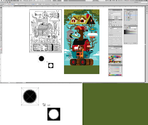
One of the coolest new features in CC is the Multiple File Place tool, allowing you to adjust the size of your file before dropping them on the artboard.
CC's new Touch Type tool is especially great as well, allowing you to manipulate and edit individual characters without creating outlines.
Those are just 2 of my favorite new features. Read about the rest. A few details below:


... and pick up the giant 25" x 46" poster in the shop now for only $40.
 It's an absolute honor to be interviewed by The Great Discontent. Cozy up with that brand new iPad from Grandma and have a read. Merry Christmas and Happy New Year!
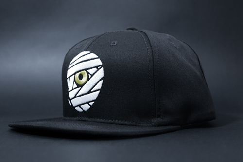
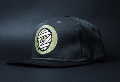
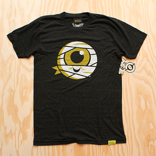
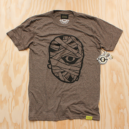
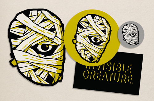
 As we enter into our seventh year here at IC, we've decided to give our iconic mummy mark an upgrade.
The reenvisioning of our logomark is something we have been considering for some time. With a consciousness for particularly small uses (social media icons, products, packaging, clothing tags, etc.) we sought out for a bold, timeless mark that stands strong in every possible scenario. With a handful of new projects/products on the horizon, we decided that now is the time.

The original mark I created in 2006 was inspired by skateboard graphics and other pop art from our coming of age. Although it feels somewhat classic in its own right, the detailed style has proved to be limiting over the years.

Our goal was to create a simpler, more streamlined version of our classic "cyclops mummy," keeping its overall concept (and hopefully its recognizability) in tact, but modernized and with a broader range of usability.
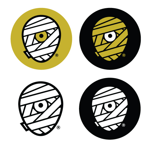
We explored a variety of shapes for the head itself - a perfect circle, a rectangle with rounded corners, etc. In the end, it was imperative that it truly convey a head shape, so we landed on what we refer to as the "egg."
Aside from the logo's core theme, we also knew we'd be sticking with our classic color scheme. It feels as integral to our brand as the mark itself, and allows us to maintain our focus. Another benefit of this new mark is our ability to explore varying combinations of these colors depending on its use. The solid white or yellow wrap will be the primary marks, while the shaded versions - with white highlights on the yellow wrap, and yellow lowlights on the white wrap, give us more detailed options as well.
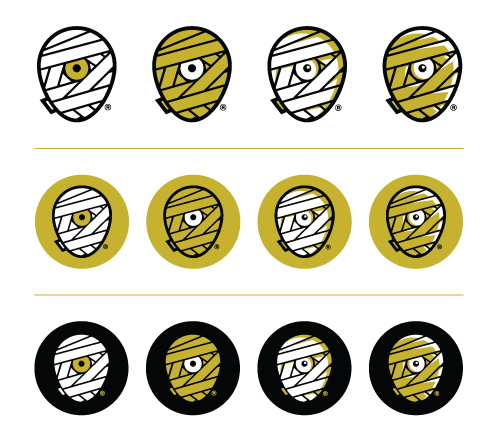
A minor but important detail was the small piece of wrap peeking around the backside of the mummy head. It's a subtle inclusion, but it truly helps the read. It was necessary that this piece be included, but without jeopardizing the true center of the new mark.
You'll also notice the inclusion of an ® mark. With the recent registration of our brand name and identity, it's time to make it official.
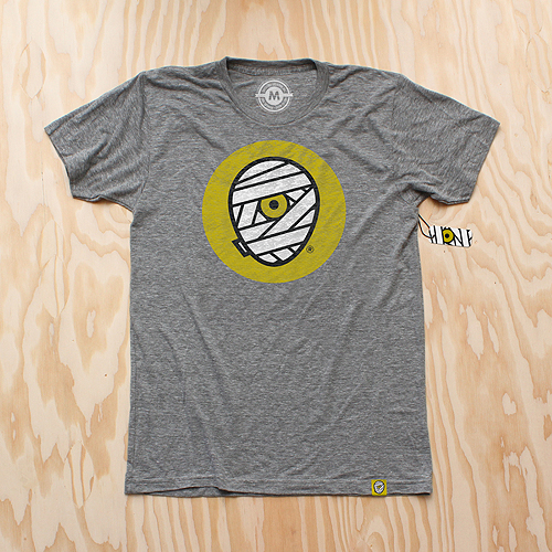
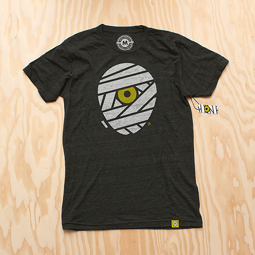
And of course, we celebrate this momentous occasion with some swag. New T-Shirts are available for pre-order (shipping mid-late September) as well as new silk-screened die-cut stickers.
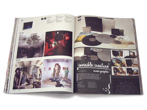
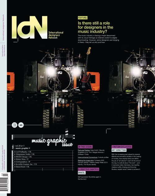 Is there still a role for designers in the music industry? We're honored to be amongst 7 studios interviewed and featured in IdN's Music Graphic issue.
Recorded music has always been packaged, from the very earliest days when wax cylinders came in cardboard tubes, and has therefore always involved designers. In the palmy days of vinyl LPs with sometimes stunning cover art and often erudite liner notes, the presentation was almost as important as the product.
But with the industry morphing so rapidly into the field of digital-download delivery, where do the graphics come in now? This is a burning question for all those working in the area of visually representing music. To see what their answers are, read this feature story, which solicits the views of seven specialist music designers.
Featuring: Telegramme Studio | Invisible Creature, Inc. | IWant Design | Daniel Reed | Matteo Meta | Leif Podhajsky | Giottographica
// Grab a copy here.
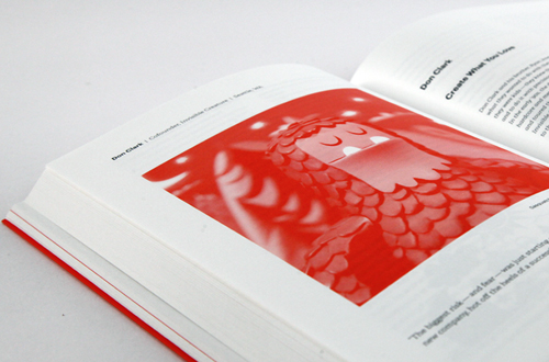
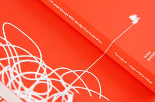
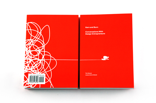 We're honored to be part of the fantastic new book Kern and Burn: Conversations With Design Entrepreneurs curated by Tim Hoover and Jessica Karle Heltzel. Featuring Aaron Draplin, Heads Of State, Arman Vit and many others.
'Kern and Burn: Conversations With Design Entrepreneurs' is a beautiful two-color book that features candid conversations with 30 leading designers who have founded startups, channeled personal passions into self-made careers and taken risks to do what they love. In this book they share their failures, successes, and perspectives. Our hope is that you can learn from them — not to follow in their footsteps, but to chart your own course in parallel, one that allows you to thrive, add value to the world and love what you do.
The entire Kern and Burn project was brought to life by a successful Kickstarter campaign, but here's where it all started. Tim and Jessica's spirit and passion for this book is an inspiration, pick up a copy if you can!

 To commemorate Demon Hunter's ten years, we've created a silkscreen poster featuring imagery from all six studio albums. This is a limited pressing of 100, signed by Ryan Clark (me), and is available in the store now. Order by December 20th for holiday arrival! (orders for this poster do NOT include IC Holiday Giveaway print)
 As we celebrate IC's 6 year anniversary, we are thankful for 2012 (our bestest year yet!) and the amazing projects we've had the pleasure of working on. So we thought we'd spread the joy a little by creating "The Lookout", a sequel (of sorts) to 2010's Snowballer print. With every purchase over $25, we'll be sending out a signed 11" x 14" giclee print until December 20th, which also happens to be our last day of shipping before Christmas.
Special note - International orders: Due to shipping costs, we are only able to send "The Lookout" with poster and print orders. Offer doesn't apply to T-shirt or toy orders. Sorry!
We'll have the set of 2 available to purchase after the holidays. Go in peace!
 Honored to be featured in Print's 2012 Regional Design Annual. Gigantic thanks goes to our favorite clients over at Target inHouse.
 Back To School? Naw, forget that. It's an endless summer. Soft inks printed on American Apparel Tri-Blend T's. Ships on or before September 18th. Grab them all here.
Spirit Of '77 printed on Tri-Indigo Blue.
Mummy Jr. printed on Tri-Black.
Leroy's Boy printed on Athletic Gray.
Respect printed on Tri-Black.
Mummy Classic printed on Tri-Coffee.
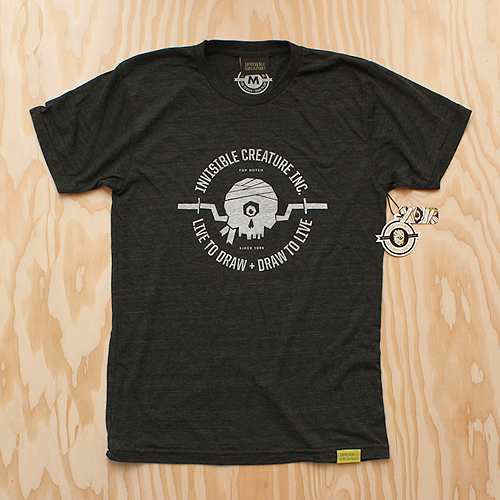
Live To Draw printed on Tri-Black.
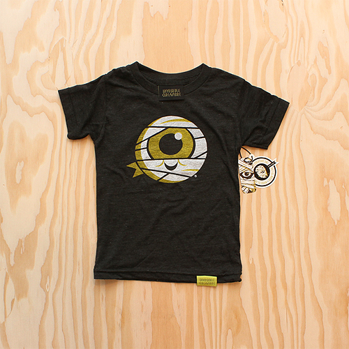
Mummy Jr. (Kids Sizes!) printed on Tri-Black.
 Our gracious friends over at
 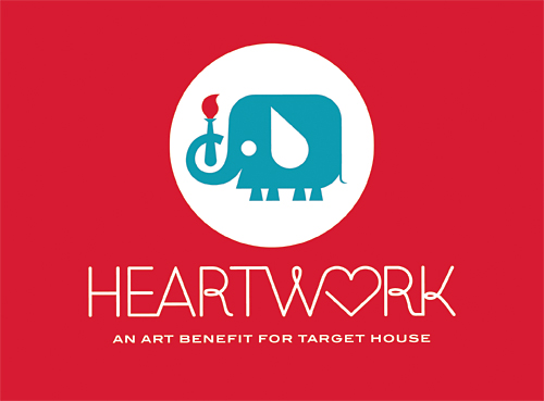 We're extremely excited to launch Heartwork 2012. Featuring limited prints by Lab Partners, Jessica Hische, Julia Rothman, Aesthetic Apparatus, Nate Wragg, Gina Triplett, Meg Hunt, Jason Munn & IC. Each edition is extremely limited (only 10 prints available from each artist) so grab they while you can.
We’re honored to be part of this project and thankful for everyone who donated their time and talent.
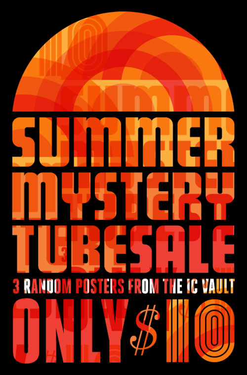 Scratch & dent. Overstock. Printing errors. Old posters. We got 'em and we need to get rid of 'em. For the remainder of the summer (or until we run out of stock) we'll be stuffing tubes full of posters and prints for a measly $10. Unfortunately we can't list which posters and prints we'll be including in the sale as we just have so many to choose from. Most have slight blemishes or some sort of minor printing error, while others have just been sitting on the shelves for awhile.
The risk? You may just hate every band listed on the posters your receive. The payoff? Your walls aren't that picky. Act now!
 Now sticking/shipping.
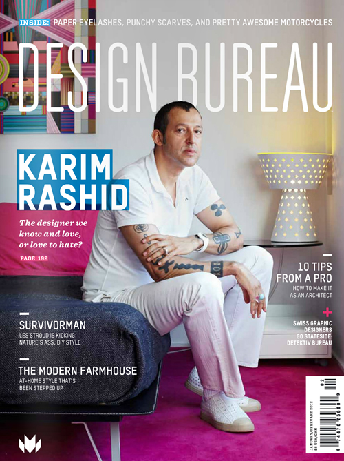 Design Bureau Magazine asks us a few questions in their latest issue. Featuring K-Rash like a boss on the cover.
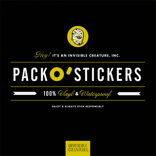
 Ruin your mom's van. Assorted vinyl IC stickers finally added to the shop.
 Ahhh, the first day of pre-school. Today was a biggie for my son - definitely a few tears. Continuing tradition, here's a quick drawing I stuffed in his lunchbox to ease his first day jitters. Also in the shop for $12.
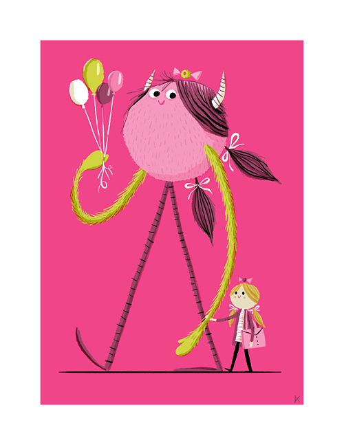 Time flies. Today is my little girl's first day of first grade. Just like last year, I decided to make her a quick treat for her lunchbox. Many of you asked for prints last time, so we added an 8.5" x 11" print to the shop for $12. All proceeds benefit her lunch fund ... and I'm happy to report that there were less tears this year ...
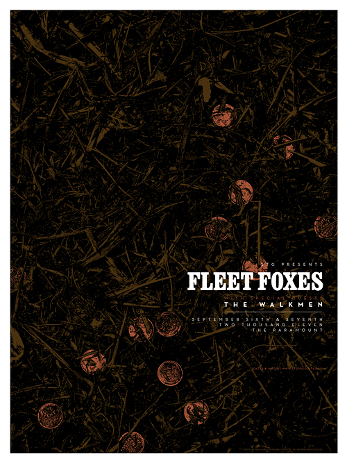 Here's a glimpse at our poster for 2 upcoming Fleet Foxes shows here in Seattle. The concept comes from a song called "The Shrine" (from their latest record, Helplessness Blues) where the lyrics speak of an old dried-up fountain filled with forgotten pennies. In this case, the pennies are actually metallic copper ink. In the store soon!