Long before music and design (and almost everything else), there was ... baseball.
In the eighties it was our hometown pride and joy - The Bend Bucks - who would later become the Portland Rockies. The Bucks were a single A farm club for the (now) Anaheim Angels. We'd love to hit the games with Dad and grab autographs from the retired major leaguers who were acting coaches for the team. $5 tickets and cheap popcorn didn't hurt either.
Between Bucks games, the best movie ever created, our own little league games (where I told all my teammates that I was related to this guy), watching the Braves (lose) every waking moment on TBS and our unhealthy addiction to baseball cards (wish we still had this), there was time for little else. In 1989, our family moved to Sacramento and our love of the game got even stronger - thanks to the Giants and these guys across the bay. RIP Candlestick Park.
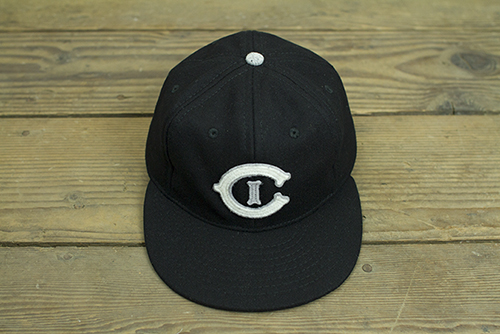
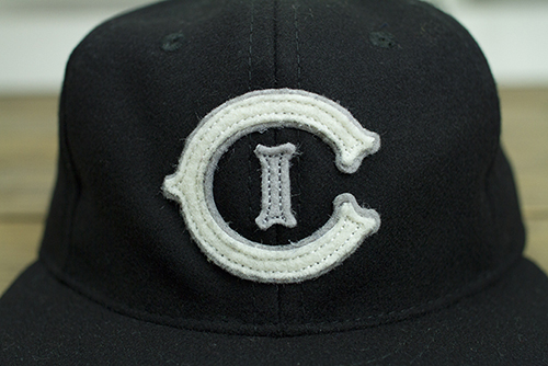
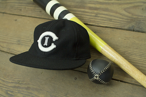
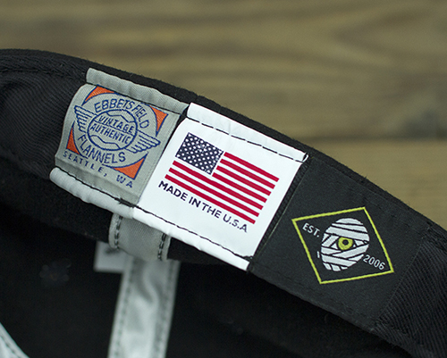
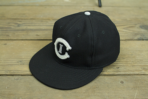
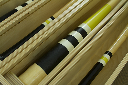
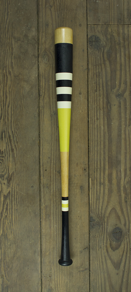
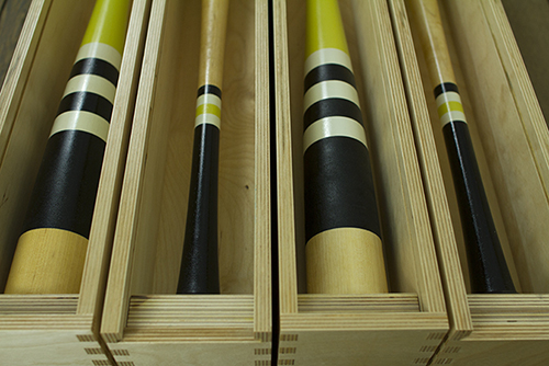
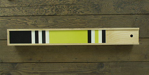
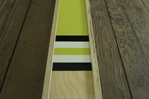
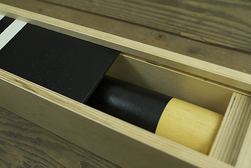
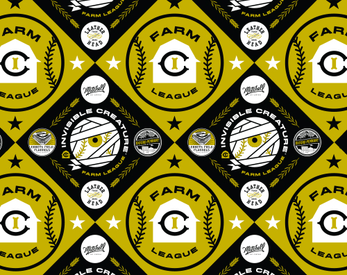
Fast forward 25 years later. After visiting the beautiful new Ebbets Field Flannels storefront in Seattle a few months back, we came up with a crazy idea to fuse a few of our old passions into one: Baseball, art and ... people. People who are making really cool things in the world of baseball - and beyond. We even commissioned our Humble Beast bros in Portland to create some knickerbocker-era music to bring it all together. After coming up with a dream team list (and it was hard to stop at 6), we had our roster.
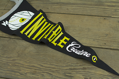
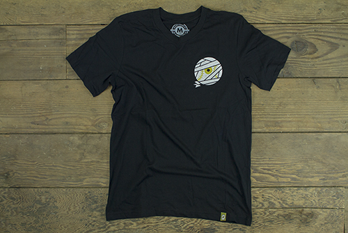
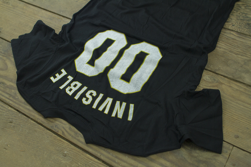
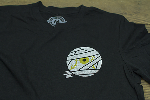
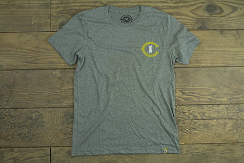
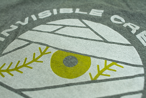
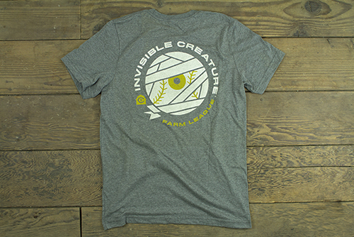
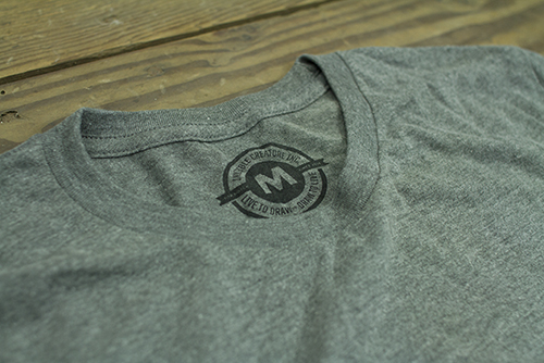
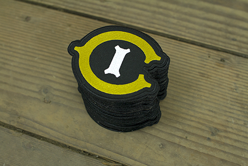
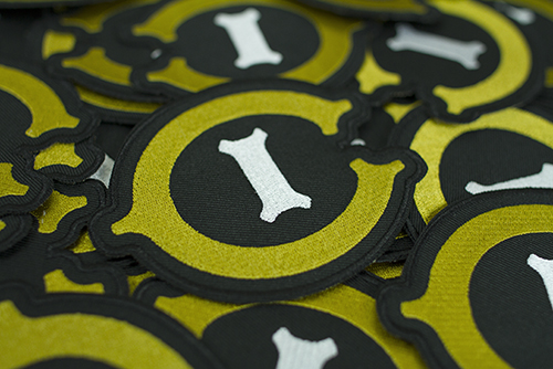
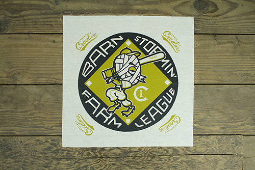
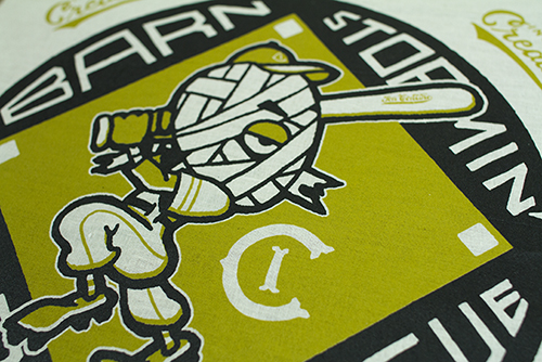
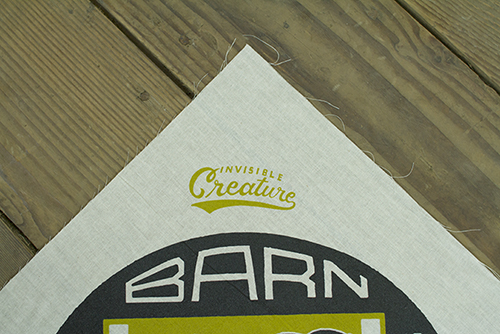
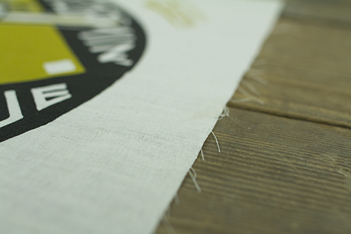
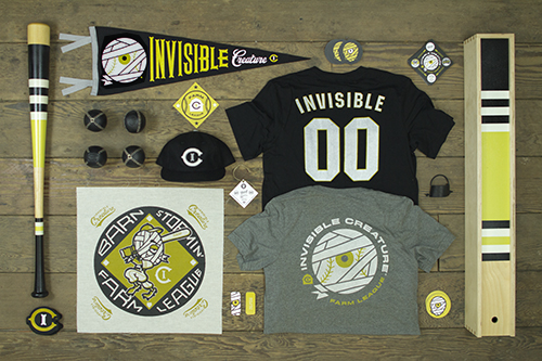
Enter: Invisible Creature Farm League.
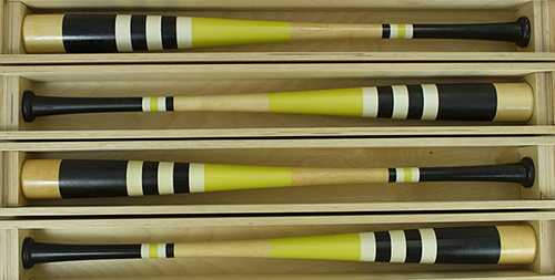
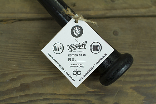
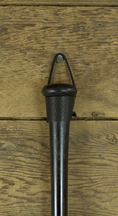
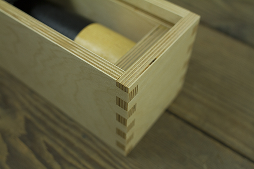
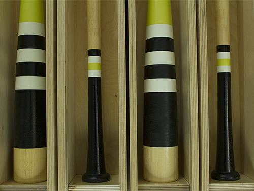
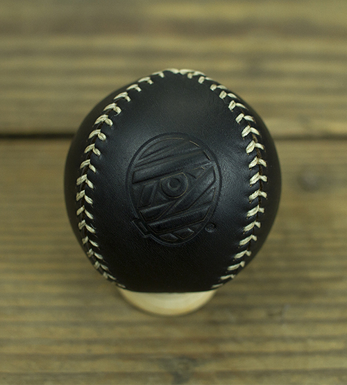
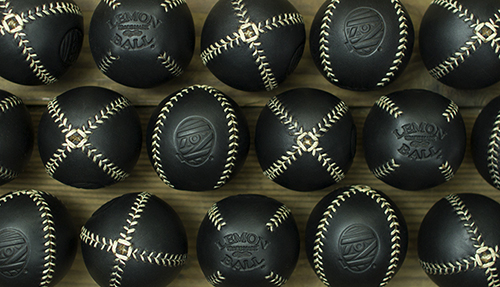
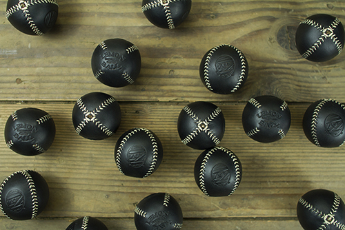
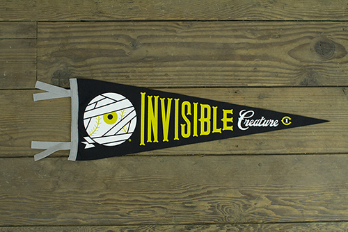
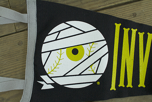
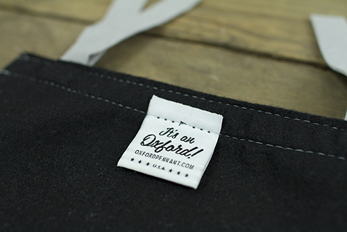
We've partnered with Ebbets Field Flannels from Seattle, Mitchell Bat Co. from Nashville, Leather Head Sports from New Jersey, Oxford Pennant from New York, Curtis Clark Woodworks (or, Dad) from California and the uber-talented and undisputed aesthetic king of baseball himself, Jon Contino from New York to bring you IC inspired game gear for your closet, wall, shelf, desk ... and even the field.
Have a look around our rookie season and click some stuff. A HUGE thanks to all of our collaborators for an amazing experience. We hope you enjoy ...


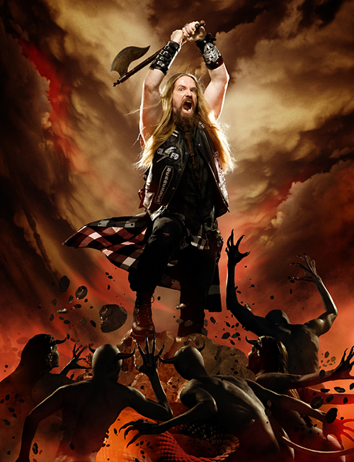
 Check out the cover we just wrapped up for
 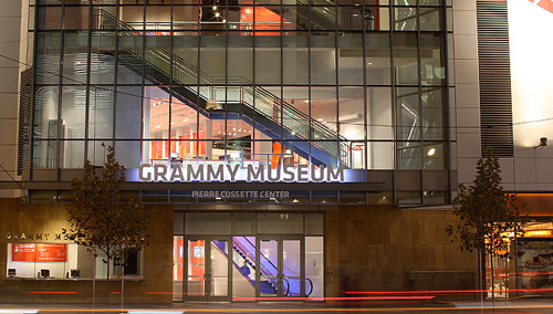 We're honored to have our work featured in The Grammy Museum's new installation "
 So it's kind of a long story, but when my buddy Vijay, who owns and operates
 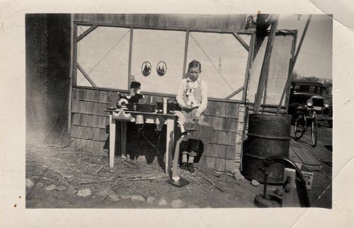 Here's a fun photo of our grandfather, Don Clark (great name, right?) at around 10-12 years old (which should put this at around 1938-1940) with a few home-made wooden toys he had created.
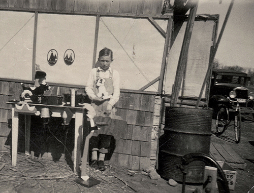
 Stumbled upon this yesterday. Circa 2001 with Mr.
 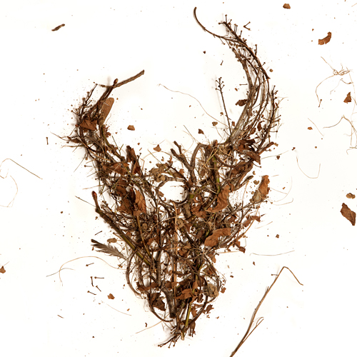 Here is the cover for an upcoming Demon Hunter release featuring the first 3 albums in one package. The 3 disc set will be available everywhere March 8th. If you've had trouble finding these older releases in a store near you, here's the chance to get them all (and cheaply). As always, the DH demon skull graces the cover, this time made from the trees of my back yard. I gathered up some fallen branches and leaves, constructed the logo on a large sheet of white paper, and Jerad Knudson shot the photo.
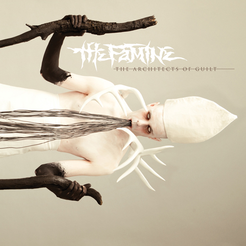 We just wrapped up the artwork for our friends, The Famine, and after an interesting photo shoot of blowing black body paint on a total stranger through a straw, I'm glad to say I'm pleased with the outcome. Be afraid.
 In this series I'm going to try my best not to compare apples to oranges. I understand there are vast differences in technology, ideology, legality, etc between designs of the past and designs of the present. However, I believe there was, is, and will always be a way to almost objectively design something properly. To me, this means a design that is well executed, aesthetically pleasing and properly communicative... in relation to whatever is being "sold."
 I had the idea a while back to post about the perils of modern design, specifically in regard to rebranding, the evolution of a particular design and things of that nature. I've decided to finally pull the trigger and go for it. As my brother has begun posting a series dedicated to our grandfather, I thought this might be the right time. After all... the time period in which our grandfather was designing will often be the era in which my postings will refer to.
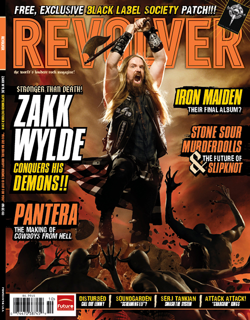
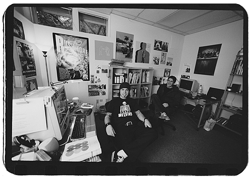
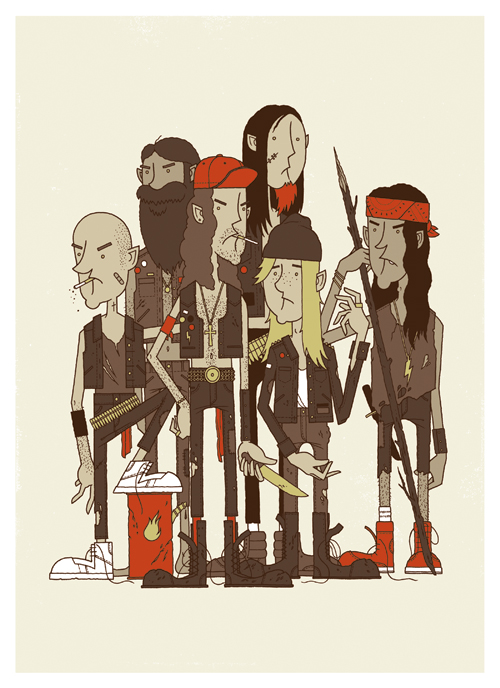 It's the Rowdy Boys Heavy Metal Club! These ruffians may look a little troubled, but they're good kids... just don't tell them you think
 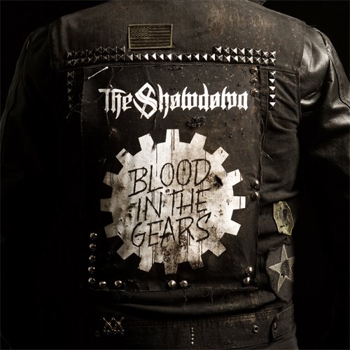 Check out the cover we recently finished for our buddies
  Here's the cover for new Solid State band, To Speak Of Wolves' debut release. Hands are still tough for me. I probably drew 15 pairs of hands before I felt like I got it right...
 We just launched a pre-order for the new Demon Hunter record, The World Is A Thorn. Go