 I had the pleasure of answering a few questions for Meghan over at The Creative Unconscious. Thanks for the opportunity Meghan!
Filtering by Category: IC Feature,Metal
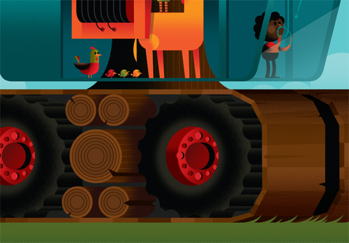
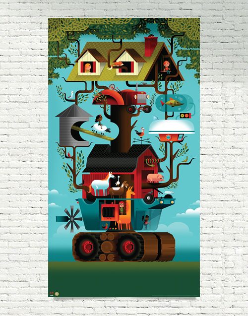
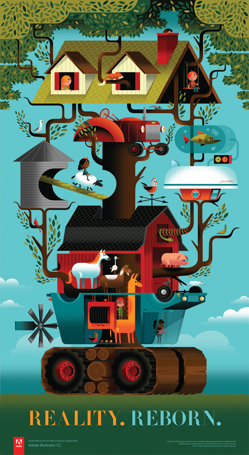 Last year we received a call from our favorite software company, asking us if we'd like to preview the soon-to-be-released Illustrator CC. The one caveat was that we had to create whatever we wanted and document how we did it. Our answer? A resounding 'Awesome!' and "Uh-oh, what are we going to create?" There were no guidelines, save for a few key words: Modern, fearless and reborn. Adobe's theme for the new release.
Since we had just recently bought a farm outside of the city, we were in the thick of having our normal lives turned upside down - yet at the same time, we were having a blast with our new lifestyle. 'Reality. Reborn.' is inspired by that personal transition ... blended together nicely with the amazing new features of Illustrator CC and Adobe's willingness to give us carte blanche on creative direction.
We've been using Adobe's products for almost 20 years now and rely extensively on their tools to create our projects. Huge thanks to Terry Hemphill and the Adobe team for asking us to do this. We had a lot of fun with CC's great new features.
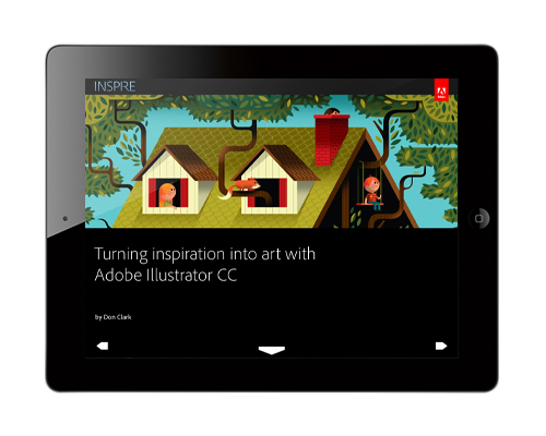
Without further ado, download Adobe's awesome iPad magazine, Inspire to check it all out - or read it online. And to top it all off, grab the mega-huge uber-limited 25" x 46" poster in our shop now.
Read about how we went from sketch phase to final color blocking ... and how our process always evolves as we work.
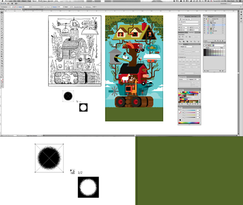
One of the coolest new features in CC is the Multiple File Place tool, allowing you to adjust the size of your file before dropping them on the artboard.
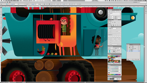
CC's new Touch Type tool is especially great as well, allowing you to manipulate and edit individual characters without creating outlines.
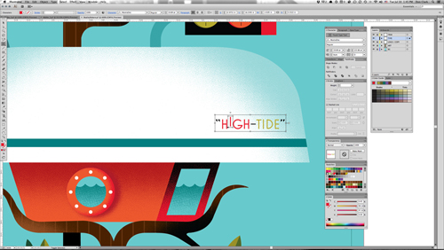
Those are just 2 of my favorite new features. Read about the rest. A few details below:


... and pick up the giant 25" x 46" poster in the shop now for only $40.
 It's an absolute honor to be interviewed by The Great Discontent. Cozy up with that brand new iPad from Grandma and have a read. Merry Christmas and Happy New Year!
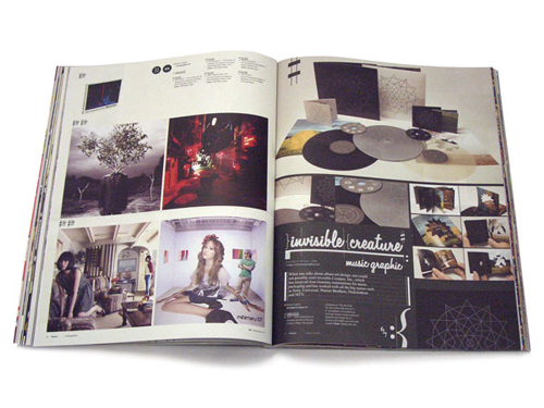
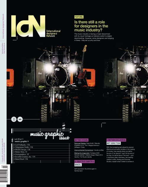 Is there still a role for designers in the music industry? We're honored to be amongst 7 studios interviewed and featured in IdN's Music Graphic issue.
Recorded music has always been packaged, from the very earliest days when wax cylinders came in cardboard tubes, and has therefore always involved designers. In the palmy days of vinyl LPs with sometimes stunning cover art and often erudite liner notes, the presentation was almost as important as the product.
But with the industry morphing so rapidly into the field of digital-download delivery, where do the graphics come in now? This is a burning question for all those working in the area of visually representing music. To see what their answers are, read this feature story, which solicits the views of seven specialist music designers.
Featuring: Telegramme Studio | Invisible Creature, Inc. | IWant Design | Daniel Reed | Matteo Meta | Leif Podhajsky | Giottographica
// Grab a copy here.
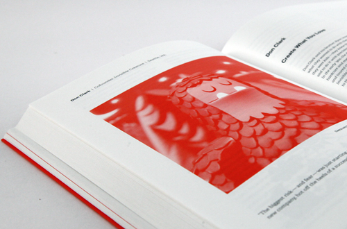
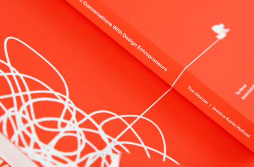
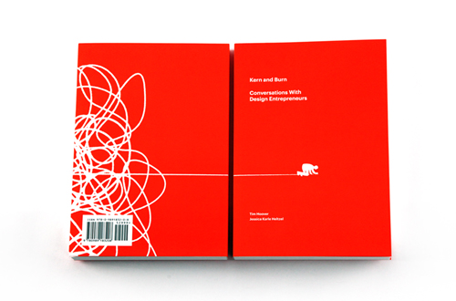 We're honored to be part of the fantastic new book Kern and Burn: Conversations With Design Entrepreneurs curated by Tim Hoover and Jessica Karle Heltzel. Featuring Aaron Draplin, Heads Of State, Arman Vit and many others.
'Kern and Burn: Conversations With Design Entrepreneurs' is a beautiful two-color book that features candid conversations with 30 leading designers who have founded startups, channeled personal passions into self-made careers and taken risks to do what they love. In this book they share their failures, successes, and perspectives. Our hope is that you can learn from them — not to follow in their footsteps, but to chart your own course in parallel, one that allows you to thrive, add value to the world and love what you do.
The entire Kern and Burn project was brought to life by a successful Kickstarter campaign, but here's where it all started. Tim and Jessica's spirit and passion for this book is an inspiration, pick up a copy if you can!

 Here's a look at the recently completed cover for August Burns Red's new album, Rescue & Restore. The album will be available June 25th on CD, double gatefold vinyl, and limited edition vinyl box set. Pre-orders available soon! We had an absolute blast putting this together. Thanks to JB and the guys for their trust and letting us run crazy with it.
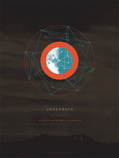 Our friends in Underøath asked us to contribute a design dedicated to one show of their upcoming farewell tour. This design (for both poster and t-shirt) specifically commemorates the Houston, TX date of the tour. If you have a chance, don't miss seeing this band for the last time, and be sure to check out all of the final tour designs created by friends of the band here.
 To commemorate Demon Hunter's ten years, we've created a silkscreen poster featuring imagery from all six studio albums. This is a limited pressing of 100, signed by Ryan Clark (me), and is available in the store now. Order by December 20th for holiday arrival! (orders for this poster do NOT include IC Holiday Giveaway print)
 Honored to be featured in Print's 2012 Regional Design Annual. Gigantic thanks goes to our favorite clients over at Target inHouse.
 Our gracious friends over at
  Check out the cover we just wrapped up for Sold State newcomers The Overseer.
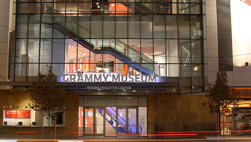 We're honored to have our work featured in The Grammy Museum's new installation "The History Of Heavy Metal", opening April 11th. The exhibit opening coincides with The Golden Gods and will feature numerous album covers from our early years within the heavy music genre. The show will be up for one year and definitely worth checking out.
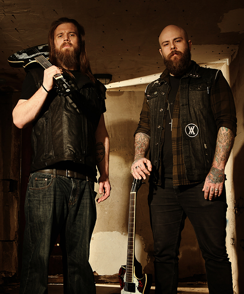 So it's kind of a long story, but when my buddy Vijay, who owns and operates Artist Series Guitar, mentioned that his good friend, Ryan Hurst, would be doing a photo shoot for his custom Demon Hunter and Throwdown guitars, I had to make sure I was there. For years now, people have said I look like Opie, a character that Hurst plays in the always-enthralling Sons Of Anarchy TV show. All of us in Demon Hunter have become huge fans of the show over the years, so this was a really cool opportunity. Oh, and my wife made the dope leather vest Hurst is wearing in the shoot. Checking off that bucket list, one day at a time.
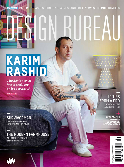 Design Bureau Magazine asks us a few questions in their latest issue. Featuring K-Rash like a boss on the cover.
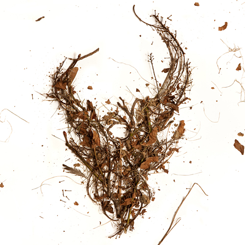 Here is the cover for an upcoming Demon Hunter release featuring the first 3 albums in one package. The 3 disc set will be available everywhere March 8th. If you've had trouble finding these older releases in a store near you, here's the chance to get them all (and cheaply). As always, the DH demon skull graces the cover, this time made from the trees of my back yard. I gathered up some fallen branches and leaves, constructed the logo on a large sheet of white paper, and Jerad Knudson shot the photo.
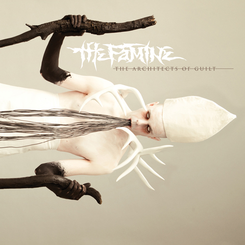 We just wrapped up the artwork for our friends, The Famine, and after an interesting photo shoot of blowing black body paint on a total stranger through a straw, I'm glad to say I'm pleased with the outcome. Be afraid.
 As They Sleep is a new band on Solid State Records, bringing some much needed brutality to the masses. This is the album cover that we recently completed for their upcoming release titled Dynasty. We again enlisted photographic/set design whiz Jerad Knudson to help us see the vision through, and we couldn't be happier with the results. Apparently the model is a homeless man that sells newspapers near Jerad's house in Seattle's Capital Hill neighborhood.
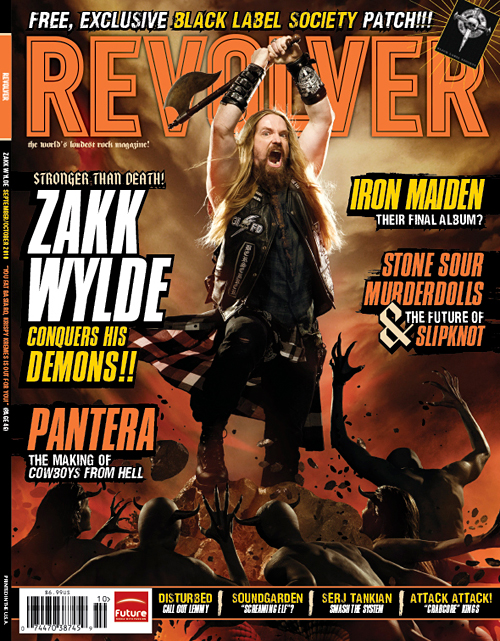
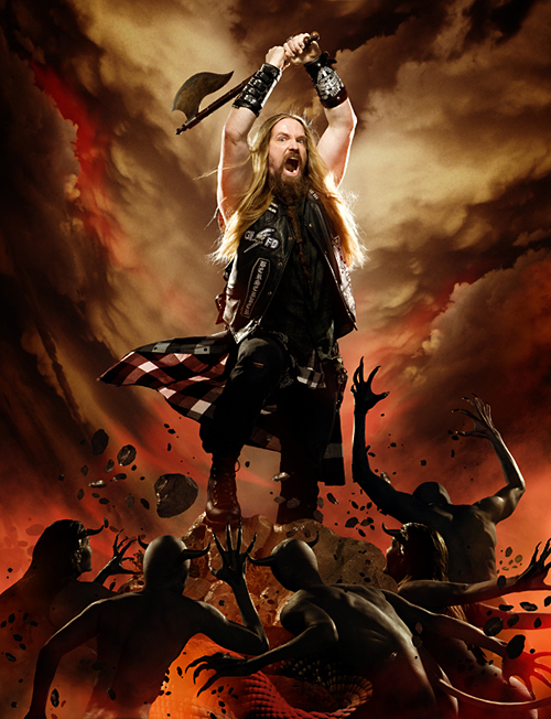
Check out your local newsstands now for the new issue of Revolver Magazine, featuring Zakk Wylde. We did the photo-illustration work for the cover and the feature, which meant many hours of cutting out little demon people to create the elaborate scenes. The cover image itself pays homage to recently deceased Frank Frazetta's classic artwork.
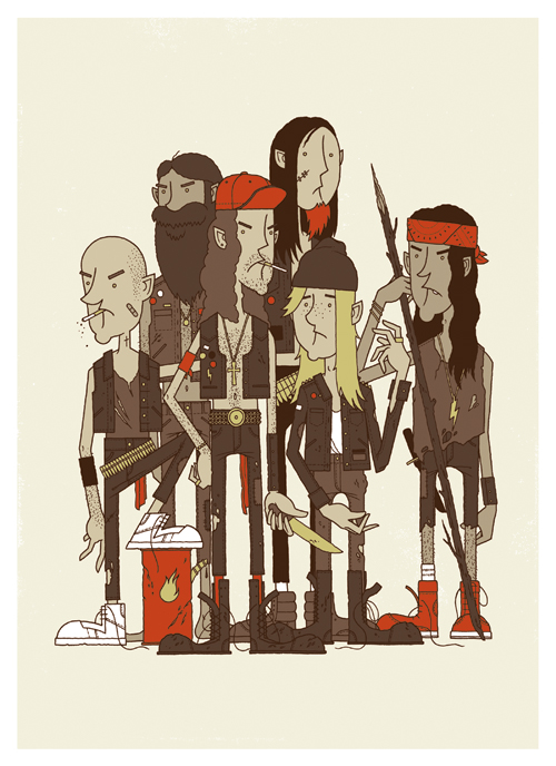 It's the Rowdy Boys Heavy Metal Club! These ruffians may look a little troubled, but they're good kids... just don't tell them you think Inside The Torn Apart is the best Napalm Death album. The brand new 16" x 22" Giclee print is available in the store now.
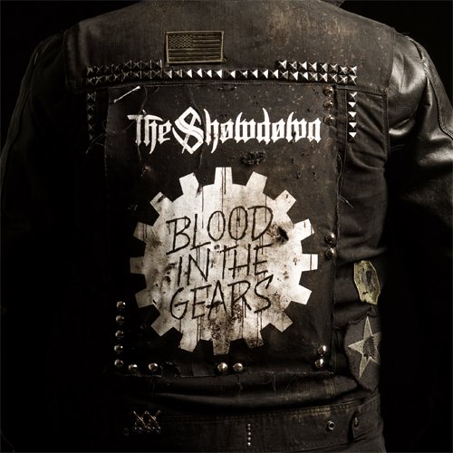 Check out the cover we recently finished for our buddies The Showdown. The new record, Blood In The Gears, has a very gritty, Southern, biker sound to it, so that's exactly what we went for. That's me in the jacket, and there's no Photoshop magic here- we had the back patch made just for the cover. Ride to live...