As we enter into our seventh year here at IC, we've decided to give our iconic mummy mark an upgrade.
The reenvisioning of our logomark is something we have been considering for some time. With a consciousness for particularly small uses (social media icons, products, packaging, clothing tags, etc.) we sought out for a bold, timeless mark that stands strong in every possible scenario. With a handful of new projects/products on the horizon, we decided that now is the time.

The original mark I created in 2006 was inspired by skateboard graphics and other pop art from our coming of age. Although it feels somewhat classic in its own right, the detailed style has proved to be limiting over the years.

Our goal was to create a simpler, more streamlined version of our classic "cyclops mummy," keeping its overall concept (and hopefully its recognizability) in tact, but modernized and with a broader range of usability.
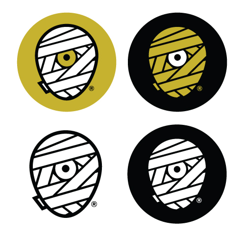
We explored a variety of shapes for the head itself - a perfect circle, a rectangle with rounded corners, etc. In the end, it was imperative that it truly convey a head shape, so we landed on what we refer to as the "egg."
Aside from the logo's core theme, we also knew we'd be sticking with our classic color scheme. It feels as integral to our brand as the mark itself, and allows us to maintain our focus. Another benefit of this new mark is our ability to explore varying combinations of these colors depending on its use. The solid white or yellow wrap will be the primary marks, while the shaded versions - with white highlights on the yellow wrap, and yellow lowlights on the white wrap, give us more detailed options as well.
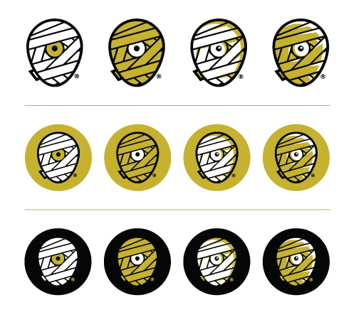
A minor but important detail was the small piece of wrap peeking around the backside of the mummy head. It's a subtle inclusion, but it truly helps the read. It was necessary that this piece be included, but without jeopardizing the true center of the new mark.
You'll also notice the inclusion of an ® mark. With the recent registration of our brand name and identity, it's time to make it official.
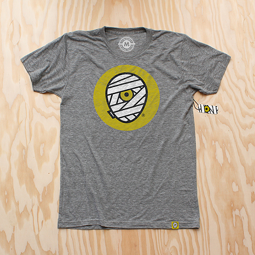
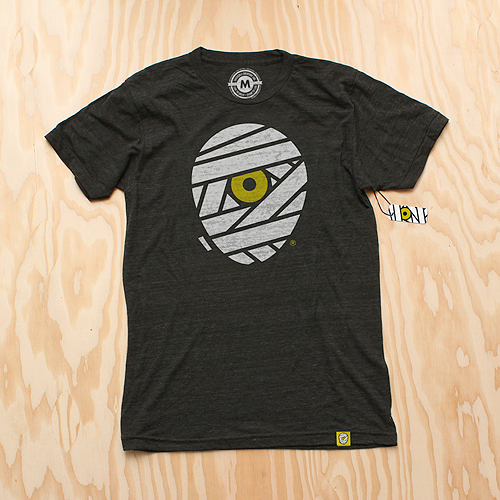
And of course, we celebrate this momentous occasion with some swag. New T-Shirts are available for pre-order (shipping mid-late September) as well as new silk-screened die-cut stickers.

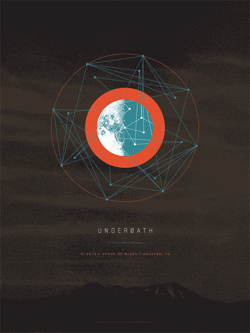


 Check out the cover we just wrapped up for
 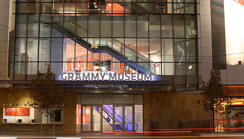 We're honored to have our work featured in The Grammy Museum's new installation "
 So it's kind of a long story, but when my buddy Vijay, who owns and operates
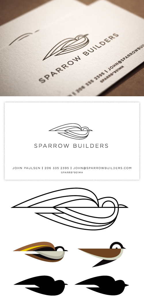
 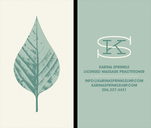 Our longtime friend, Karina Sprinkle, asked us to create the identity for her new massage practice. The idea was to convey a sense of calmness and peace, but steer away from typical massage related imagery (hands, Papyrus font). The leaf seemed like an appropriate direction, given their often medicinal qualities, and it also gives a little love to the great PNW. Here's a look at the business card.
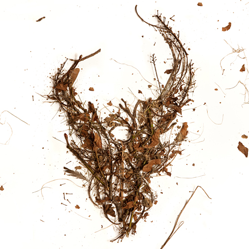 Here is the cover for an upcoming Demon Hunter release featuring the first 3 albums in one package. The 3 disc set will be available everywhere March 8th. If you've had trouble finding these older releases in a store near you, here's the chance to get them all (and cheaply). As always, the DH demon skull graces the cover, this time made from the trees of my back yard. I gathered up some fallen branches and leaves, constructed the logo on a large sheet of white paper, and Jerad Knudson shot the photo.
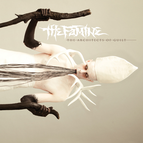 We just wrapped up the artwork for our friends, The Famine, and after an interesting photo shoot of blowing black body paint on a total stranger through a straw, I'm glad to say I'm pleased with the outcome. Be afraid.
 We recently just wrapped a fun logo/business card project for
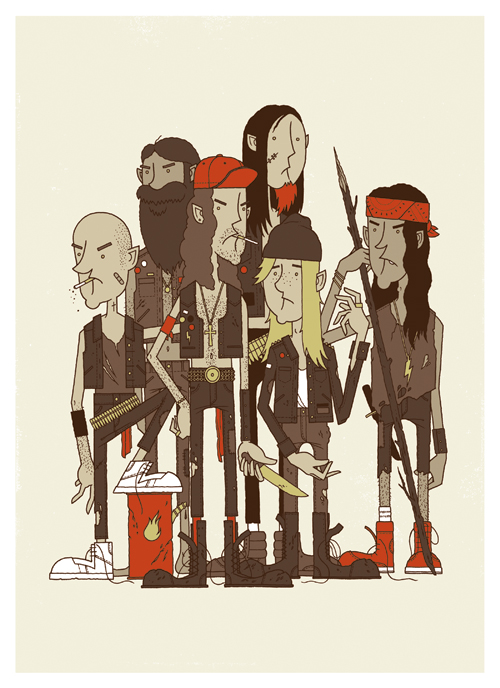 It's the Rowdy Boys Heavy Metal Club! These ruffians may look a little troubled, but they're good kids... just don't tell them you think
 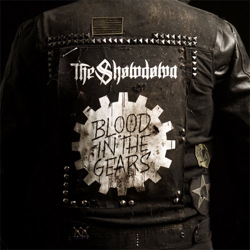 Check out the cover we recently finished for our buddies
  Here's the cover for new Solid State band, To Speak Of Wolves' debut release. Hands are still tough for me. I probably drew 15 pairs of hands before I felt like I got it right...
 We just launched a pre-order for the new Demon Hunter record, The World Is A Thorn. Go