 Well, the second annual Lil' Happy Club was another fun success. Over 130 envelopes were sent in and we had a blast checking out each original creation. Thanks to all of you who spent the time to craft your envelope and send it off to our hood. We're a bit busy with a few projects right now, but we promise to return the favor soon. Oh, and check out our favorites here.
Filtering by Category: Bum Out,Lil' Happy


Tommy Perez (see last post) blogged about his ultra cool Leroy C. Lil' Happy submission. Downloadable PDF (courtesy of Tommy) coming soon as well.

 It's that time of year again. What time is that you ask? Lil' Happy time. Last year was heaps of fun - we had a few hundred envelope submissions in a little over a month. We promised ourselves that if it was a success, we'd make it an annual thing. Well, here we are.
As Lil' Happy's new outfit may suggest, this year is a bit different. We've got a few tricks up our sleeve that may need to be 'decoded', but unfortunately you won't know what that is until you get your envelopes back. Cool, right?
For those of you that did not participate last year -- or are just now joining us ... here is why we created the Lil' Happy Club and what it is exactly:
---------
Do you remember real mailboxes? How about real mail? What about that feeling of excitement as you opened up that rusty old mailbox in hopes that something would be addressed to YOU?
It seems like much of that is lost nowadays. A letter addressed to us now means we probably owe someone money.
Well, we miss that feeling. So, we decided to start The Lil' Happy Invisible Creature S.A.S.E. Club. Inspired by our youth - when the simple task of addressing an envelope to ourselves, licking a few stamps and patiently waiting a few weeks could mean receiving anything from a signed baseball card from spring training to various stickers from our favorite skateboard company.
It's real simple. Send us a self-addressed stamped envelope and we'll fill it with goodies.
However, we thought we'd make it a bit more fun and interactive. Regardless of your artistic ability, your envelope addressed to us MUST be creatively designed or illustrated. No rules, anything goes - and we'll post the 'Envelope of the Day' (our daily favorite) on the Lil' Happy Twitter and Flickr pages.
So, that's it! Oh, and we figured we should set some ground rules and answer a few questions. Just in case.
---------
DEADLINE: October 15th, 2011 Please send us your S.A.S.E. by that date.
Please send your envelopes to: The Lil' Happy Invisible Creature S.A.S.E. Club, P.O. Box 375, Seahurst, WA 98062
Q: How many stamps should I put on the envelope that will be returned to me? A: Great question. Please slap TWO stamps on the return envelope.
Q: I can't draw to save my life. What should I do? A: Like we mentioned, it's regardless of your ability. C'mon, it'll be fun!
Q: What are you going to send us? A: We're not telling. It'll be fun though. We promise.
Q: When should we expect our envelope back? A: In the fall. It could take us awhile as we also run a full-time studio over here. If you send it, it will come. A little patience.
Q: I don't live in the U.S., can I still participate? A: Probably not, due to customs. However, we aren't international mail professionals, if you can find a way that works via USPS, we'll definitely send it back! If it involves anything more than dropping it in a mailbox, we won't be able to pull it off. Sorry.
Q: Can I send you more than one envelope? A: No, sorry.
Q: Can I send a poster tube? How about a large document envelope or soft pack? A: Sorry, no. Let's keep this old school. Legal sized envelopes would be the biggest/best option. Be sure to slap 2 stamps on that return envelope though!
Any more questions? Feel free to email us at lilhappy@invisiblecreature.com
 In this series I'm going to try my best not to compare apples to oranges. I understand there are vast differences in technology, ideology, legality, etc between designs of the past and designs of the present. However, I believe there was, is, and will always be a way to almost objectively design something properly. To me, this means a design that is well executed, aesthetically pleasing and properly communicative... in relation to whatever is being "sold."
TWIW, V.2 is in regard to travel advertising. In this case, specifically cruises. Here are my thoughts on the ads in question:
1. I don't even know where to start. How about the copy? Clearly one is simply advertising a specific cruise ship, while the other goes into much more detail about the price, locations, discounts, dates, etc., but that in itself says something about modern advertising's problem with forcing too much information into a single ad. Add to that the tragedy of 5+ arbitrarily used fonts and typesetting that seems to make no sense at all. Except of course for the legal line, which is strategically set in black type over a dark portion of the image. Crafty.
2. We used to marvel at things like the massive Cunard cruise ship, shown above. But as technology and engineering progress, we're less interested in how we'll be getting to our destination and more interested in where it's taking us (and how much it will cost). But aren't these ads for the cruise itself? If you just want to go to The Bahamas, you can fly there in a fraction of the time. This is about the experience of the cruise. And as you can see in the more recent ad, the actual cruise ship has become an afterthought; a footnote.
3. As for the imagery, we're faced with the obvious difference between professional designer and someone with a personal computer. Before the computer we relied on professionals to do the job of advertising. They were skilled in their craft. They knew type and composition and cohesion and color. They designed because they were good at it. I know I'm stating the obvious here, (and there's a heaping helping of irony as I sit here and type this) but it's a bit of a bummer that the computer has turned every civilized human into a jack-of-all-trades.
4. In the end, one is clearly worth framing and displaying in your home, and the other is sure to end up in a trash bin. I refuse to believe that we collect things that are "vintage" purely based on nostalgia. The bottom line is that, in most cases, that old stuff is flat out better than the garbage that we see today.
 I had the idea a while back to post about the perils of modern design, specifically in regard to rebranding, the evolution of a particular design and things of that nature. I've decided to finally pull the trigger and go for it. As my brother has begun posting a series dedicated to our grandfather, I thought this might be the right time. After all... the time period in which our grandfather was designing will often be the era in which my postings will refer to.
"The Way It Was" will be a study (and occasional pseudo-rant) about a particular design of the past, and a directly (or at least somewhat) related piece from recent years.
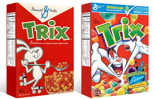
TWIW #001 is based on an email conversation I had with a few like-minded friends a couple of years ago. The subject in this case is a box of Trix cereal. Target had announced that it was re-issuing old General Mills cereal box designs for a limited time, (God bless design-savvy corporations) and in being reminded of that classic old box design, I couldn't help but dissect the modern design and suppose what it's trying to tell today's consumer. Here are my thoughts:
1. The logo, once simple and bold, is now 3-dimensional, has a white stroke, yellow bevel, and emboss. ALL of which have gradients. Somehow this "pops" more.
2. Since brand loyalty is dead, the nice big General Mills logo at the top of the box (which I'm sure used to assure people of the reliability and integrity of the product) is replaced by a very small GM logo, overpowered by a "whole grain guarantee" and a list of other nutritional values. Not that nutrition is anything to shrug at, but let's be real- this is Trix.
3. The cereal itself isn't enough anymore, so there has to be added incentive to buy. In this case, there's an ad for "fruitalicious" games on the back of the box.
4. The fun-loving bunny on cute roller skates is replaced by (honestly) what seems to be an INSANE rabbit, literally throwing Trix at you.
5. Lastly, and probably most importantly, the modern box has a disclaimer sentence that reads something like "cereal shown not actual size," because people are so stupid (or assumed to be so stupid) that they can't comprehend that the 1" macro-lens-photographed meteor puffs on the front of the box are bigger than they actually are.
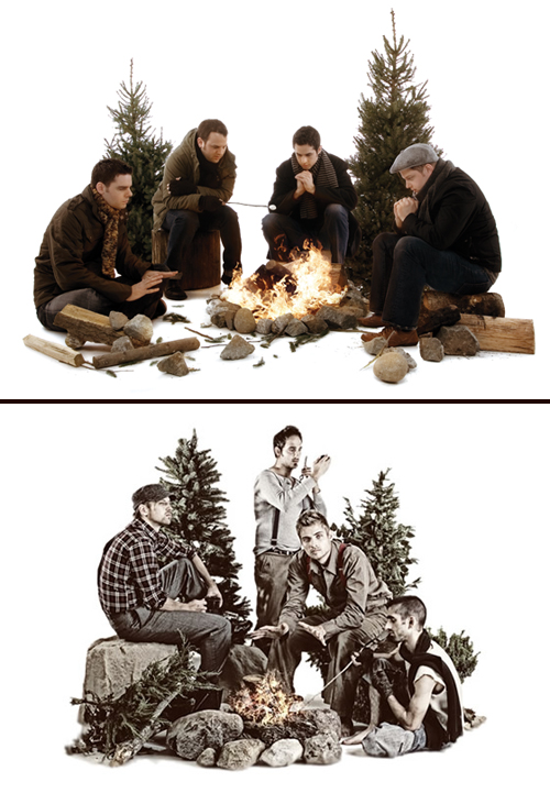 Four guys in outdoor clothing- check. Rocks and various debris- check. 2 staggered pine trees- check. Campfire- check. One guy warming his hands, one guy roasting a marshmallow- check. White seamless backdrop- check. Congrats- you've successfully ripped off our Fair artwork! Your Dave Hill photo treatment needs some work though.
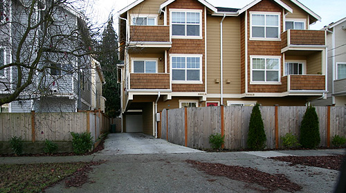 Build has an excellent rant, I mean blog about the current "nostalgic faux-crapsman" town homes popping up everywhere around Seattle. This was just a topic of conversation amongst friends last week, it's good to see we're not alone.
They also posted a link to a Seattle Times article regarding the same issue.