 I had the pleasure of answering a few questions for Meghan over at The Creative Unconscious. Thanks for the opportunity Meghan!
Filtering by Category: Photo-Illustration,IC Feature
It's been busy here at IC, to say the least, and we haven't been updating the blog as often as we'd like. To make up for lost time, here are a handful of new albums we've been working on over the past 6 months. Enjoy.

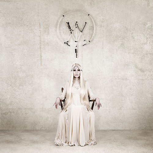
WovenWar I've been friends with these guys ever since we toured together in 2010, but never had the chance to work with them on a design level. I couldn't be more pleased with how smoothly everything went. We knew we wanted a cover image that centered around an icon, and the WW mark is something that came to mind instantly after our first conversation. As always, I loved working in simple black and white. Each image is comprised of abstract painted shapes to convey a ink-blot/rorschach vibe. Pre-order the physical package here.
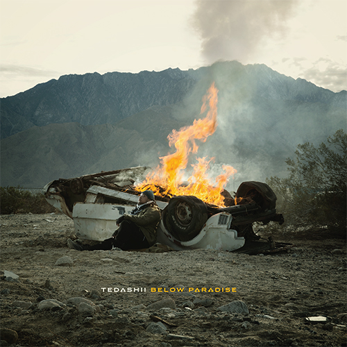
Tedashii Below Paradise Taking a page from the late, great Storm Thorgerson book of "doing it for real," we ventured out into the high desert of Southern California in early 2014 to create this album cover. Caleb Kuhl did a killer job on the photos, Neil Visel was particularly handy with the forklift, and I put too much lighter fluid on the car and we had to call the fire department. Apparently they saw the smoke from a neighboring county. Oops. Grab the physical album here.
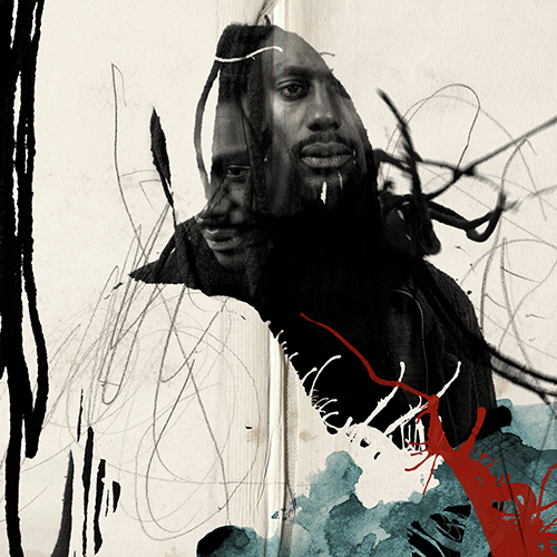
Propaganda Crimson Cord Our pal Prop gave us free reign on his (amazing) new album - we wanted the packaging concept to feel as organic and layered as his music. What may look like paint drips and splatters are (mostly) images of his iconic dreadlocks. Our goal was to blend his soul into the art as much as possible - which was inspired by the album title and album concept. Grab the physical album here.
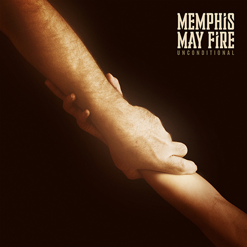
Memphis May Fire Unconditional The guys in MMF came to me with this concept, which I thought was great - that of the bond between father and child. Since my dad happened to be coming to town around this time, I thought it would be a great opportunity to photograph his arm for this cover... and I was able to talk one of my brother's children into giving us a "hand" as well. Grab the physical album here.
The Atlas Moth The Old Believer I’ve always enjoyed creating imagery that is “more than meets the eye.” I also love concepts that allow for some real hands-on interaction. Ideas like this have kept music packaging exciting for me through the years. When The Atlas Moth came to me with a concept that would change the cover image when wet, I thought there was no way we'd get the necessary approval to make it happen. Thanks to the folks at Profound Lore, who, in rare fashion, believe in going the extra mile in the name of artistic endeavor, this amazing idea is something you can now hold (and drench) for yourself. Above are both "before" and "after" versions of the cover. Grab the physical album here.
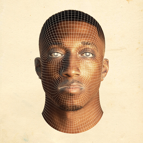
Lecrae Anomaly One of our favorite clients, Lecrae (and his label - Reach Records), asked us to work on the follow-up to his last album Gravity, which we had the pleasure of working on in 2012. We enlisted the help of our friends at Shinbone Creative to create Crae's likeness in 3D wireframe (spot gloss varnish!) form for the cover. The physical packaging will def. be worth checking out. Pre-order that here.

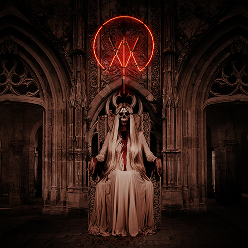
Killer Be Killed Working with an entire band of metal visionaries isn't something I get to do every day. Needless to say, I jumped at the chance. The aesthetic that we really bonded over, and seemed fitting for this project, was that of crusty, gritty, photocopied punk. The real fringe - Discharge, Man Is The Bastard, Doom, Crass, etc. It was a blast getting to work in a style that I love, for awesome guys that totally get it. Grab the physical album here.


Grieves Winter & The Wolves Another album cover that's more than meets the eye. We worked with Grieves to create something really special for 2011's Together/Apart, and we knew we wanted to do something amazing for this record as well. The actual cover (top image here) features a die cut hole right in the center, where a standing Grieves shows through. When the cover is opened, we see that he's surrounded by wolves. Careful out there, buddy. Grab the physical album here.
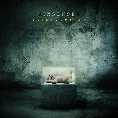
Insense De:Evolution I had the pleasure of touring with these guys in Europe during the spring of 2012. We spoke a bit on the road about working together for the artwork on their new record, and I'm stoked that we were able to make it happen. Not to worry - no babies were harmed in the making of this cover. Grab the physical album here.
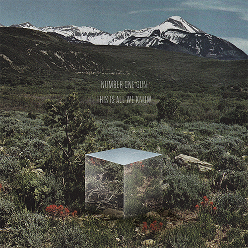 Over the years, Number One Gun has been a source of creative exploration for us. They've always been great at essentially giving us free-reign, which has allowed us the room to create some work that we're really proud of (thanks, Jeff). For this, their newest digital-only release, This Is All We Know, we created a scene made to look like a page cut from a special Twilight Zone Edition of a 1960s Life Magazine. We started with a pre-printed image and added a mysterious mirrored box, nestled into the setting.
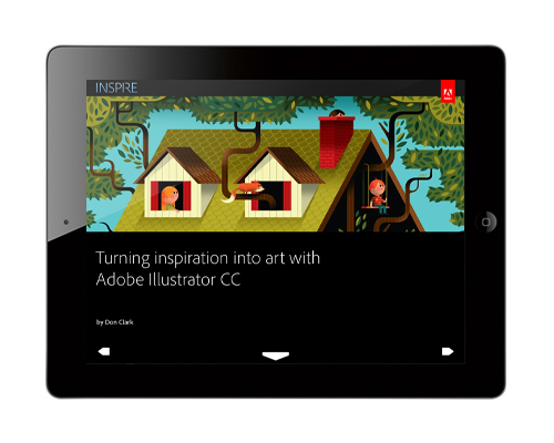
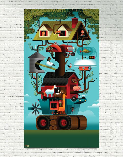
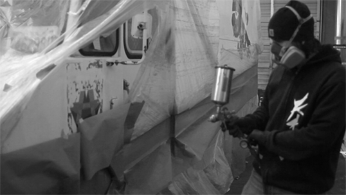
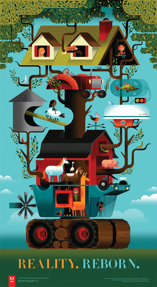 Last year we received a call from our favorite software company, asking us if we'd like to preview the soon-to-be-released Illustrator CC. The one caveat was that we had to create whatever we wanted and document how we did it. Our answer? A resounding 'Awesome!' and "Uh-oh, what are we going to create?" There were no guidelines, save for a few key words: Modern, fearless and reborn. Adobe's theme for the new release.
Since we had just recently bought a farm outside of the city, we were in the thick of having our normal lives turned upside down - yet at the same time, we were having a blast with our new lifestyle. 'Reality. Reborn.' is inspired by that personal transition ... blended together nicely with the amazing new features of Illustrator CC and Adobe's willingness to give us carte blanche on creative direction.
We've been using Adobe's products for almost 20 years now and rely extensively on their tools to create our projects. Huge thanks to Terry Hemphill and the Adobe team for asking us to do this. We had a lot of fun with CC's great new features.
Without further ado, download Adobe's awesome iPad magazine, Inspire to check it all out - or read it online. And to top it all off, grab the mega-huge uber-limited 25" x 46" poster in our shop now.
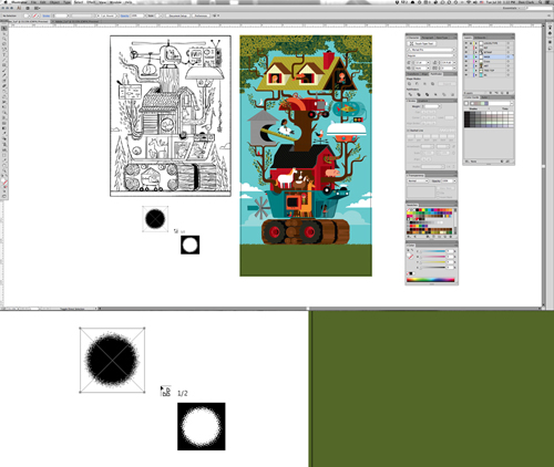
Read about how we went from sketch phase to final color blocking ... and how our process always evolves as we work.
One of the coolest new features in CC is the Multiple File Place tool, allowing you to adjust the size of your file before dropping them on the artboard.
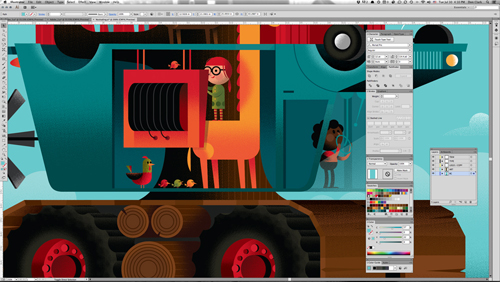
CC's new Touch Type tool is especially great as well, allowing you to manipulate and edit individual characters without creating outlines.
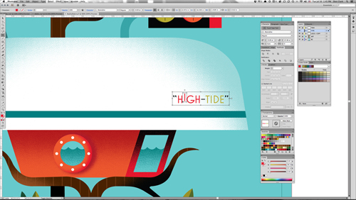
Those are just 2 of my favorite new features. Read about the rest. A few details below:

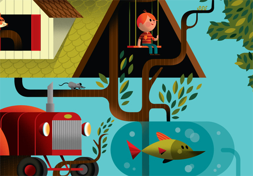

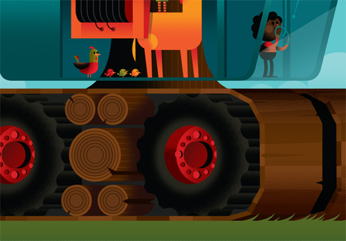

... and pick up the giant 25" x 46" poster in the shop now for only $40.
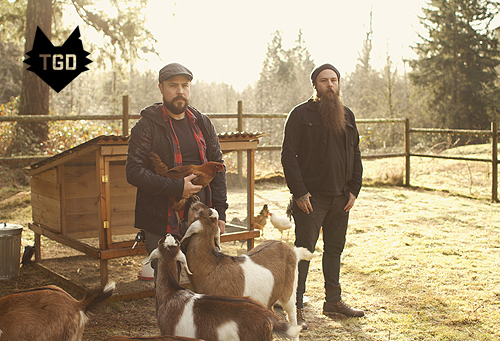 It's an absolute honor to be interviewed by The Great Discontent. Cozy up with that brand new iPad from Grandma and have a read. Merry Christmas and Happy New Year!
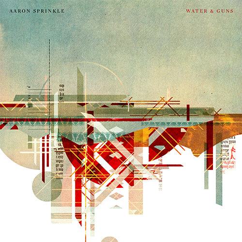 Here's a look at the album cover we created with long-time friend Aaron Sprinkle, for his newest release, Water & Guns. The Album itself is phenomenal, and Aaron, as usual, gave us his unyielding trust to create something with no boundaries but our own imagination. Water & Guns speaks of (among many other things) Aaron's recent move across the country, and his long journey to complete this record. Our idea was to represent two polarizing landscapes using abstract shapes. In this case, all pre-printed materials from vintage magazines. Buy this record.
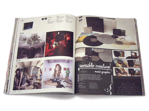
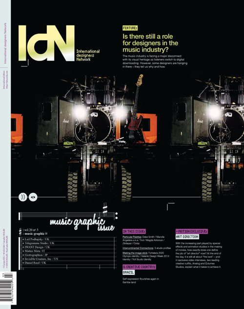 Is there still a role for designers in the music industry? We're honored to be amongst 7 studios interviewed and featured in IdN's Music Graphic issue.
Recorded music has always been packaged, from the very earliest days when wax cylinders came in cardboard tubes, and has therefore always involved designers. In the palmy days of vinyl LPs with sometimes stunning cover art and often erudite liner notes, the presentation was almost as important as the product.
But with the industry morphing so rapidly into the field of digital-download delivery, where do the graphics come in now? This is a burning question for all those working in the area of visually representing music. To see what their answers are, read this feature story, which solicits the views of seven specialist music designers.
Featuring: Telegramme Studio | Invisible Creature, Inc. | IWant Design | Daniel Reed | Matteo Meta | Leif Podhajsky | Giottographica
// Grab a copy here.
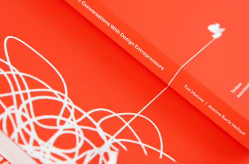
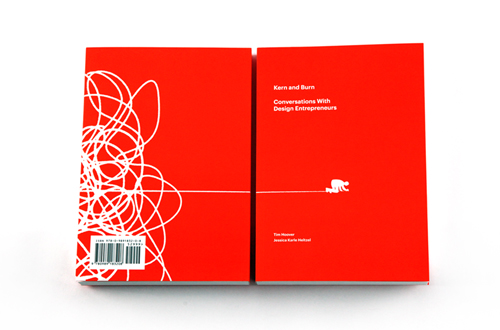 We're honored to be part of the fantastic new book Kern and Burn: Conversations With Design Entrepreneurs curated by Tim Hoover and Jessica Karle Heltzel. Featuring Aaron Draplin, Heads Of State, Arman Vit and many others.
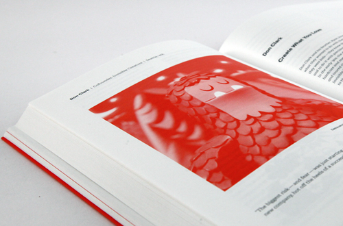
'Kern and Burn: Conversations With Design Entrepreneurs' is a beautiful two-color book that features candid conversations with 30 leading designers who have founded startups, channeled personal passions into self-made careers and taken risks to do what they love. In this book they share their failures, successes, and perspectives. Our hope is that you can learn from them — not to follow in their footsteps, but to chart your own course in parallel, one that allows you to thrive, add value to the world and love what you do.
The entire Kern and Burn project was brought to life by a successful Kickstarter campaign, but here's where it all started. Tim and Jessica's spirit and passion for this book is an inspiration, pick up a copy if you can!

 Here's our album cover for the one, the only Andy Mineo. Heroes For Sale arrives on April 16th. To be continued...


 Honored to be featured in Print's 2012 Regional Design Annual. Gigantic thanks goes to our favorite clients over at Target inHouse.
 Here's our cover for Lecrae's much-anticipated new album Gravity. We've been fans of what Reach Records has been doing for years - so we're pretty excited to be part of this record. And Church Clothes has been on repeat in the studio since it dropped.
 Our gracious friends over at
  Check out the cover we just wrapped up for Sold State newcomers The Overseer.
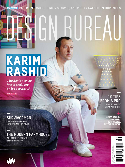 Design Bureau Magazine asks us a few questions in their latest issue. Featuring K-Rash like a boss on the cover.

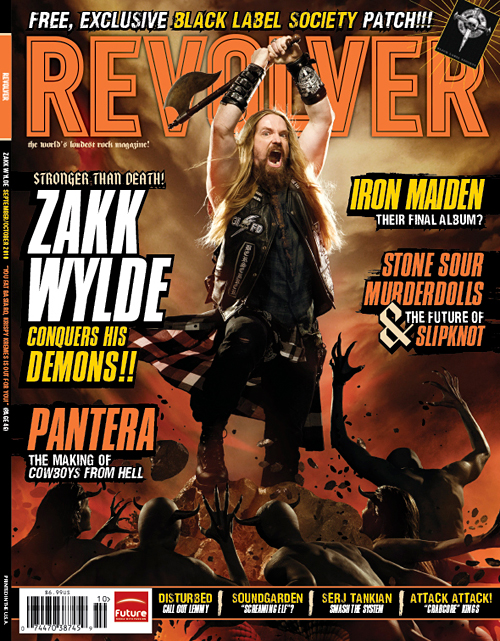
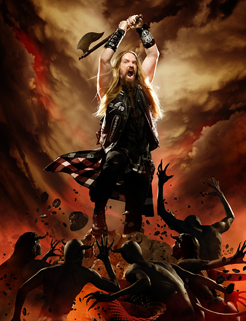
Check out your local newsstands now for the new issue of Revolver Magazine, featuring Zakk Wylde. We did the photo-illustration work for the cover and the feature, which meant many hours of cutting out little demon people to create the elaborate scenes. The cover image itself pays homage to recently deceased Frank Frazetta's classic artwork.
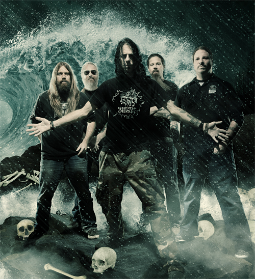 Check out our new post over at Headbangers Blog, in which we explain the process of creating imagery for the April, 2009 issue of Revolver magazine, featuring metal heavyweights Lamb Of God. Feel the wrath!
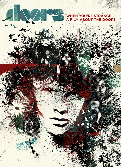 Here is a cover that we did for a documentary about The Doors, titled "When You're Strange." Unfortunately this cover was rejected when it turned out that the band just "wanted a band photo" instead. We thought we'd show it to you anyway, as we're rather fond of it.
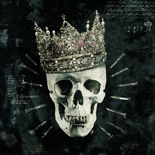
 Here's the cover for Demon Hunter's new "Live In Nashville" record. For this album cover we wanted to execute our "demon skull" logo (which graces every DH cover) in a new and unique way. If you focus on the black negative space, you'll see it. Album available January 27th!
 Just finishing up the artwork for new Solid State band, The Ascendicate. This is actually a band that I sought out and recently helped sign to the label. I'm very excited for the release of this record. The above image is the final cover (sans sticker, which displays the band name, album title).