 It's an absolute honor to be interviewed by The Great Discontent. Cozy up with that brand new iPad from Grandma and have a read. Merry Christmas and Happy New Year!
Filtering by Category: Design,Coming Soon
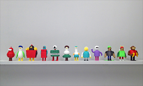
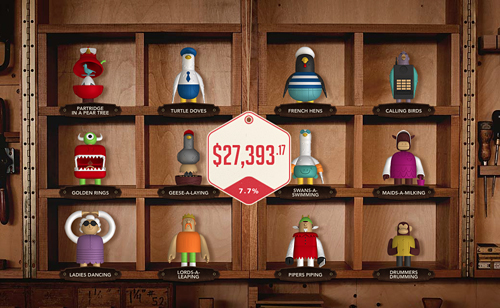
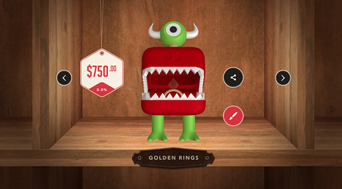
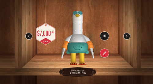
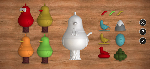
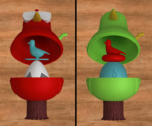
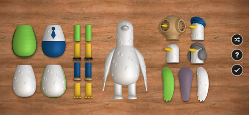
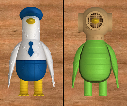
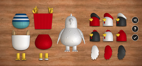
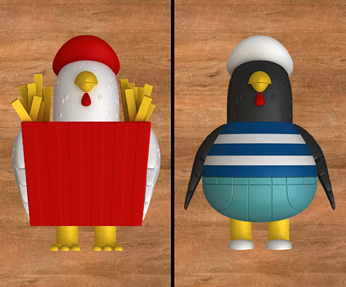
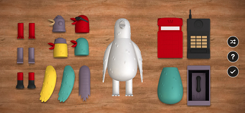
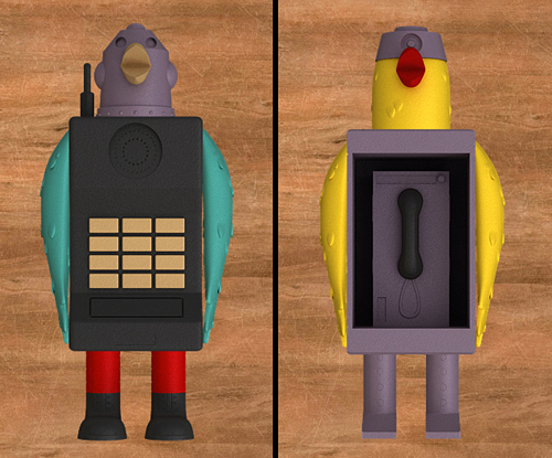
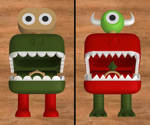
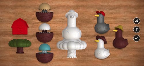
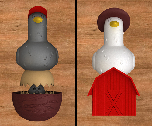
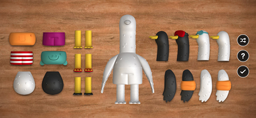
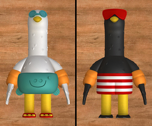
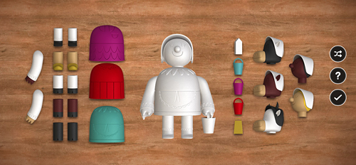
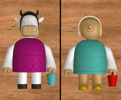
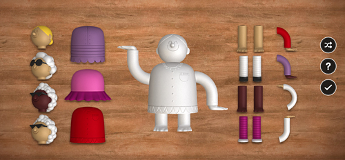
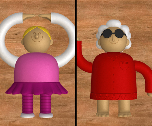
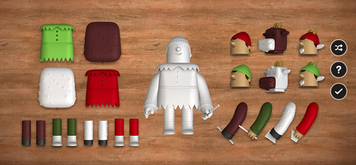
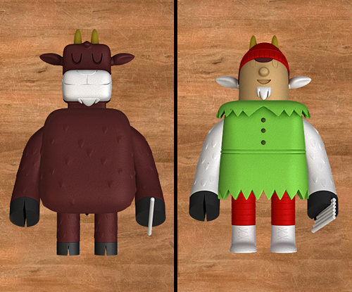
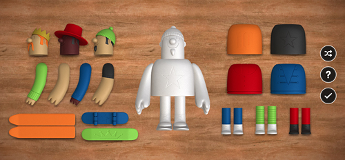
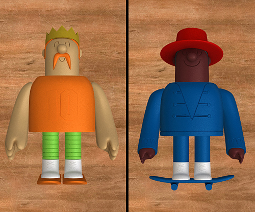
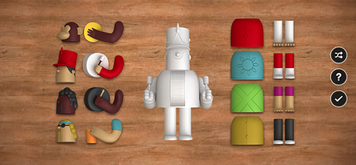
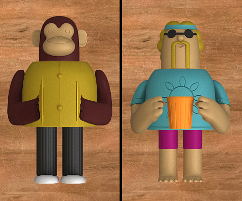
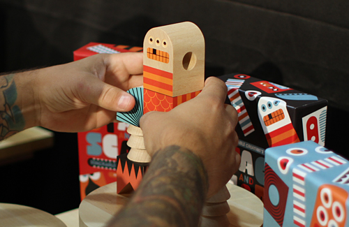
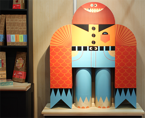
We are excited to announce the launch of a fun new project we just finished up with the kind folks at Deutsch NY. Deutsch commissioned IC to create 12 unique character toy designs based on the classic song "The Twelve Days Of Christmas" for PNC's infamous annual PNC Christmas Price Index. Beyond the task of creating 12 original characters based on the song, we also designed multiple interchangeable parts for each character - over 100 pieces in total. Partridge In A Pear Tree, Turtledove, French Hen, Calling Birds, Golden Rings, Geese-a-Laying, Swans-a-Swimming, Maids-a-Milking, Ladies Dancing, Lords-a-Leaping, Pipers Piping and Drummers Drumming.
The PNC Christmas Price Index site is loads of fun and allows you to create your own toy by selecting various heads, legs, arms, bodies and accessories. When you are done creating your character, PNC calculates the total cost of what your selection would be in 2013, as well as how much it has gone up or down since 2012.
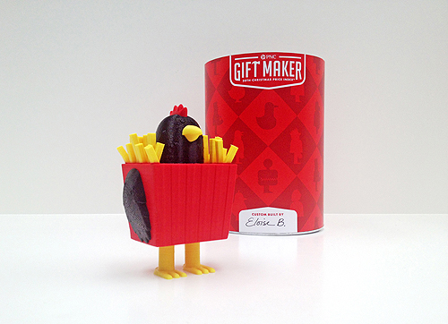
But the coolest part? For 12 days, PNC is selecting 24 lucky winners per day to receive a 3D-printed gift in time for the holidays! Using Makerbot desktop printers, winners will be chosen randomly and selected each day. The more gifts you build, the more chances you have to win. Read more about that here.
We had so much fun with this project, now it's your turn!
More about PNC Bank's Christmas Price Index:
The PNC Christmas Price Index® shows the current cost for one set of each of the gifts given in the song “The Twelve Days of Christmas.”
It began 30 years ago when the chief economist at PNC Bank decided to figure out how much it would cost to buy each of the gifts. Little did he know, he was starting a holiday tradition that continues to this day.
The PNC Christmas Price Index® is similar to the Consumer Price Index, which measures changes in prices of goods and services like housing, food, clothing, transportation and more that reflect the spending habits of the average American.
The goods and services in the PNC Christmas Price Index® are far more whimsical. And most years, the price changes closely mirror those in the Consumer Price Index. It’s a fun way to measure consumer spending and trends in the economy. So even if “pipers piping” or “geese-a-laying” didn’t make your gift list, you can still learn a lot by checking out how their prices have gone up and down over the years.
Deutsch Credits:
Partner/ Chief Creative Officer: Kerry Keenan SVP, Group Creative Director: Jeremy Bernstein Senior Copywriter: Matt Moyer VP, Creative Director: Qian Qian EVP/Director of Integrated Production: Joe Calabrese SVP/Director of Digital Production: Suzanne Molinaro VP/Executive Digital Producer: Jennifer McBride Senior Art Producer: Hillary Jackson Producer: Jillian Cornette
Production Companies:
MediaMonks (creative digital production) Invisible Creature (toy design & packaging) 3D Printer Experience (3D printing the toys) ShootersNYC (intro/outro video production) Director/DP: Craig Needleman Executive Producer: Jim Huie Senior Editor: Anthony Marinelli Account Director: Amy Sweeney


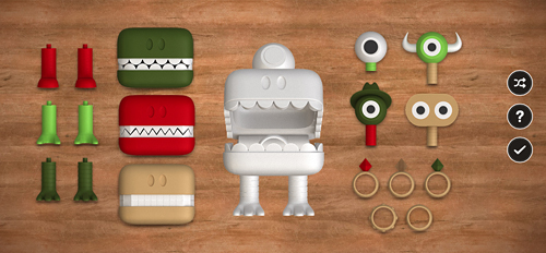
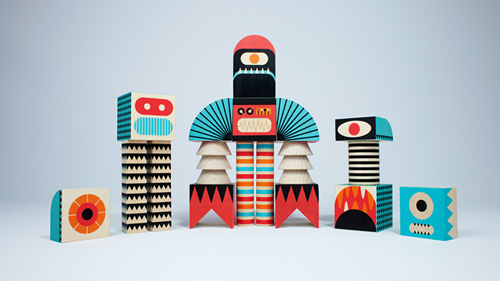
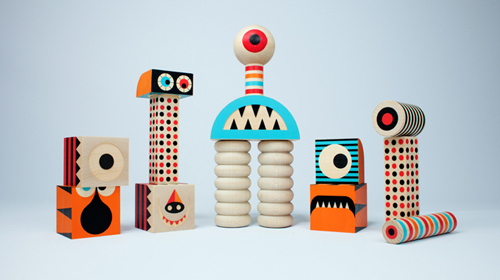
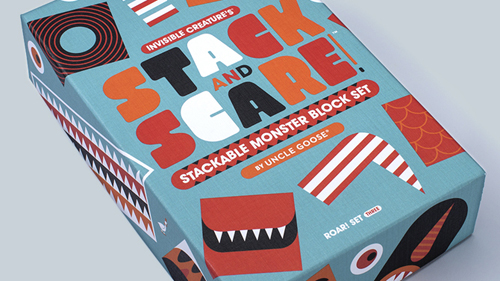
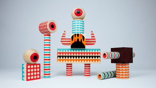
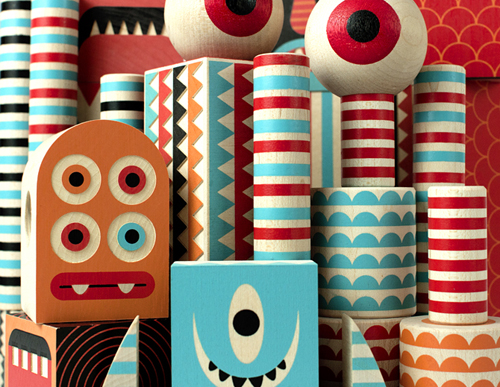
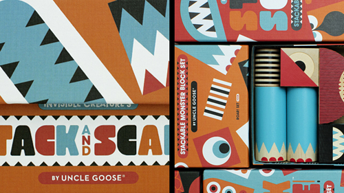
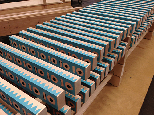
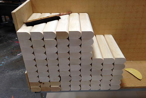
We're extremely excited to announce that our first line of toys with Uncle Goose is now available! Over a year in the making, Stack And Scare™ is a series of 4 stackable wooden monster block sets. Each Roar! set contains 14-18 pieces in various shapes and sizes. Featuring eyeballs, teeth, horns, arms, rounded shapes for shoulders and eyes, monster heads, hands, feet, legs, torsos, patterns and more. Mix and match shapes or combine with other Stack And Scare™ sets to unleash endless (and taller) creature combinations! Beautifully and meticulously crafted by our friends at Uncle Goose in Grand Rapids, Michigan. Made from FSC certified basswood, using non-toxic inks. Purchase Stack And Scare™ from us, Uncle Goose or independent toy stores everywhere. We designed Stack And Scare™ for everyone at any age. We can't wait to see what you do with them. Share with us at #stackandscare.
And of course ... we thought it would be fitting to create a short "IC Filmmercial" featuring our wooden critters in action. We enlisted our friends in Portland, Beautiful Eulogy, to create a score using the blocks themselves and the result is pretty fantastic. Scroll to the bottom of this post to see how we (and they) made it all happen ...
Roar! Set One:


Roar! Set Two:


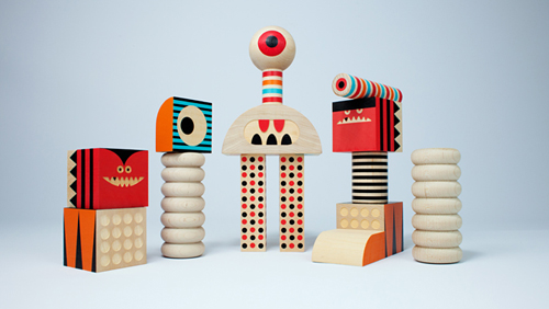


Roar! Set Three:


Roar! Set Four:


... And check out how we (and Beautiful Eulogy) made the film ... Then go grab their new album Instruments Of Mercy, out today.
Missed our original teaser? Check it out.
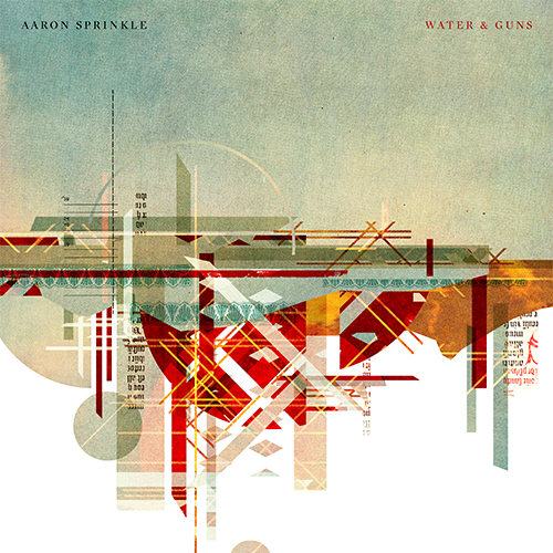 Here's a look at the album cover we created with long-time friend Aaron Sprinkle, for his newest release, Water & Guns. The Album itself is phenomenal, and Aaron, as usual, gave us his unyielding trust to create something with no boundaries but our own imagination. Water & Guns speaks of (among many other things) Aaron's recent move across the country, and his long journey to complete this record. Our idea was to represent two polarizing landscapes using abstract shapes. In this case, all pre-printed materials from vintage magazines. Buy this record.

We are extremely excited to announce our new partnership with Uncle Goose Toys. Made in Grand Rapids, Michigan for the past 30 years, Uncle Goose is the world's premiere manufacturer of wooden blocks. We've partnered up with their amazing team to bring the highest quality and most creative wooden toys and playsets to the market. With new products and creations lined up through 2015 and beyond, we couldn't be more thrilled to work with such a passionate company dedicated to their craft.
Hot off their debut at the NY NOW International Gift Show, our first product is titled Stack And Scare. Crafted from replenishable basswood and printed with non-toxic inks, the Stack And Scare series contains four stackable block sets that allow children (and you!) to create and configure hundreds of possible monster options. Before we let too much out of the bag (or box), we've put together a teaser film announcing the new line.
Stack And Scare will be available in retail locations worldwide and through our shop beginning in October. Stay tuned for the big launch ...

We were in the big apple for their debut at the NY NOW show ...

... and we visited the UG workshop in Grand Rapids this month to check out the progress.


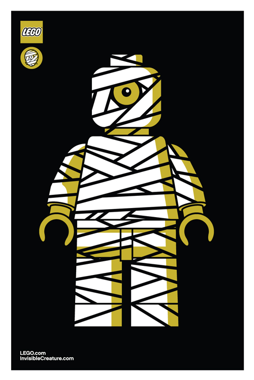
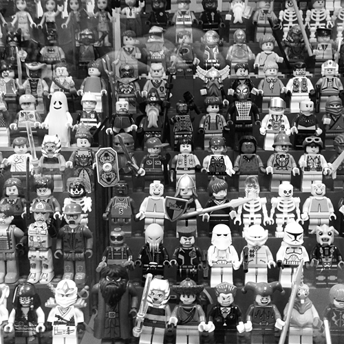
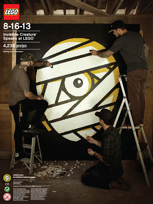 We had the great privilege and honor of speaking at LEGO's internal Design Camp last week - a day away from the office for the creative team in beautiful Enfield, Connecticut. Scott Decoteau, along with the talented and generous crew at LEGO, were gracious hosts during our time in New England. Highlights of the trip included the LEGO HQ tour (wow), dangerously delicious indian food, bowling and sharing sentimental stories about the infamous drawstring denim LEGO bag.
To commemorate our talk, we decided to make some things. One of them being a poster of us creating our new mark out of 4,236 bricks - flown in from all over the world. After 2 hot days, 1 broken mallet (don't ask), 6 iced coffees and 3 blisters, the mosaic came to life. Extra special thanks to LEGO for supplying the baseplates.
Unfortunately these posters and prints are not for sale, but who knows - we may throw some in future IC poster orders ...
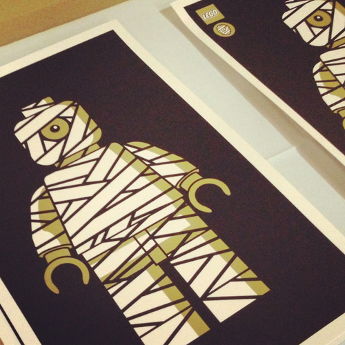


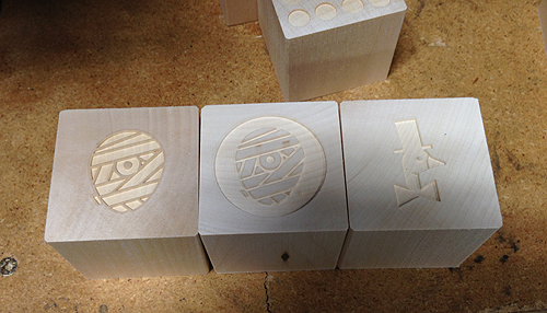
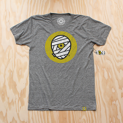
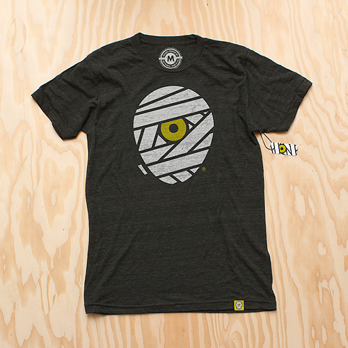
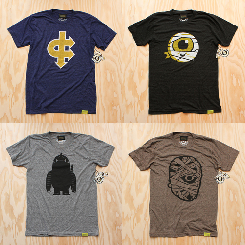
 As we enter into our seventh year here at IC, we've decided to give our iconic mummy mark an upgrade.
The reenvisioning of our logomark is something we have been considering for some time. With a consciousness for particularly small uses (social media icons, products, packaging, clothing tags, etc.) we sought out for a bold, timeless mark that stands strong in every possible scenario. With a handful of new projects/products on the horizon, we decided that now is the time.

The original mark I created in 2006 was inspired by skateboard graphics and other pop art from our coming of age. Although it feels somewhat classic in its own right, the detailed style has proved to be limiting over the years.

Our goal was to create a simpler, more streamlined version of our classic "cyclops mummy," keeping its overall concept (and hopefully its recognizability) in tact, but modernized and with a broader range of usability.
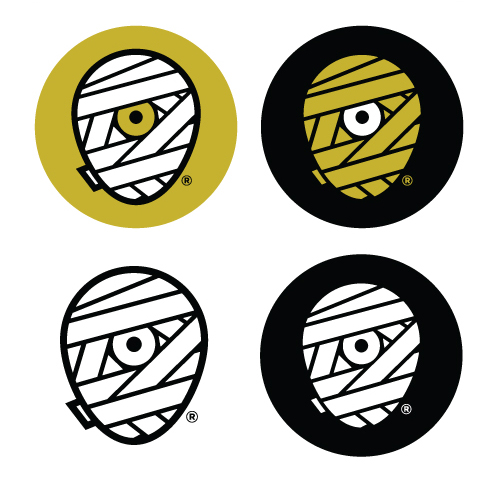
We explored a variety of shapes for the head itself - a perfect circle, a rectangle with rounded corners, etc. In the end, it was imperative that it truly convey a head shape, so we landed on what we refer to as the "egg."
Aside from the logo's core theme, we also knew we'd be sticking with our classic color scheme. It feels as integral to our brand as the mark itself, and allows us to maintain our focus. Another benefit of this new mark is our ability to explore varying combinations of these colors depending on its use. The solid white or yellow wrap will be the primary marks, while the shaded versions - with white highlights on the yellow wrap, and yellow lowlights on the white wrap, give us more detailed options as well.
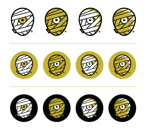
A minor but important detail was the small piece of wrap peeking around the backside of the mummy head. It's a subtle inclusion, but it truly helps the read. It was necessary that this piece be included, but without jeopardizing the true center of the new mark.
You'll also notice the inclusion of an ® mark. With the recent registration of our brand name and identity, it's time to make it official.
And of course, we celebrate this momentous occasion with some swag. New T-Shirts are available for pre-order (shipping mid-late September) as well as new silk-screened die-cut stickers.
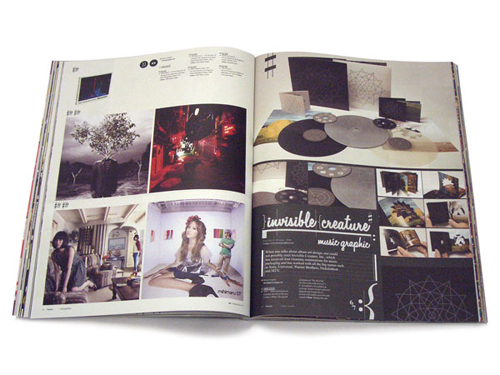
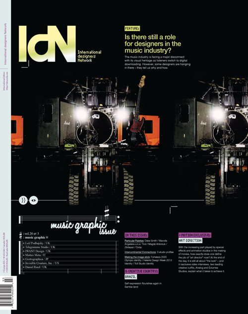 Is there still a role for designers in the music industry? We're honored to be amongst 7 studios interviewed and featured in IdN's Music Graphic issue.
Recorded music has always been packaged, from the very earliest days when wax cylinders came in cardboard tubes, and has therefore always involved designers. In the palmy days of vinyl LPs with sometimes stunning cover art and often erudite liner notes, the presentation was almost as important as the product.
But with the industry morphing so rapidly into the field of digital-download delivery, where do the graphics come in now? This is a burning question for all those working in the area of visually representing music. To see what their answers are, read this feature story, which solicits the views of seven specialist music designers.
Featuring: Telegramme Studio | Invisible Creature, Inc. | IWant Design | Daniel Reed | Matteo Meta | Leif Podhajsky | Giottographica
// Grab a copy here.
 Our buddy Joby Harris, a visual strategist at NASA JPL, gave our Blast Off! pennant a tour of the facilities in Pasadena. Next time we'll accompany the pennant, but for now this is pretty freaking cool. Huge thanks to Joby for doing this! Above: The Mission Control Room.
The art studio:

At the Mission Formulation room:

At The Spacecraft Formulation Building:

The Mission Control Room lobby:

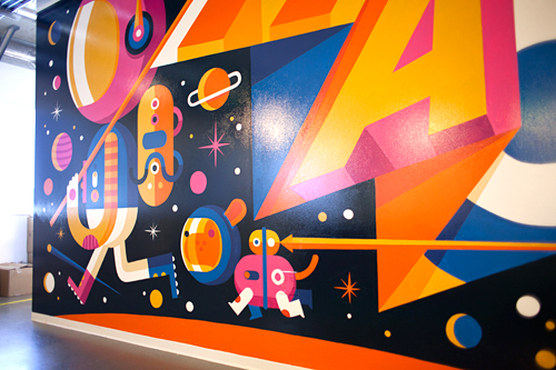
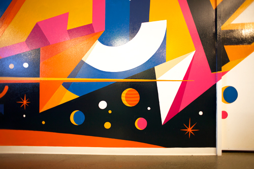
 A few months ago we were approached by the kind folks at Facebook, asking if we'd be interested in creating a mural for their offices here in Seattle. It sounded like heaps of fun, so we signed up. They gave us a few keywords that represented the culture and atmosphere at Facebook. 'Making The World More Connected' and 'Hacker' got the most votes internally, so we dug into those ideas as our direction. Inspired by Ben Barry's in-house postings, we based our piece on combining both thoughts - the idea of going beyond the 'world' being more connected intrigued us. Facebook existing outside of planet Earth seems like an attainable goal, so that's where we landed. Once again we worked with our friend Don Rockwell on the application of the mural and it turned out pretty spectacular. See our quick and fun 'Making Of' film below:


 Heyo! It's hot and you need T-Shirts! All adult and kids sizes of last year's T's are on sale for $15. We don't have a ton left, so grab them while you can (and help us make room for the new IC wearables coming soon). Tell the world!
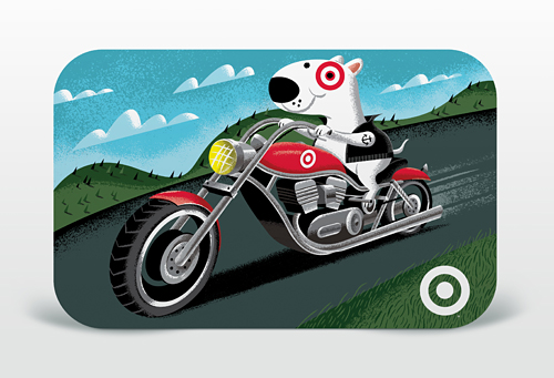 Fire up the V-Twin and pick up our new Biker Bullseye Gift Card for Target - in stores now. Complete with ultra-cool chromium reflective foil stamping technology in person! Below are a few initial sketches we provided the client before we began illustrating the final card -- but see the whole process here.
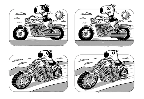
Illustrator: Don Clark / Sketch Artist: Doug Oudekerk / Art Directors/Designers: Scott Gilson & David Ledsinger / Writer: Aaron Muther / Production Designer: Sarah Schroeder / Creative Manager: Ted Halbur
 We're excited to reveal our new cover for Minorville, the upcoming album from Nashville's finest: Derek Minor. With the help of Curtis Clark (or 'Dad', as we like to call him), we designed this from the ground up in approx. 2 weeks. With over 100 feet of basswood and baltic birch, Dad took our design and created an entire city in 50 hours. Each structure arrived safely in Seattle, ready to be constructed in the shape of Derek's profile. When we were initially presented with the challenge of creating this album cover, this was the first concept we pitched - Many thanks to Derek and Reach Records for sending us off and running. Stay tuned for a full comprehensive "Making Of" film coming in the next few weeks, but for now - enjoy the teaser (Processed using VSCO film emulation):


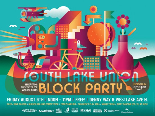 Oh Summer, where art thou? It's always a pleasure working with Josh Lackey and our friends at Vulcan Real Estate. Here is our poster art for the 2013 South Lake Union Block Party, happening Friday August 9th and benefitting The Center For Wooden Boats. Printed on 80 lb. Cougar Opaque stock. See you at the beer garden.


![]()
We're excited to announce the launch of Heartwork 2013! We're so thankful to all of the artists that donated their time and talents this year.
What is Heartwork?
Heartwork is a project designed to raise money for art supplies within the art room at Target House — this wonderful home-away-from-home for the families of children facing long-term treatment at St. Jude® Children's Research Hospital.
The whole idea started simply enough. We, along with a few other creative individuals, were asked to work on various design projects for the St. Jude Target House. But, in the process, we were so deeply moved by the experience that we didn't want it to end. We witnessed firsthand the special connection the kids had with the art room in particular. It was a place where we saw kids at all stages of health just being kids. So, we began to wonder, "What if we could create a ongoing way to support more and better art supplies for these children?" It was then that Heartwork was born.
Every year, a group of talented artists create a series of 11" x 14" giclee prints to raise money for the art room. Each of the prints feature an interpretation of the word "Hope" and each edition is limited to only 10 pieces and signed/numbered by the artist.
Print details:
Archival giclee - printed with pigment inks on archival cotton rag paper Size: 11 inches x 14 inches with a 1" border for framing Signed & numbered editions of 10
Purchase the prints here.
2013 Artists:
"Hope" by The Heads Of State

"Black Rhino's Forge Ahead" by Always With Honor

"Wild" by Jolby

"Flower Friends" by Tad Carpenter

"My Robot Friend" by Kevin Tong

"Thick-Lined Valley Of Love" by Aaron Draplin

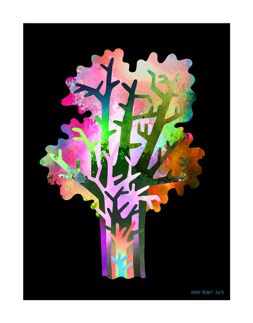
"Growth" by Mike Perry
"Create Yourself" by Don Shank

"Upswing" by Invisible Creature

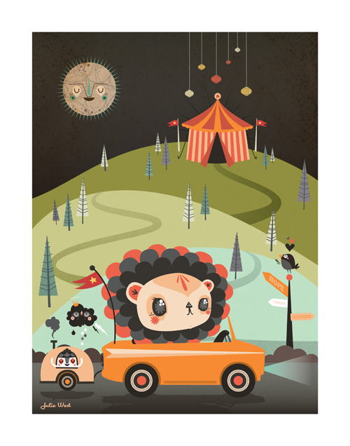
"Hope Mobile" by Julie West
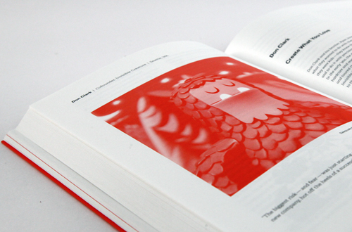
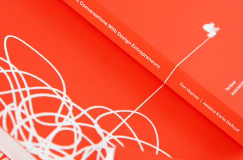
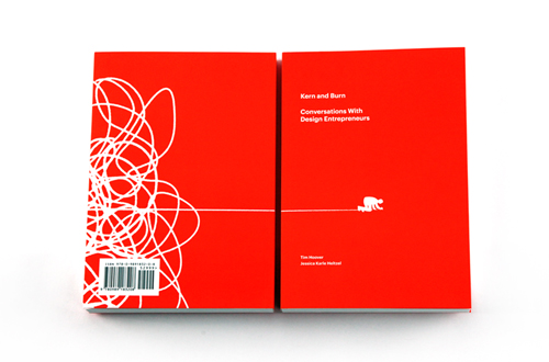 We're honored to be part of the fantastic new book Kern and Burn: Conversations With Design Entrepreneurs curated by Tim Hoover and Jessica Karle Heltzel. Featuring Aaron Draplin, Heads Of State, Arman Vit and many others.
'Kern and Burn: Conversations With Design Entrepreneurs' is a beautiful two-color book that features candid conversations with 30 leading designers who have founded startups, channeled personal passions into self-made careers and taken risks to do what they love. In this book they share their failures, successes, and perspectives. Our hope is that you can learn from them — not to follow in their footsteps, but to chart your own course in parallel, one that allows you to thrive, add value to the world and love what you do.
The entire Kern and Burn project was brought to life by a successful Kickstarter campaign, but here's where it all started. Tim and Jessica's spirit and passion for this book is an inspiration, pick up a copy if you can!

 Here's a look at the recently completed cover for August Burns Red's new album, Rescue & Restore. The album will be available June 25th on CD, double gatefold vinyl, and limited edition vinyl box set. Pre-orders available soon! We had an absolute blast putting this together. Thanks to JB and the guys for their trust and letting us run crazy with it.
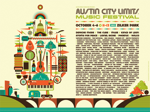

Last February, the kind folks at Austin City Limits Music Festival commissioned us to design key art and assets for their infamous 6-day event, which is happening October 4-6 and 11-13. We graciously accepted their request and the new look is now out in the wild. We had a blast compiling all that there is to love about the iconic festival, the city of Austin ... and even a little of their historic bat and flag culture. Oh, and Depeche Mode is playing?!
![]()


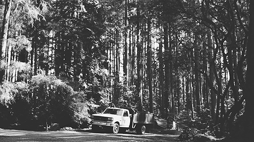
We were commissioned by our good friends at Toth Construction to produce and direct a short film documenting their rich heritage, high level of craftsmanship and the importance of building relationships. We shot this over a period of 2 weeks and used VSCO film emulation for the final edit. Music: "When I Am Old And Gray" by the Candlepark Stars.


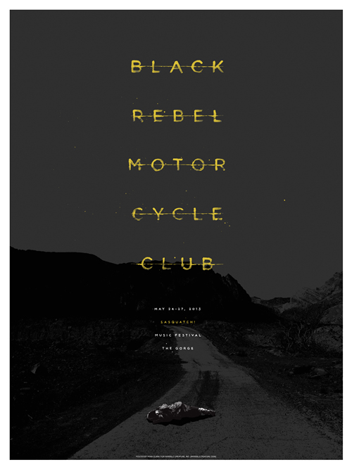
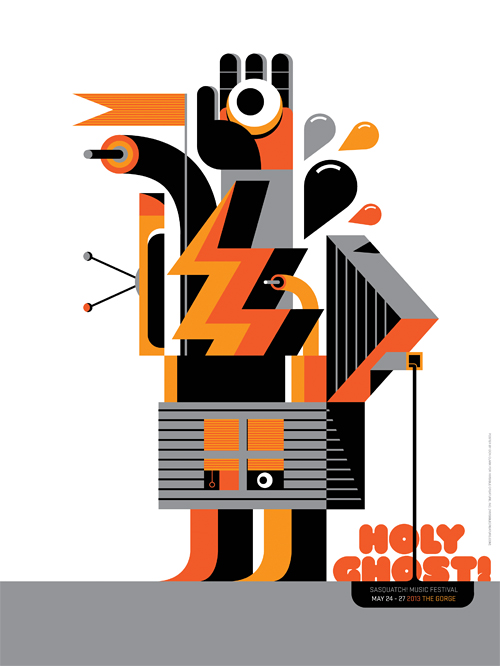 New posters for Holy Ghost! and Black Rebel Motorcycle Club for this year's Sasquatch! Festival. Available for purchase at 10AM on May 20th. See them on display at Vermillion in Capitol Hill starting May 18th, 7PM. 21+.