Filtering by Category: New Work,Environments

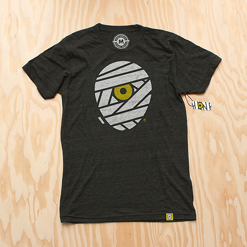
As we enter into our seventh year here at IC, we've decided to give our iconic mummy mark an upgrade.

The reenvisioning of our logomark is something we have been considering for some time. With a consciousness for particularly small uses (social media icons, products, packaging, clothing tags, etc.) we sought out for a bold, timeless mark that stands strong in every possible scenario. With a handful of new projects/products on the horizon, we decided that now is the time.

The original mark I created in 2006 was inspired by skateboard graphics and other pop art from our coming of age. Although it feels somewhat classic in its own right, the detailed style has proved to be limiting over the years.

Our goal was to create a simpler, more streamlined version of our classic "cyclops mummy," keeping its overall concept (and hopefully its recognizability) in tact, but modernized and with a broader range of usability.

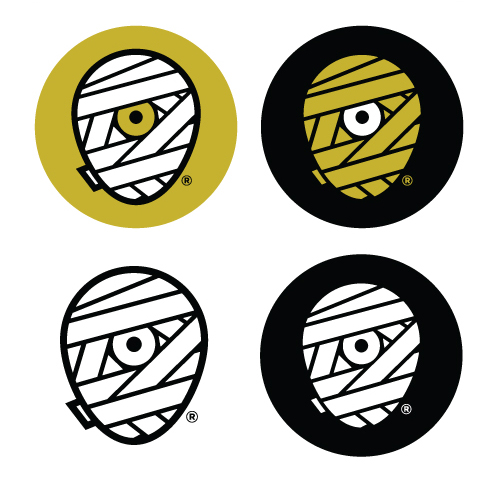
We explored a variety of shapes for the head itself - a perfect circle, a rectangle with rounded corners, etc. In the end, it was imperative that it truly convey a head shape, so we landed on what we refer to as the "egg."

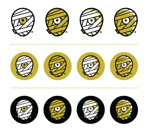
Aside from the logo's core theme, we also knew we'd be sticking with our classic color scheme. It feels as integral to our brand as the mark itself, and allows us to maintain our focus. Another benefit of this new mark is our ability to explore varying combinations of these colors depending on its use. The solid white or yellow wrap will be the primary marks, while the shaded versions - with white highlights on the yellow wrap, and yellow lowlights on the white wrap, give us more detailed options as well.

A minor but important detail was the small piece of wrap peeking around the backside of the mummy head. It's a subtle inclusion, but it truly helps the read. It was necessary that this piece be included, but without jeopardizing the true center of the new mark.

You'll also notice the inclusion of an ® mark. With the recent registration of our brand name and identity, it's time to make it official.

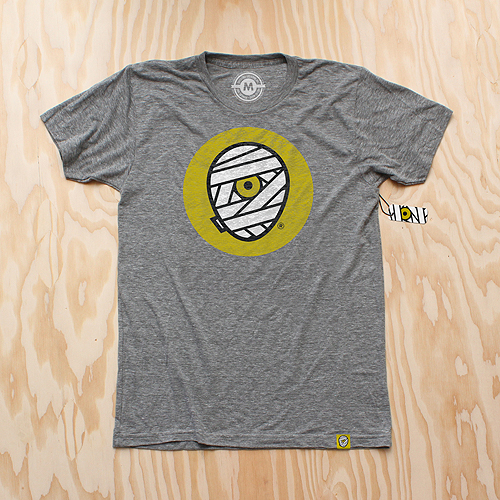
And of course, we celebrate this momentous occasion with some swag. New T-Shirts are available for pre-order (shipping mid-late September) as well as new silk-screened die-cut stickers.
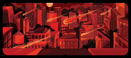
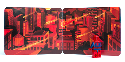
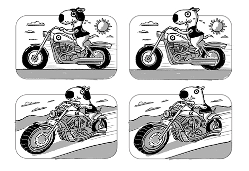
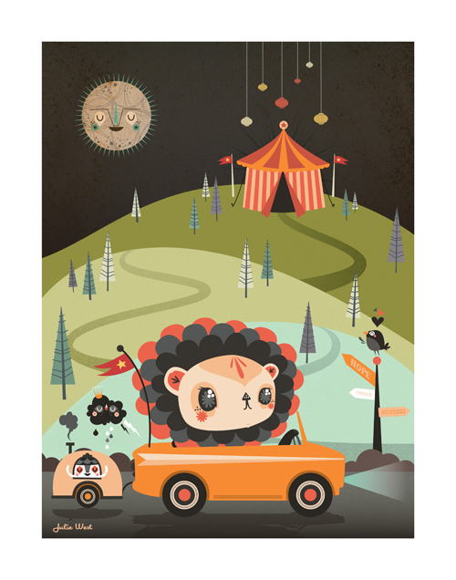
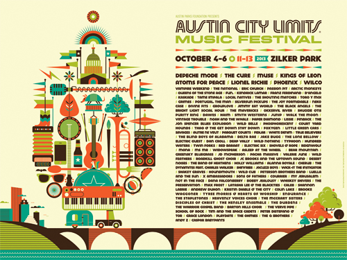
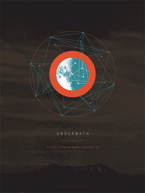
Comic-Conners! Head over to the LEGO booth and check out the FREE 2013 SDCC Exclusive Superhero Minifigures! We had the pleasure of designing and illustrating the packaging, 2 for Marvel (Spiderman & Spiderwoman) and 2 for DC (Superman & Green Arrow). Each carrier folds out to create an action-packed city backdrop for your Superhero. From what we've heard, these go pretty fast - so Tweet or Instagram us if you grab one! Gigantic thanks to Scott Decoteau and the team at LEGO for the super (get it?) fun project.

Our buddy Joby Harris, a visual strategist at NASA JPL, gave our Blast Off! pennant a tour of the facilities in Pasadena. Next time we'll accompany the pennant, but for now this is pretty freaking cool. Huge thanks to Joby for doing this! Above: The Mission Control Room.

The art studio:

At the Mission Formulation room:

At The Spacecraft Formulation Building:

The Mission Control Room lobby:

A few months ago we were approached by the kind folks at Facebook, asking if we'd be interested in creating a mural for their offices here in Seattle. It sounded like heaps of fun, so we signed up. They gave us a few keywords that represented the culture and atmosphere at Facebook. 'Making The World More Connected' and 'Hacker' got the most votes internally, so we dug into those ideas as our direction. Inspired by Ben Barry's in-house postings, we based our piece on combining both thoughts - the idea of going beyond the 'world' being more connected intrigued us. Facebook existing outside of planet Earth seems like an attainable goal, so that's where we landed. Once again we worked with our friend Don Rockwell on the application of the mural and it turned out pretty spectacular. See our quick and fun 'Making Of' film below:

Spacehack_3


We're extremely thrilled to take part in the campaign for a new film titled Gennadiy. Our friends, Steve Hoover and Danny Yourd, the visionaries behind the powerful and moving Blood Brother documentary, have been hard at work on this incredible film and are now looking to finish the project with a little help from you. Visit the Kickstarter campaign here, where you can view the trailer, read about the film, and learn all the ways you can contribute to ensure its completion!

Once the campaign reaches $10,000 the poster that we created for the film will be revealed.

Fire up the V-Twin and pick up our new Biker Bullseye Gift Card for Target - in stores now. Complete with ultra-cool chromium reflective foil stamping technology in person! Below are a few initial sketches we provided the client before we began illustrating the final card -- but see the whole process here.

Illustrator: Don Clark / Sketch Artist: Doug Oudekerk / Art Directors/Designers: Scott Gilson & David Ledsinger / Writer: Aaron Muther / Production Designer: Sarah Schroeder / Creative Manager: Ted Halbur

We're excited to reveal our new cover for Minorville, the upcoming album from Nashville's finest: Derek Minor. With the help of Curtis Clark (or 'Dad', as we like to call him), we designed this from the ground up in approx. 2 weeks. With over 100 feet of basswood and baltic birch, Dad took our design and created an entire city in 50 hours. Each structure arrived safely in Seattle, ready to be constructed in the shape of Derek's profile. When we were initially presented with the challenge of creating this album cover, this was the first concept we pitched - Many thanks to Derek and Reach Records for sending us off and running. Stay tuned for a full comprehensive "Making Of" film coming in the next few weeks, but for now - enjoy the teaser (Processed using VSCO film emulation):

We're excited to announce the launch of Heartwork 2013! We're so thankful to all of the artists that donated their time and talents this year.

What is Heartwork?

Heartwork is a project designed to raise money for art supplies within the art room at Target House — this wonderful home-away-from-home for the families of children facing long-term treatment at St. Jude® Children's Research Hospital.

The whole idea started simply enough. We, along with a few other creative individuals, were asked to work on various design projects for the St. Jude Target House. But, in the process, we were so deeply moved by the experience that we didn't want it to end. We witnessed firsthand the special connection the kids had with the art room in particular. It was a place where we saw kids at all stages of health just being kids. So, we began to wonder, "What if we could create a ongoing way to support more and better art supplies for these children?" It was then that Heartwork was born.

Every year, a group of talented artists create a series of 11" x 14" giclee prints to raise money for the art room. Each of the prints feature an interpretation of the word "Hope" and each edition is limited to only 10 pieces and signed/numbered by the artist.

Print details:

Archival giclee - printed with pigment inks on archival cotton rag paper Size: 11 inches x 14 inches with a 1" border for framing Signed & numbered editions of 10

Purchase the prints here.

2013 Artists:

"Hope" by The Heads Of State

"Black Rhino's Forge Ahead" by Always With Honor

"Wild" by Jolby

"Flower Friends" by Tad Carpenter

"My Robot Friend" by Kevin Tong

"Thick-Lined Valley Of Love" by Aaron Draplin

"Growth" by Mike Perry

"Create Yourself" by Don Shank

"Upswing" by Invisible Creature

"Hope Mobile" by Julie West

abr_rescue_cover Here's a look at the recently completed cover for August Burns Red's new album, Rescue & Restore. The album will be available June 25th on CD, double gatefold vinyl, and limited edition vinyl box set. Pre-orders available soon! We had an absolute blast putting this together. Thanks to JB and the guys for their trust and letting us run crazy with it.

Last February, the kind folks at Austin City Limits Music Festival commissioned us to design key art and assets for their infamous 6-day event, which is happening October 4-6 and 11-13. We graciously accepted their request and the new look is now out in the wild. We had a blast compiling all that there is to love about the iconic festival, the city of Austin ... and even a little of their historic bat and flag culture. Oh, and Depeche Mode is playing?!


What happens when two ex-Altec Lansing guys, an architect/furniture designer and a liquor industry operational expert come together? Grain Audio. Check out the great video and bio over at their Kickstarter page to learn more. Better yet, pledge some of that hard-earned cash and make this dream a reality. The products are beautiful and they sound even better. We even designed a poster to help seal the deal. Go!

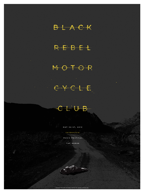
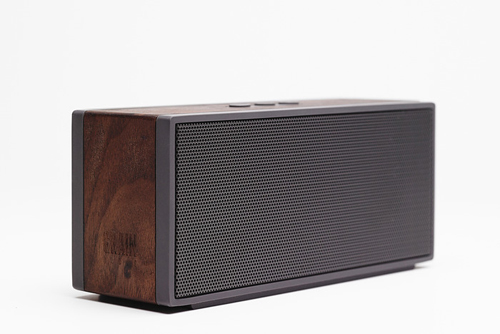
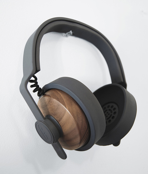
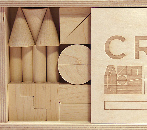
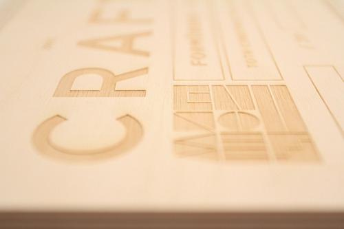
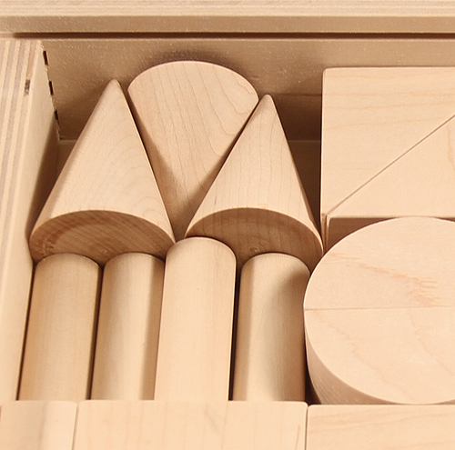
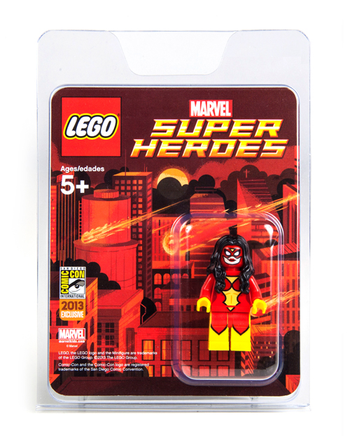
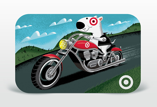
Our latest product for Target is in stores now ... and it's a fun one. Captain Bullseye's Build-A-Plane! Gift Card is a whopping 21 pieces of snap-together awesomeness. Complete with accents of metallic silver, a spinning propeller and a display stand that doubles as a cloud/Gift Card holder. See more here and purchase here. As always, big thanks to our A.D.'s Ted Halbur and Brian Holt. You are now free to move about the toy shelf.


Our friends in Underøath asked us to contribute a design dedicated to one show of their upcoming farewell tour. This design (for both poster and t-shirt) specifically commemorates the Houston, TX date of the tour. If you have a chance, don't miss seeing this band for the last time, and be sure to check out all of the final tour designs created by friends of the band here.

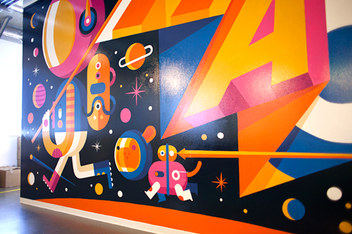
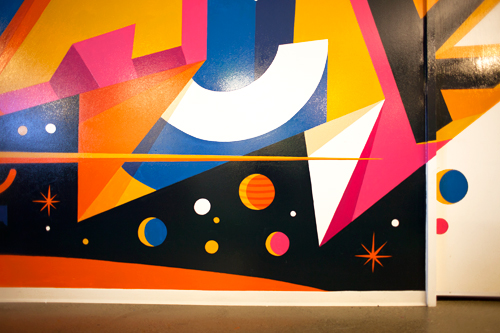
Our friends Klaus & Erik over at Toth Construction commissioned us to design a set of wooden architectural nesting blocks for their top tier clients this holiday season. Each hand-signed and numbered set includes a sliding laser-etched Russian birch wood lid and 19 individual sugar maple blocks. Special thanks to Jonathan Cowles over at Patronus Design for meticulously handling the production of each set. We also collaborated with Rachel Brandzel to create hand-made letterpressed cards to accompany each box. Oh, and do yourself a favor by perusing one of Toth's latest works of art, designed by Jim Olson.

To commemorate Demon Hunter's ten years, we've created a silkscreen poster featuring imagery from all six studio albums. This is a limited pressing of 100, signed by Ryan Clark (me), and is available in the store now. Order by December 20th for holiday arrival! (orders for this poster do NOT include IC Holiday Giveaway print)