We often get asked what our process is like. While we have multiple ways of conceptualizing and pitching ideas, the 3-step process that I'm going to outline below is pretty standard fare for us, as I'm sure it is with many illustrators. Sketch, sketch some more, sketch again, then on to final. 'Final' for us, usually means we hop into Illustrator and block out shapes. Once we have our shapes dialed and approved, we move on to lining and shading in Photoshop. There are many times when we start and finish in Photoshop as well, but a typical project like this will begin as vector art. I thought it might be fun to break down the evolution of an illustrated project, specifically a Gift Card for Target.
Let us begin ...
With the majority of art direction already fleshed out by the wonderful team at Target, we're given the project and asked to create sketches based on their initial ideas. Since their initial ideas are always completely awesome, it's a joy to build off of them. The name of this particular card is 'Glow-In-The Dark Space Maze'. In this case, it's a card that doubles as a glow-in-the-dark space maze that doubles as a spaceship. Wait, is that triples as? ... Nevermind.
The first task is the game itself. The manufacturer needs to get started on producing these suckers, so the game dieline is first priority. After a few sketches, we dial it down and come up with our shape.

After the basic game shape is a wrap, we get to the fun part - figuring out the maze! After heading to the store to pick up a few similar maze games, we play, throw down to the floor and curse at said maze games. Once we think we know what we're doing, we start to sketch out our walls. To make it easier, we're given the ball diameter and wall thickness before we begin. After a zillion attempts, the sketch below is the winning configuration - which means anyone under the age of 5 can conquer the game in under 1 minute while the rest of us need about an hour.
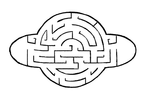
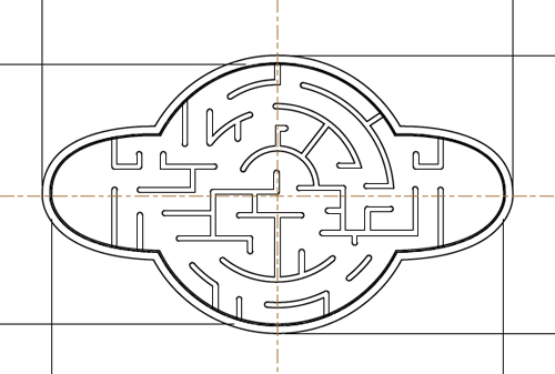
After the sketch is approved (and tweaked a little), we move to final vector art for the manufacturer. Bada-bing:
After the game material is off being made, it's time to move into final art. With the nature of this card being glow-in-the-dark, the client asks that we use bright colors. Done. Here are a few colors we pitched:
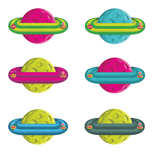
... as well as this color scheme, which ultimately gets chosen.
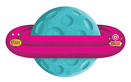
So now that the game itself is done, time to start sketching the actual card backer - which is always a big chunk of the fun. We sent the client a few options, with this particular idea taking home the trophy ...
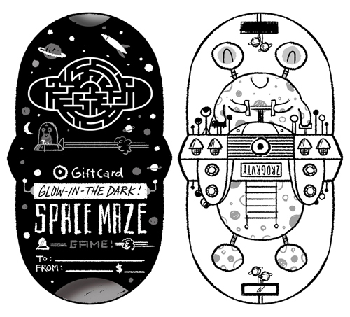
So now what's next? You guessed it. A few tweaks, then on to Illustrator. That's when we start blocking out shapes and finalizing color schemes. After a few rounds of small revisions, we have our final ready for shading ...
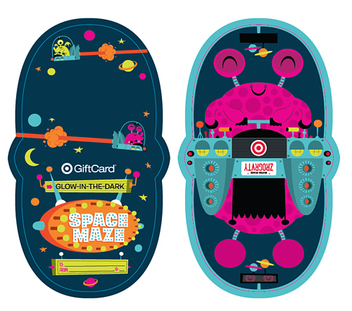
And there you have it ... a finished Gift Card. That was fun, right? Now it's your turn.
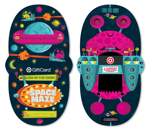
See it a bit larger in our portfolio. Now go grab one and keep the cursing to a minimum please.
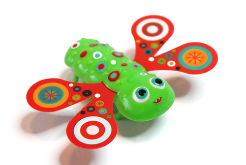
 If you have a son between the ages of 4 and 10, you probably know all about Hexbug. We've had the Nano habitat fired up at our place for awhile, so when our friends at Target asked if we'd like to design our own, my son (and his dad) gave an ecstatic and audible thumbs up. The Hexapillar Gift Card goes from caterpillar to butterfly in seconds flat and comes alive with one flip of the switch. In stores now. See it a tad larger here.

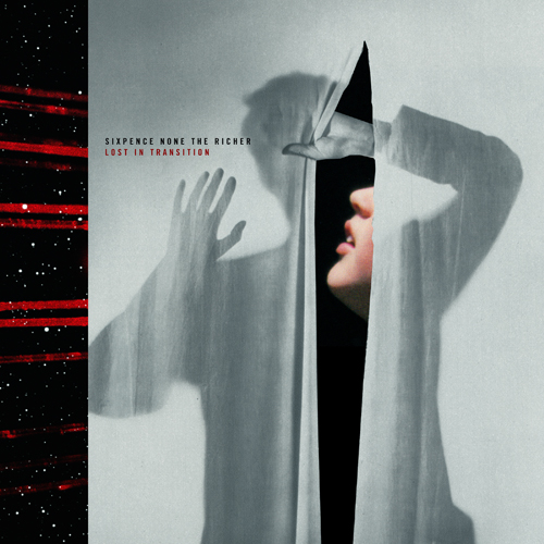 Here's our cover for
 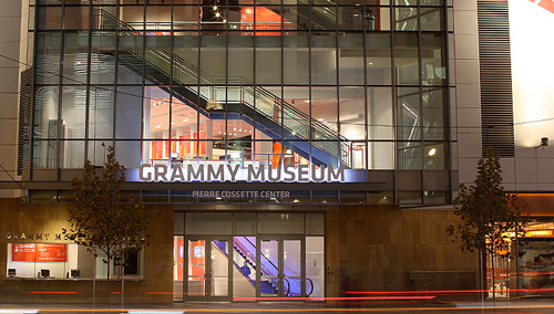 We're honored to have our work featured in The Grammy Museum's new installation "
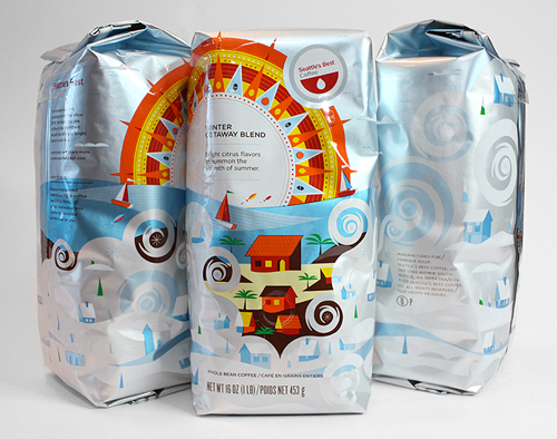
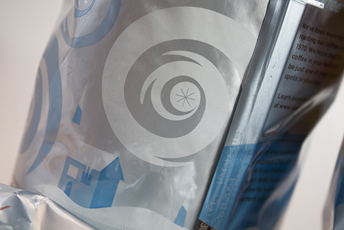
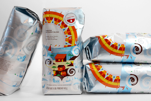 Looking for a little sun amidst those long, cold and blustery days? We suggest the new 'Winter Getaway Blend' packaging we created for
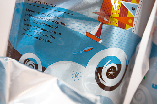
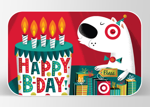 Happy New Year! We have two new Gift Cards hanging out on various
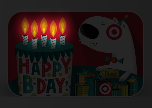

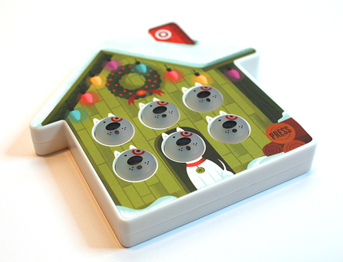
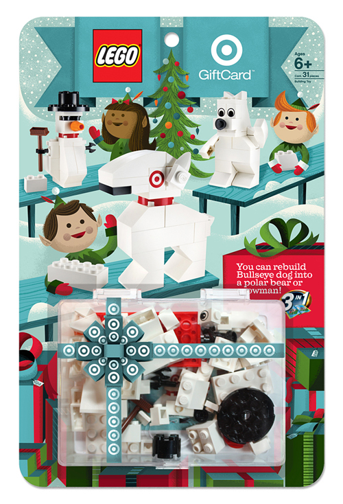 Ahhhh, our favorite time of year is back. The two Frank's (Sinatra & Capra), Yuletide logs, eggnogs, and Lord Of The Rings DVD extras in our pajamas. And of course, the great seasonal goodies at
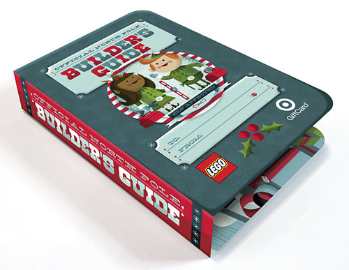
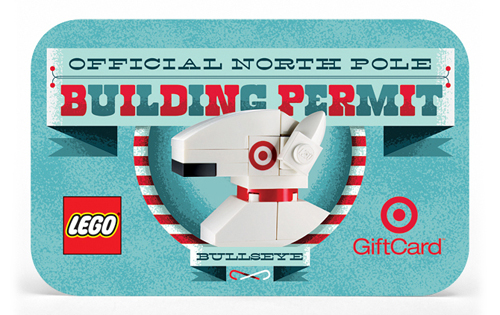
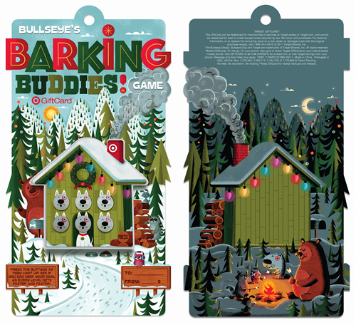








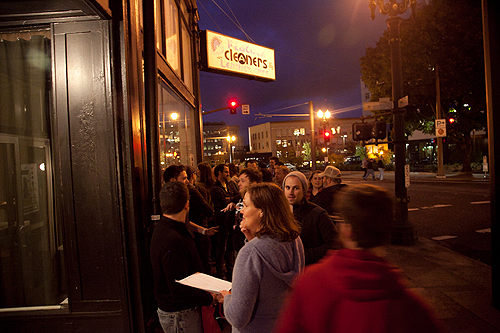


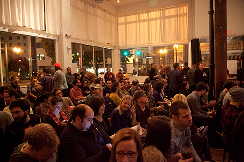
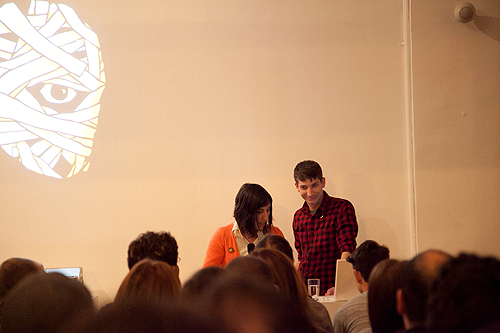
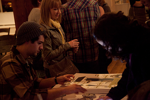
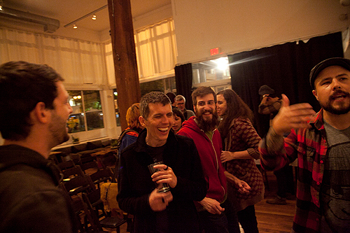
 You may have seen a fairly vague posting regarding this last week, but here's the lowdown:
 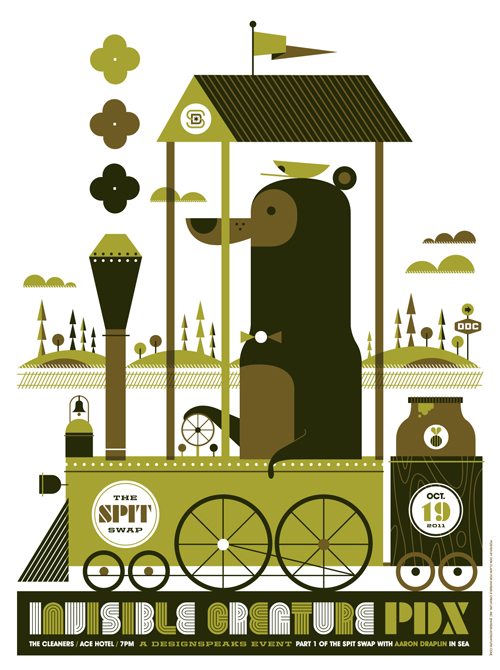 We'll have 100 of these 3-color silk-screened posters for sale at our
 It's 100% official and tickets are now
  Something awesome is unraveling. IC vs.

 We recently had the luxury of working with
  We're honored that we could
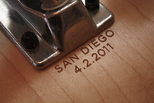
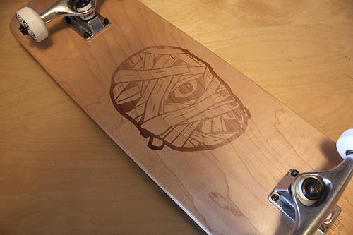
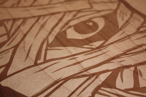
 We're honored to have a few projects for


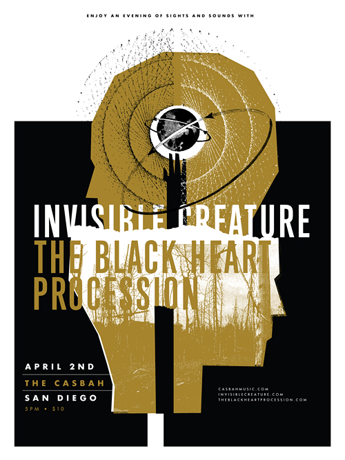 Last year, our buddy
 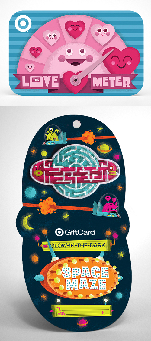 Our latest Gift Cards for Target,