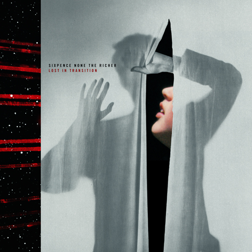
 Here's our cover for Sixpence None The Richer's great new album, Lost In Transition.
Filtering by Category: Packaging,Bum Out
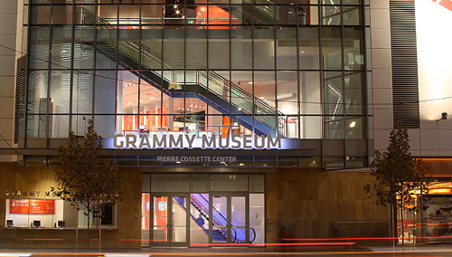 We're honored to have our work featured in The Grammy Museum's new installation "The History Of Heavy Metal", opening April 11th. The exhibit opening coincides with The Golden Gods and will feature numerous album covers from our early years within the heavy music genre. The show will be up for one year and definitely worth checking out.
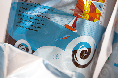
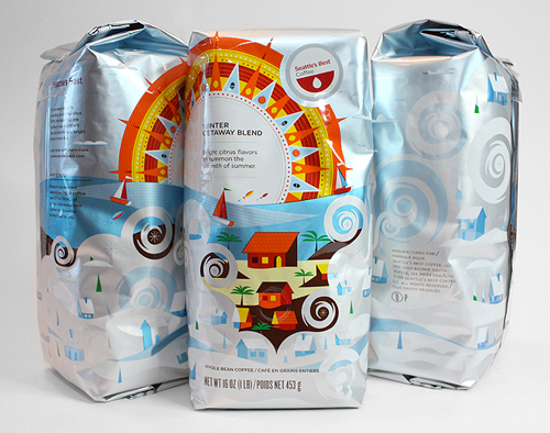
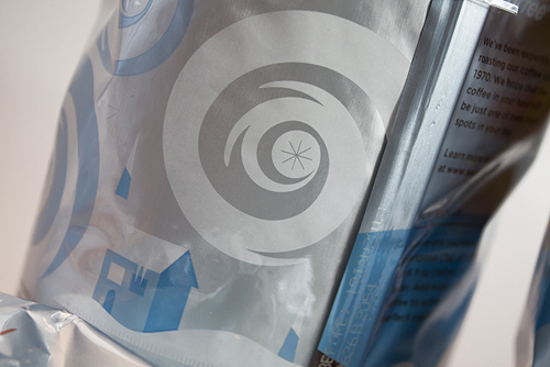
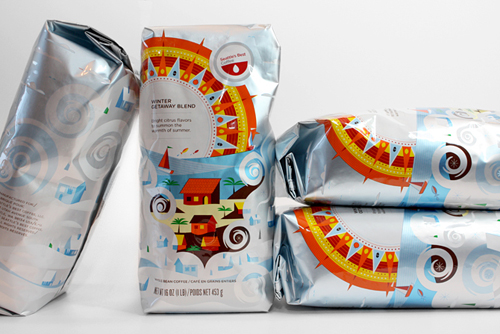 Looking for a little sun amidst those long, cold and blustery days? We suggest the new 'Winter Getaway Blend' packaging we created for Seattle's Best Coffee and the fine folks at Creature. As obvious fans of all things caffeinated, this was a real treat to work on. Big thanks to Dave Taylor, Kaylin Fitzpatrick and Cara Schwartz at Creature for the fun project. Get a slightly closer look in our portfolio. Only available in SBC Cafe's.

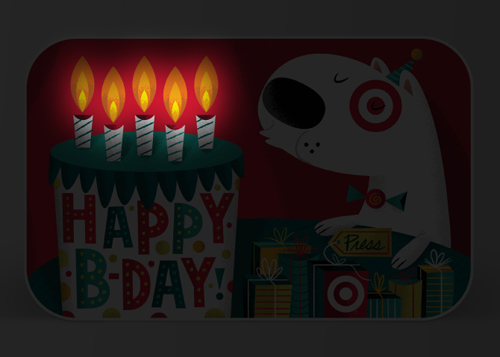
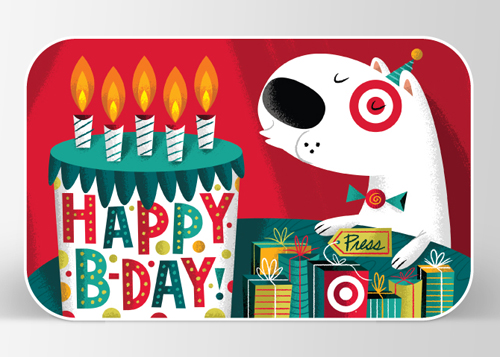 Happy New Year! We have two new Gift Cards hanging out on various Bullseye end caps throughout the nation. The first one actually features candles that light up and turn off as you blow them out! Pretty cool technology and sure to cure those winter blues. Grab it here.
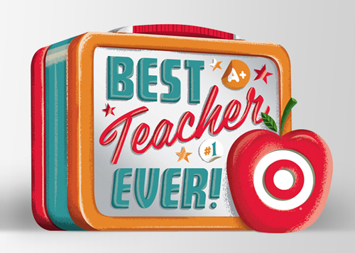
The second one is for that special teacher in your life. Featuring a cool embossed reflective 'vintage lunchbox metal' type material. Pick one up here.
Always a fun time. Art direction: Rob Weaver, Kelly Gray and Ted Halbur.
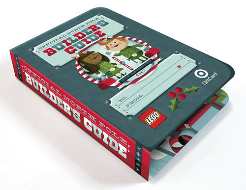
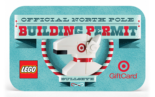
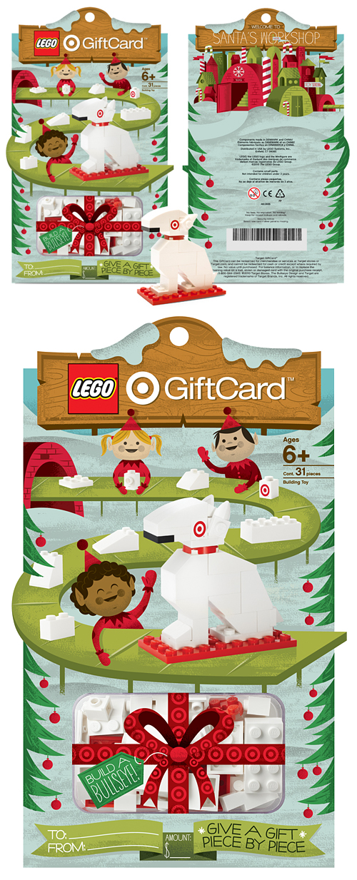
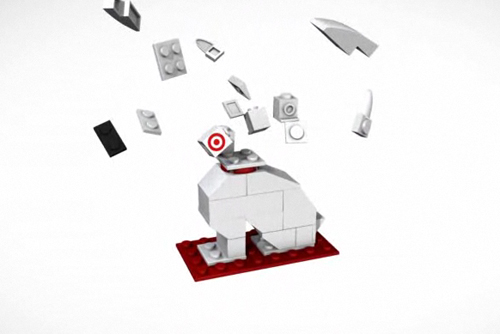
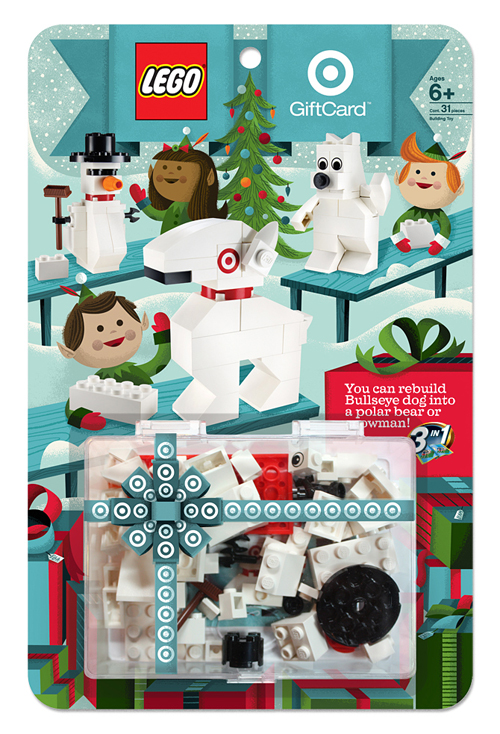 Ahhhh, our favorite time of year is back. The two Frank's (Sinatra & Capra), Yuletide logs, eggnogs, and Lord Of The Rings DVD extras in our pajamas. And of course, the great seasonal goodies at Target. We were lucky enough to work on two fun stocking stuffers this Holiday season. Last year, the LEGO Build A Bullseye set was such a hit, we were asked to come back for round two. And to make the kids (and us) even more ecstatic, you can create a polar bear and snowman in addition to Bullseye dog. It all folds up into a gift-able size for that special someone. Sequels are supposed to be better, right?
And the gifts keep coming ... We were also asked to design and illustrate a super-fun (and addicting) interactive game featuring our favorite pooch. The big idea: Can you pat the dogs as quickly as they light up without losing your cool? Oh, and each level gets more and more insane as you continue to play. Lights, barking, action. Find them both in-store or online now.
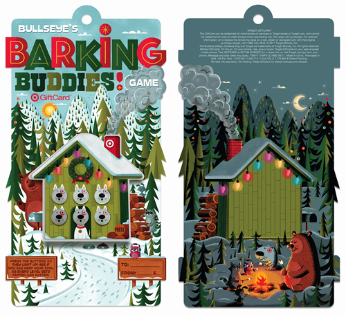
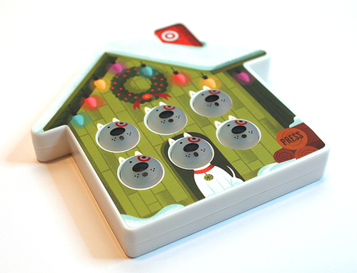

Art direction: Brian Holt, Rob Weaver and Ted Halbur. Once again, extra special thanks to the team at Target.
 You may have seen a fairly vague posting regarding this last week, but here's the lowdown: Low & Behold is a new project band that J Martin and I have been working on for a few years now. In a nutshell, it's really stripped-down classic goth/new wave- for those of you that dig on the likes of Depeche Mode, Sisters Of Mercy, etc. The first release, a 12" single titled Blood Red, is available for pre-order now here. The record features the title track, plus a b-side (Violent Sound), packaged in a gatefold sleeve, with a 11" x 11" 2-sided art print. So, yes, $9 is a steal.


It's officially summer. At least that's what we've been told anyways. Join in the fun by grabbing our new Splash 'N Squirt and Happy Birthday Gift Cards. Many thanks to our awesome A.D.'s: Brian Holt, Ted Halbur & Aaron Muther!
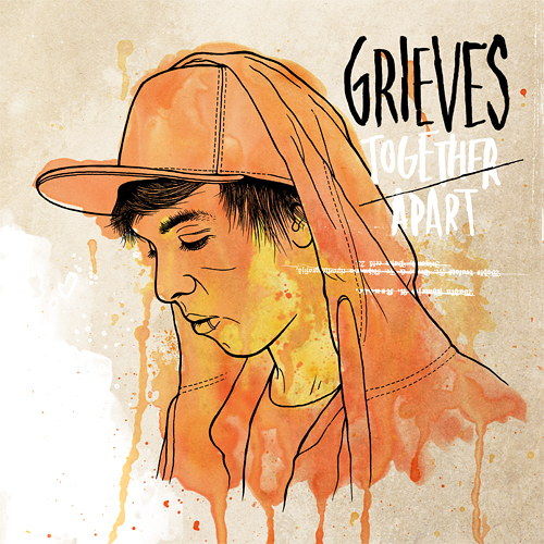 We recently had the luxury of working with Rhymesayers Entertainment once again, this time for Seattle-based artist Grieves. RS is one of the only labels still investing their time, effort and finances into elaborate physical packaging... because they care and they believe their listeners deserve it. And obviously we love any opportunity to work with cool, innovative people to create unique packaging and artwork. Check out this video of the new Grieves package for "Together/Apart," and be sure to pick up the record June 21st.
 We're honored that we could help out with Target's 7 cube win the other night at AIGA Minnesota's annual Design Show. Go Bullseye.
 We're honored to have a few projects for
 We often get asked what our process is like. While we have multiple ways of conceptualizing and pitching ideas, the 3-step process that I'm going to outline below is pretty standard fare for us, as I'm sure it is with many illustrators. Sketch, sketch some more, sketch again, then on to final. 'Final' for us, usually means we hop into Illustrator and block out shapes. Once we have our shapes dialed and approved, we move on to lining and shading in Photoshop. There are many times when we start and finish in Photoshop as well, but a typical project like this will begin as vector art. I thought it might be fun to break down the evolution of an illustrated project, specifically a Gift Card for Target. Let us begin ...
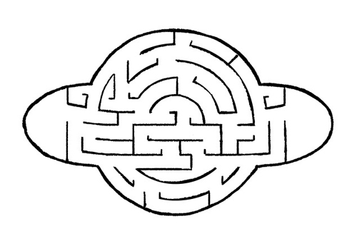
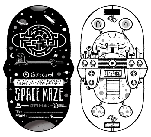
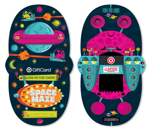
With the majority of art direction already fleshed out by the wonderful team at Target, we're given the project and asked to create sketches based on their initial ideas. Since their initial ideas are always completely awesome, it's a joy to build off of them. The name of this particular card is 'Glow-In-The Dark Space Maze'. In this case, it's a card that doubles as a glow-in-the-dark space maze that doubles as a spaceship. Wait, is that triples as? ... Nevermind.
The first task is the game itself. The manufacturer needs to get started on producing these suckers, so the game dieline is first priority. After a few sketches, we dial it down and come up with our shape.

After the basic game shape is a wrap, we get to the fun part - figuring out the maze! After heading to the store to pick up a few similar maze games, we play, throw down to the floor and curse at said maze games. Once we think we know what we're doing, we start to sketch out our walls. To make it easier, we're given the ball diameter and wall thickness before we begin. After a zillion attempts, the sketch below is the winning configuration - which means anyone under the age of 5 can conquer the game in under 1 minute while the rest of us need about an hour.
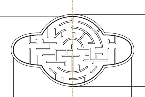
After the sketch is approved (and tweaked a little), we move to final vector art for the manufacturer. Bada-bing:
After the game material is off being made, it's time to move into final art. With the nature of this card being glow-in-the-dark, the client asks that we use bright colors. Done. Here are a few colors we pitched:
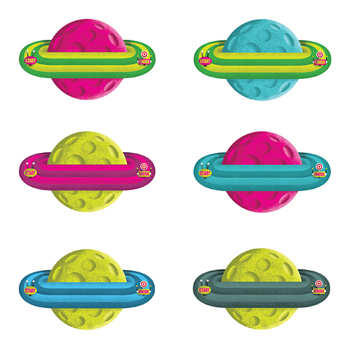
... as well as this color scheme, which ultimately gets chosen.
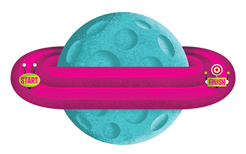
So now that the game itself is done, time to start sketching the actual card backer - which is always a big chunk of the fun. We sent the client a few options, with this particular idea taking home the trophy ...
So now what's next? You guessed it. A few tweaks, then on to Illustrator. That's when we start blocking out shapes and finalizing color schemes. After a few rounds of small revisions, we have our final ready for shading ...
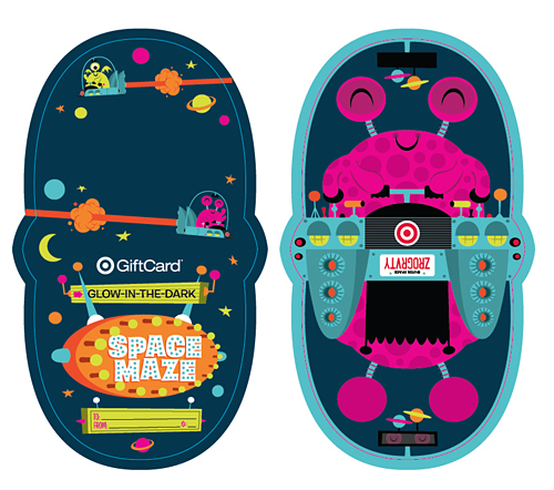
And there you have it ... a finished Gift Card. That was fun, right? Now it's your turn.
See it a bit larger in our portfolio. Now go grab one and keep the cursing to a minimum please.
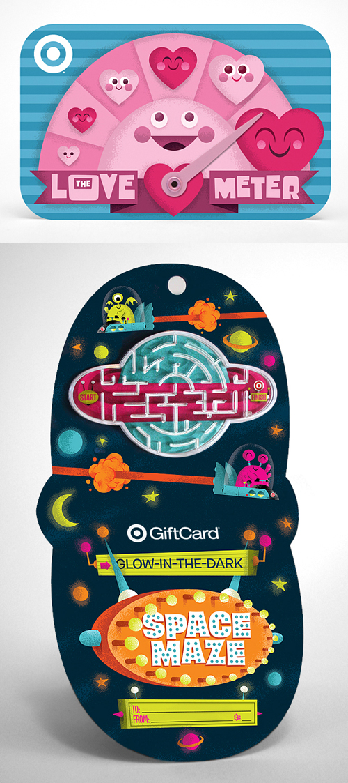 Our latest Gift Cards for Target, The Love Meter and Glow-In-The-Dark Space Maze are now available in stores or online. Grab one for that special someone, and two for yourself.
 We'll never forget that day in 1983 that our mom brought home a bag of Legos the size of a small car. She had picked it up at a garage sale (who sells Legos?) for $8. From that point on, we were hooked. For obvious reasons, Legos ended up being our favorite toy for years to come - and as with most things in parenting life, it's come full circle and is now my son's favorite toy. Like many folks, those bricks have been a big part of our family.
So as you can imagine, I wish I could hop in one of these to go back and tell my 8-year-old self about our newest project for Target, the Lego Build A Bullseye! Gift Card. We've been fortunate to work on many cool projects over the years, but this one was sorta special. We actually wrapped this up in May, so it's fun to finally see it in stores for the holidays.

Below are some shots of the carrier on press a few months back:


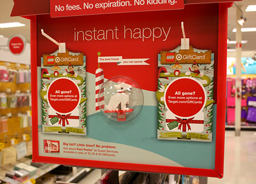
And here is the endcap fixture at the store. They were sold out at noon today, so I'm guessing there are other human beings that like Lego as well.
Thanks to our (always) amazing art director Ted for the brains behind this project, and the fine folks at LEGO for giving us the green light.
Oh, and check out the cool little animation below:
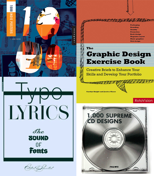 Here's 4 new (ish) books that we've been featured in recently: 1000 Indie Posters by John Foster (out in January), The Graphic Design Exercise Book by Carolyn Knight and Jessica Glaser, Typo Lyrics by Slanted and 1000 Supreme CD Designs by PageOne (This one actually came out in '08 but we spaced on it). Now you know what to get your favorite uncle for the holidays.
 In this series I'm going to try my best not to compare apples to oranges. I understand there are vast differences in technology, ideology, legality, etc between designs of the past and designs of the present. However, I believe there was, is, and will always be a way to almost objectively design something properly. To me, this means a design that is well executed, aesthetically pleasing and properly communicative... in relation to whatever is being "sold."
TWIW, V.2 is in regard to travel advertising. In this case, specifically cruises. Here are my thoughts on the ads in question:
1. I don't even know where to start. How about the copy? Clearly one is simply advertising a specific cruise ship, while the other goes into much more detail about the price, locations, discounts, dates, etc., but that in itself says something about modern advertising's problem with forcing too much information into a single ad. Add to that the tragedy of 5+ arbitrarily used fonts and typesetting that seems to make no sense at all. Except of course for the legal line, which is strategically set in black type over a dark portion of the image. Crafty.
2. We used to marvel at things like the massive Cunard cruise ship, shown above. But as technology and engineering progress, we're less interested in how we'll be getting to our destination and more interested in where it's taking us (and how much it will cost). But aren't these ads for the cruise itself? If you just want to go to The Bahamas, you can fly there in a fraction of the time. This is about the experience of the cruise. And as you can see in the more recent ad, the actual cruise ship has become an afterthought; a footnote.
3. As for the imagery, we're faced with the obvious difference between professional designer and someone with a personal computer. Before the computer we relied on professionals to do the job of advertising. They were skilled in their craft. They knew type and composition and cohesion and color. They designed because they were good at it. I know I'm stating the obvious here, (and there's a heaping helping of irony as I sit here and type this) but it's a bit of a bummer that the computer has turned every civilized human into a jack-of-all-trades.
4. In the end, one is clearly worth framing and displaying in your home, and the other is sure to end up in a trash bin. I refuse to believe that we collect things that are "vintage" purely based on nostalgia. The bottom line is that, in most cases, that old stuff is flat out better than the garbage that we see today.
 I had the idea a while back to post about the perils of modern design, specifically in regard to rebranding, the evolution of a particular design and things of that nature. I've decided to finally pull the trigger and go for it. As my brother has begun posting a series dedicated to our grandfather, I thought this might be the right time. After all... the time period in which our grandfather was designing will often be the era in which my postings will refer to.
"The Way It Was" will be a study (and occasional pseudo-rant) about a particular design of the past, and a directly (or at least somewhat) related piece from recent years.
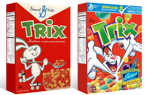
TWIW #001 is based on an email conversation I had with a few like-minded friends a couple of years ago. The subject in this case is a box of Trix cereal. Target had announced that it was re-issuing old General Mills cereal box designs for a limited time, (God bless design-savvy corporations) and in being reminded of that classic old box design, I couldn't help but dissect the modern design and suppose what it's trying to tell today's consumer. Here are my thoughts:
1. The logo, once simple and bold, is now 3-dimensional, has a white stroke, yellow bevel, and emboss. ALL of which have gradients. Somehow this "pops" more.
2. Since brand loyalty is dead, the nice big General Mills logo at the top of the box (which I'm sure used to assure people of the reliability and integrity of the product) is replaced by a very small GM logo, overpowered by a "whole grain guarantee" and a list of other nutritional values. Not that nutrition is anything to shrug at, but let's be real- this is Trix.
3. The cereal itself isn't enough anymore, so there has to be added incentive to buy. In this case, there's an ad for "fruitalicious" games on the back of the box.
4. The fun-loving bunny on cute roller skates is replaced by (honestly) what seems to be an INSANE rabbit, literally throwing Trix at you.
5. Lastly, and probably most importantly, the modern box has a disclaimer sentence that reads something like "cereal shown not actual size," because people are so stupid (or assumed to be so stupid) that they can't comprehend that the 1" macro-lens-photographed meteor puffs on the front of the box are bigger than they actually are.
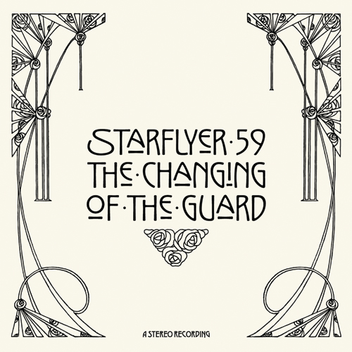 Just wrapped up the artwork for Starflyer 59's 12th album, "The Changing Of The Guard." The music, as always, is incredible... and it's always refreshing to work with Jason Martin, a guy who truly "gets it."
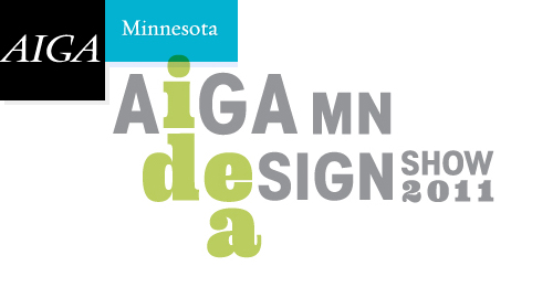
 We are extremely honored that the Minnesota chapter of the AIGA recently recognized all of our 2009 Target projects in their annual Design Show. See details here and here. Many thanks to our incredible A.D.'s over at the bullseye. More fun stuff to share coming soon ...
Super cool 'Thumb War' gift card created by our buddy Christopher Lee.
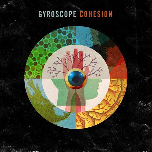 We just wrapped up the cover for 'Cohesion', the new album from Perth's own