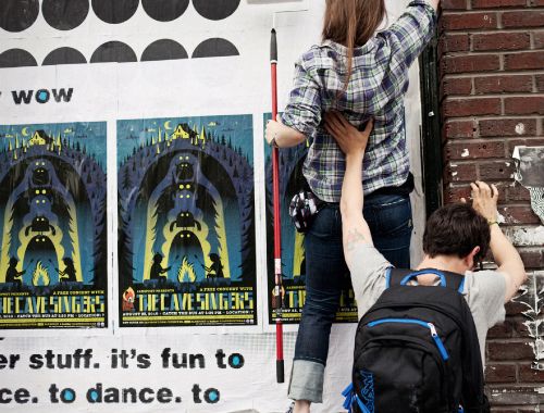
Filtering by Category: Seattle,Bum Out
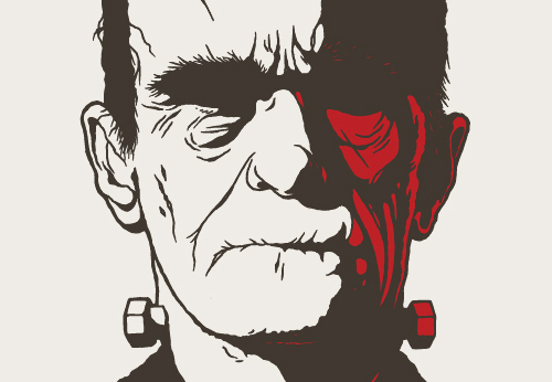
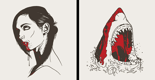
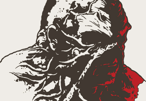
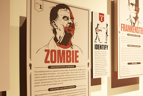
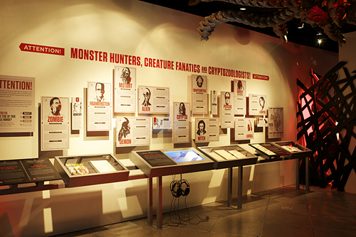
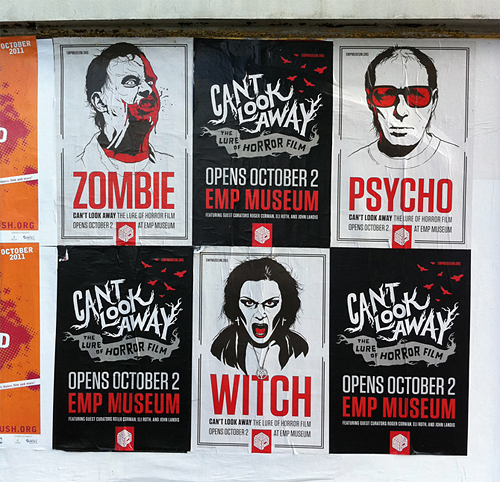
We are very pleased to be contributing to EMP's new exhibit exploring the world of horror film and the human experience it produces. Can't Look Away: The Lure Of Horror Film features 19 of our illustrations, some truly amazing artifacts, interactive experiences, and information galore. We got a sneak peek at the show, and it's absolutely incredible! Do yourself a favor and check it out- open to the public October 2nd. And check out the portfolio for a more extensive look at the work!
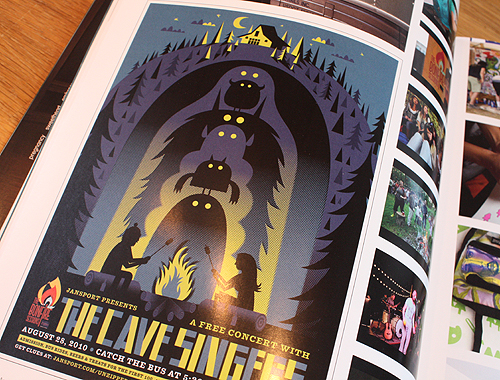
Thanks to our good friends at the other Creature for including our work together with JanSport in their Communication Arts story this month.
 It's 100% official and tickets are now
  Something awesome is unraveling. IC vs. DDC. Portland and Seattle. October 19th and 20th.
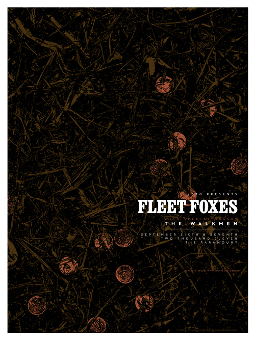 Here's a glimpse at our poster for 2 upcoming Fleet Foxes shows here in Seattle. The concept comes from a song called "The Shrine" (from their latest record, Helplessness Blues) where the lyrics speak of an old dried-up fountain filled with forgotten pennies. In this case, the pennies are actually metallic copper ink. In the store soon!
 Here's our new poster for Iron & Wine's upcoming show at The Paramount. In the shop September 11th.
 Here's our poster for Ben Harper's upcoming show at Marymoor Park on 8/27. In the shop on 8/28.
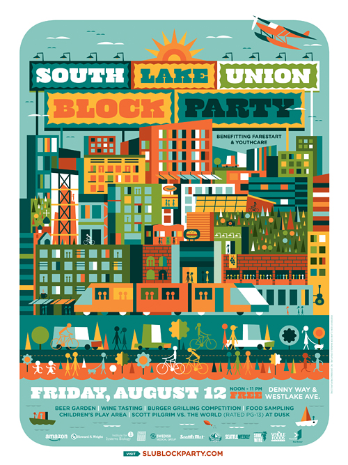 If you're local, you've undoubtedly heard the buzz about Seattle's next great neighborhood: South Lake Union. With hot new restaurants + retail spots, Amazon's brand new HQ, a beautiful waterfront and loads of new modern living spaces - the 'SLU' neighborhood is definitely the new destination within the city. IC was challenged with the task of developing a simplified and whimsical take on the neighborhood by the fine folks at Vulcan in conjunction with their annual Block Party blowout. If you are familiar with the area, you may have a little fun locating a few hot spots.
Block Party posters are available at the event on August 12 and we'll have a few in our shop on August 13th.
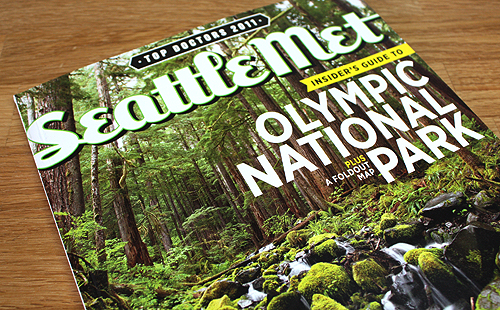
You can grab (and unfold) the full SLU neighborhood poster (below) by picking up the latest issue of Seattle Met magazine, on newsstands now.

A few details:
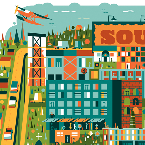

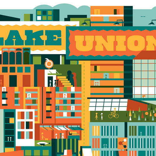
Huge high-fives to Josh Lackey and Larry Asher for making this such a fun project to work on. See it a tad bigger here.
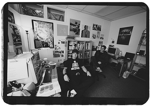 Stumbled upon this yesterday. Circa 2001 with Mr. Arges at our first studio - almost 10 years ago exactly. Where did all the time go?
 We recently had the luxury of working with Rhymesayers Entertainment once again, this time for Seattle-based artist Grieves. RS is one of the only labels still investing their time, effort and finances into elaborate physical packaging... because they care and they believe their listeners deserve it. And obviously we love any opportunity to work with cool, innovative people to create unique packaging and artwork. Check out this video of the new Grieves package for "Together/Apart," and be sure to pick up the record June 21st.


The pink and black attack are back! It's always fun working with Seattle's favorite kid-rockers.


When asked if we'd be interested in creating a poster for the new EMP exhibit 'Nirvana: Taking Punk To The Masses', we had to think about it for about zero seconds. After listening to each record a few times, I decided to base my concept on the song 'Scentless Apprentice', my favorite track from In Utero. Many thanks to Chris, Jacob and the EMP for asking us. Pick one up here (we only have 15 of these suckers) and be sure to check out the exhibit if you find yourself in these parts.
2-color (metallic silver and black) silk-screened poster on white stock.
 Just wrapped up a new poster for Against Me! at this year's Sasquatch! Festival. I used my own vest for this one. Metallic brown and black. Check our store for this one in a few weeks!
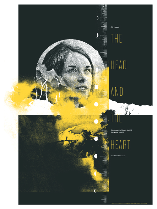 Here's a look at the poster we just wrapped up for The Head And The Heart, who will be playing 2 shows here in Seattle at the end of April.
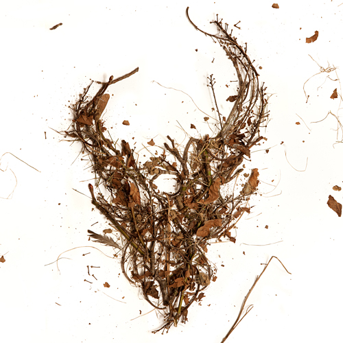 Here is the cover for an upcoming Demon Hunter release featuring the first 3 albums in one package. The 3 disc set will be available everywhere March 8th. If you've had trouble finding these older releases in a store near you, here's the chance to get them all (and cheaply). As always, the DH demon skull graces the cover, this time made from the trees of my back yard. I gathered up some fallen branches and leaves, constructed the logo on a large sheet of white paper, and Jerad Knudson shot the photo.


We recently completed posters for 2 events serendipitously taking place on the same night (January 22nd), albeit across the nation from one another. Aziz Ansari will be knocking the socks off of a presumably packed house at Carnegie Hall, while I'll be here in Seattle, in awe of White Lies and all of their glory. The Aziz poster is 5 colors, and White Lies is 2 colors, both of which feature metallic silver ink. In the store now!
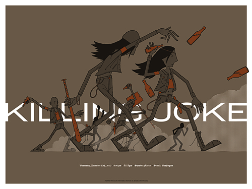 I couldn't pass up the opportunity to design a poster for one of my favorites, Killing Joke. Their music is like the soundtrack to the apocalypse, so naturally, a punk-orchestrated riot seemed like the perfect direction.
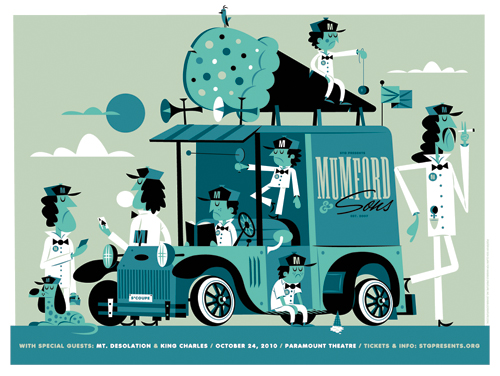 It's a slow day for Mumford and his offspring. Here's our new poster for the Mumford & Sons show happening on 10/24 at The Paramount. These will be in the shop on 10/25. Oh, be sure to sign up to our mailing list to get the scoop on upcoming poster and product releases.
 In this series I'm going to try my best not to compare apples to oranges. I understand there are vast differences in technology, ideology, legality, etc between designs of the past and designs of the present. However, I believe there was, is, and will always be a way to almost objectively design something properly. To me, this means a design that is well executed, aesthetically pleasing and properly communicative... in relation to whatever is being "sold."
TWIW, V.2 is in regard to travel advertising. In this case, specifically cruises. Here are my thoughts on the ads in question:
1. I don't even know where to start. How about the copy? Clearly one is simply advertising a specific cruise ship, while the other goes into much more detail about the price, locations, discounts, dates, etc., but that in itself says something about modern advertising's problem with forcing too much information into a single ad. Add to that the tragedy of 5+ arbitrarily used fonts and typesetting that seems to make no sense at all. Except of course for the legal line, which is strategically set in black type over a dark portion of the image. Crafty.
2. We used to marvel at things like the massive Cunard cruise ship, shown above. But as technology and engineering progress, we're less interested in how we'll be getting to our destination and more interested in where it's taking us (and how much it will cost). But aren't these ads for the cruise itself? If you just want to go to The Bahamas, you can fly there in a fraction of the time. This is about the experience of the cruise. And as you can see in the more recent ad, the actual cruise ship has become an afterthought; a footnote.
3. As for the imagery, we're faced with the obvious difference between professional designer and someone with a personal computer. Before the computer we relied on professionals to do the job of advertising. They were skilled in their craft. They knew type and composition and cohesion and color. They designed because they were good at it. I know I'm stating the obvious here, (and there's a heaping helping of irony as I sit here and type this) but it's a bit of a bummer that the computer has turned every civilized human into a jack-of-all-trades.
4. In the end, one is clearly worth framing and displaying in your home, and the other is sure to end up in a trash bin. I refuse to believe that we collect things that are "vintage" purely based on nostalgia. The bottom line is that, in most cases, that old stuff is flat out better than the garbage that we see today.