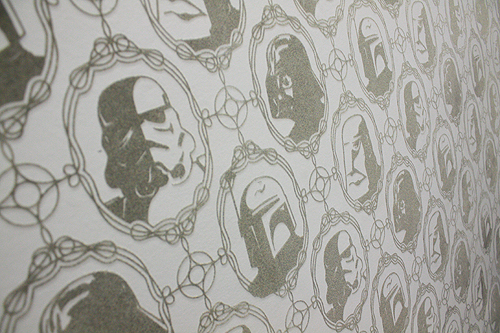
 Do you remember real mailboxes? How about real mail? What about that feeling of excitement as you opened up that rusty old mailbox in hopes that something would be addressed to YOU?
It seems like much of that is lost nowadays. A letter addressed to us now means we probably owe someone money.
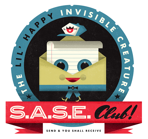
Well, we miss that feeling. So, we decided to start The Lil' Happy Invisible Creature S.A.S.E. Club. Inspired by our youth - when the simple task of addressing an envelope to ourselves, licking a few stamps and patiently waiting a few weeks could mean receiving anything from a signed baseball card from spring training to various stickers from our favorite skateboard company.
It's real simple. Send us a self-addressed stamped envelope and we'll fill it with goodies. Put 2 stamps on your return envelope and we'll fill it with more.
However, we thought we'd make it a bit more fun and interactive. Regardless of your artistic ability, we ask that your envelope addressed to us be creatively designed or illustrated. No rules, anything goes - and we'll post the coolest ones on the Lil' Happy Twitter page.
So, that's it! Oh, and we figured we should set some ground rules and answer a few questions. Just in case.
DEADLINE: September 1st, 2010
Please send us your S.A.S.E. by that date. We hope to do this once a year, but since we don't know the volume we'll be receiving, we have to shut off the valve at some point.
Please send your envelopes to:
The Lil' Happy Invisible Creature S.A.S.E. Club, P.O. Box 375, Seahurst, WA 98062
Q: I can't draw to save my life. What should I do?
A: Like we mentioned, it's regardless of your ability. C'mon, it'll be fun!
Q: What are you going to send us?
A: We're not telling. It'll be fun though. We promise.
Q: When should we expect our envelope back?
A: After the deadline sometime. It could take awhile as we also run a full-time studio over here. If you send it, it will come. A little patience.
Q: I don't live in the U.S., can I still participate?
A: Probably not, due to customs. However, we aren't international mail professionals, if you can find a way that works via USPS, we'll definitely send it back! If it involves anything more than dropping it in a mailbox, we won't be able to pull it off. Sorry.
Q: Can I send you more than one envelope?
A: No, sorry.
Q: Can I send a poster tube? How about a large document envelope or soft pack?
A: Nice try. Let's keep this old school. Legal sized envelopes would be the biggest/best option.
Any more questions? Feel free to email us at lilhappy@invisiblecreature.com
 Get him while you


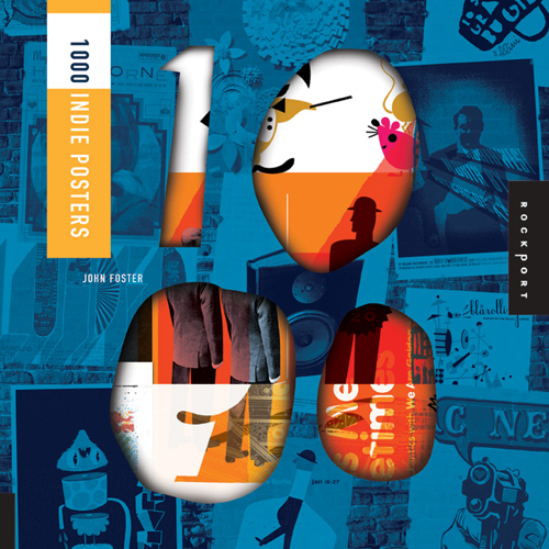 Calling all poster fans/geeks/enthusiasts: this is a must-have book.
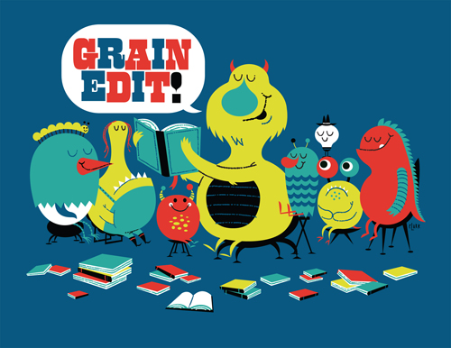
  We're honored to be featured in the January/February issue of
 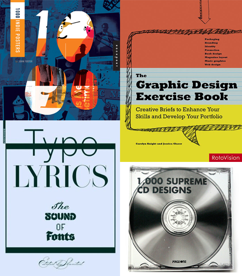 Here's 4 new (ish) books that we've been featured in recently:
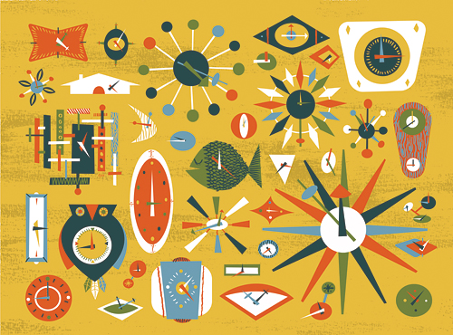
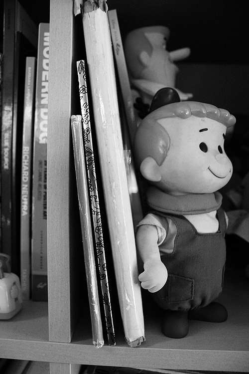
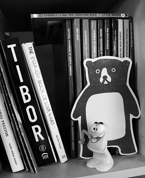
  In this series I'm going to try my best not to compare apples to oranges. I understand there are vast differences in technology, ideology, legality, etc between designs of the past and designs of the present. However, I believe there was, is, and will always be a way to almost objectively design something properly. To me, this means a design that is well executed, aesthetically pleasing and properly communicative... in relation to whatever is being "sold."
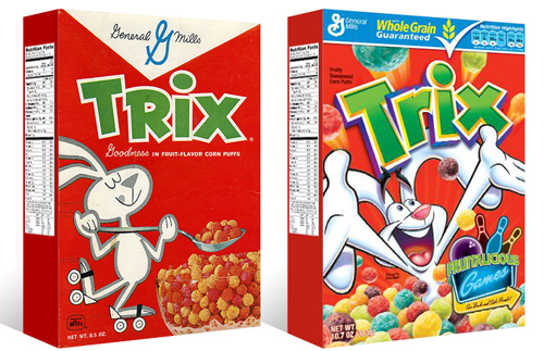 I had the idea a while back to post about the perils of modern design, specifically in regard to rebranding, the evolution of a particular design and things of that nature. I've decided to finally pull the trigger and go for it. As my brother has begun posting a series dedicated to our grandfather, I thought this might be the right time. After all... the time period in which our grandfather was designing will often be the era in which my postings will refer to.
 Our Conan O'Brien and My Morning Jacket posters have been added to the
 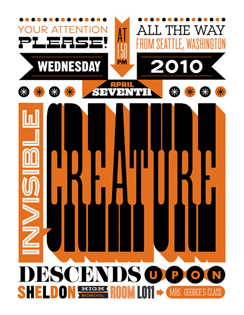 21 years after my first class with Mrs. George, my high school art teacher, I'm coming back to say hi. She was/is an amazing teacher and played a large role for me in pursuing art as a career. Because of that, I thought it would be fun to create a poster for the occasion. Looking forward to catching up after 17 years.
 As 2010 is quickly approaching with new projects and new ideas, we didn't want to neglect 2009 in this Holiday rush. It's been our best year yet (It seems like we get to say that every year) at the IC and we just wanted to say THANK YOU. To our beloved clients, those who purchase our work in various ways, our faithful blog subscribers (almost 10K feeds?!), our Twitter followers, our extremely talented and inspiring peers who push us every day, and everyone else who has dropped us a comment or thrown love our way. We are extremely thankful (especially in this economy) to be doing what we love for a living. It's so much fun to "work" here - and we have many, many people to thank for that. Merry Christmas + Happy New Year to you all ...
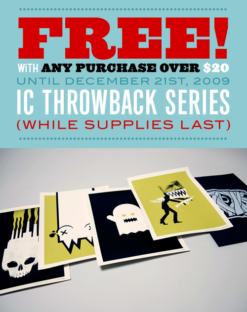 We've had an incredible year at IC and feel like passing on a little love. So, we've gotten drunk on eggnog, whipped up a graphic and logged into the blog. From now until next Monday, December 21st, we are including a FREE set of our