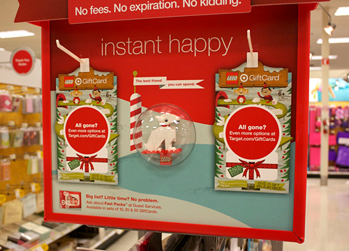
We often get asked what our process is like. While we have multiple ways of conceptualizing and pitching ideas, the 3-step process that I'm going to outline below is pretty standard fare for us, as I'm sure it is with many illustrators. Sketch, sketch some more, sketch again, then on to final. 'Final' for us, usually means we hop into Illustrator and block out shapes. Once we have our shapes dialed and approved, we move on to lining and shading in Photoshop. There are many times when we start and finish in Photoshop as well, but a typical project like this will begin as vector art. I thought it might be fun to break down the evolution of an illustrated project, specifically a Gift Card for Target.
Let us begin ...
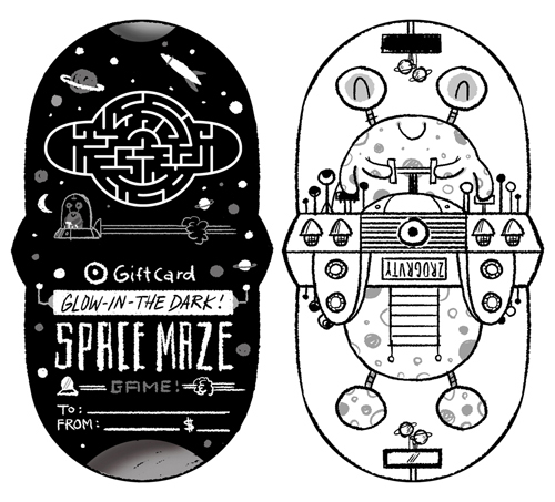
With the majority of art direction already fleshed out by the wonderful team at Target, we're given the project and asked to create sketches based on their initial ideas. Since their initial ideas are always completely awesome, it's a joy to build off of them. The name of this particular card is 'Glow-In-The Dark Space Maze'. In this case, it's a card that doubles as a glow-in-the-dark space maze that doubles as a spaceship. Wait, is that triples as? ... Nevermind.
The first task is the game itself. The manufacturer needs to get started on producing these suckers, so the game dieline is first priority. After a few sketches, we dial it down and come up with our shape.

After the basic game shape is a wrap, we get to the fun part - figuring out the maze! After heading to the store to pick up a few similar maze games, we play, throw down to the floor and curse at said maze games. Once we think we know what we're doing, we start to sketch out our walls. To make it easier, we're given the ball diameter and wall thickness before we begin. After a zillion attempts, the sketch below is the winning configuration - which means anyone under the age of 5 can conquer the game in under 1 minute while the rest of us need about an hour.
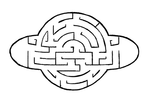
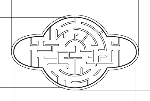
After the sketch is approved (and tweaked a little), we move to final vector art for the manufacturer. Bada-bing:
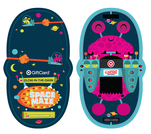
After the game material is off being made, it's time to move into final art. With the nature of this card being glow-in-the-dark, the client asks that we use bright colors. Done. Here are a few colors we pitched:
... as well as this color scheme, which ultimately gets chosen.
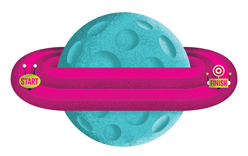
So now that the game itself is done, time to start sketching the actual card backer - which is always a big chunk of the fun. We sent the client a few options, with this particular idea taking home the trophy ...
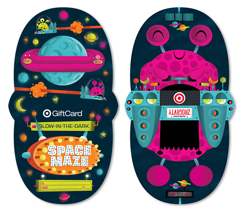
So now what's next? You guessed it. A few tweaks, then on to Illustrator. That's when we start blocking out shapes and finalizing color schemes. After a few rounds of small revisions, we have our final ready for shading ...
And there you have it ... a finished Gift Card. That was fun, right? Now it's your turn.
See it a bit larger in our portfolio. Now go grab one and keep the cursing to a minimum please.
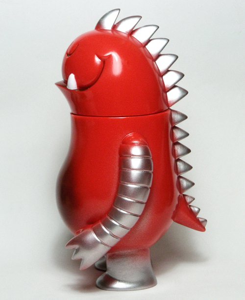
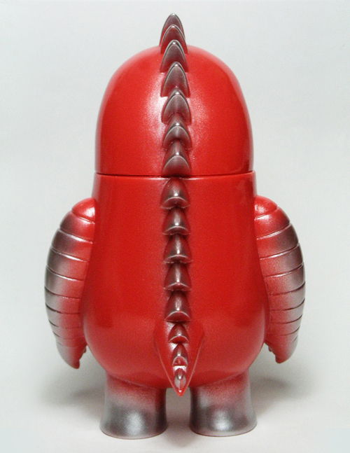
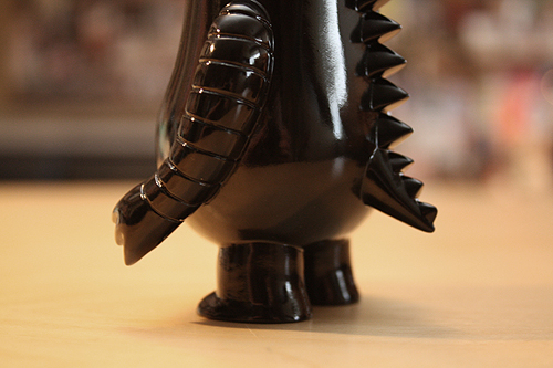
 Get him while you
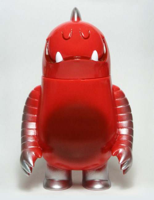

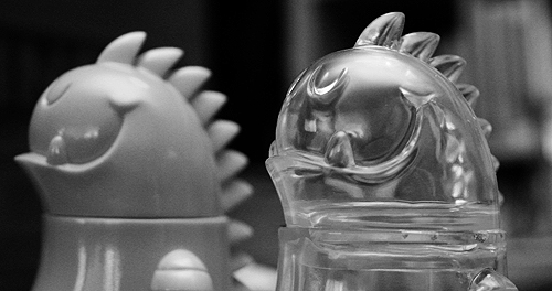

 Here's a great little
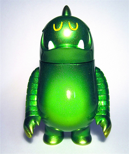
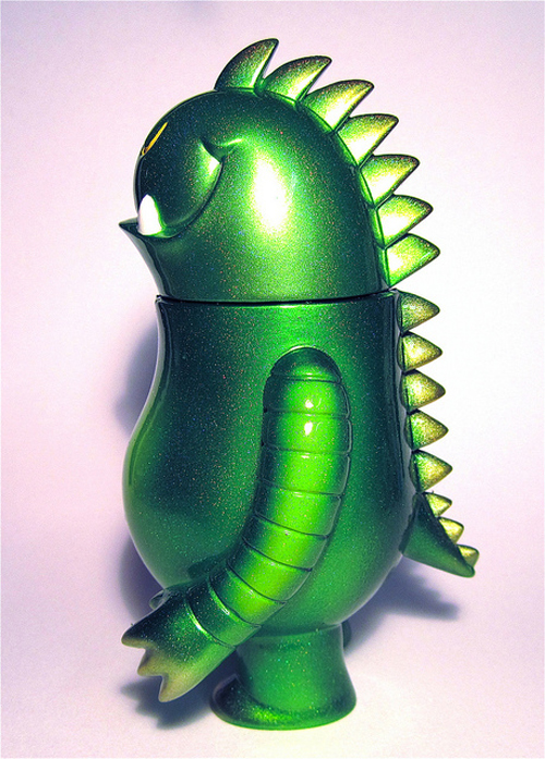
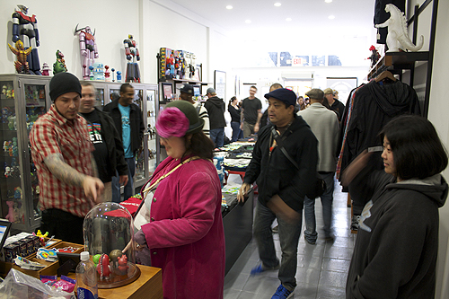
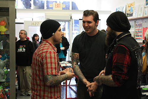
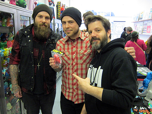
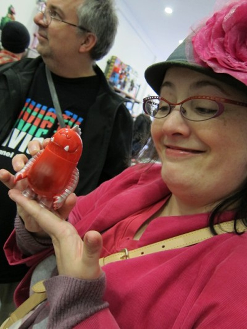
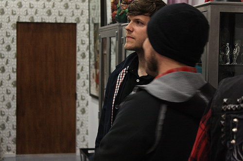
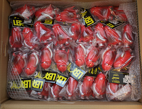
 Well, he departs tomorrow AM. Big thanks to everyone who picked up an unpainted
 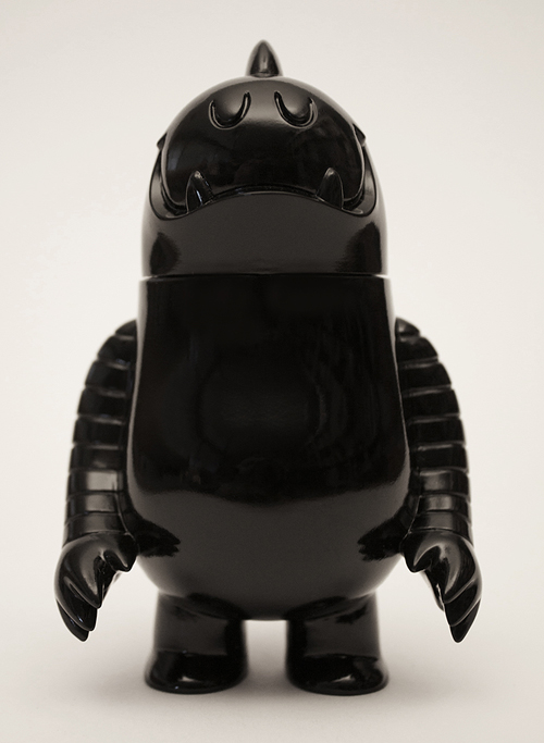 Well, that was fast. Our unpainted
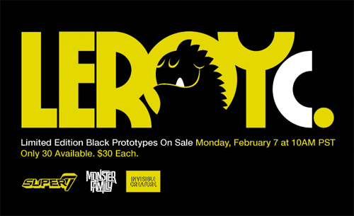
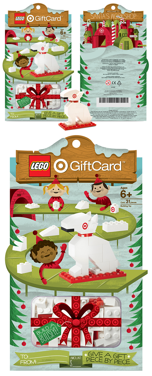 We'll never forget that day in 1983 that our mom brought home a bag of Legos the size of a small car. She had picked it up at a garage sale (who sells Legos?) for $8. From that point on, we were hooked. For


 In this series I'm going to try my best not to compare apples to oranges. I understand there are vast differences in technology, ideology, legality, etc between designs of the past and designs of the present. However, I believe there was, is, and will always be a way to almost objectively design something properly. To me, this means a design that is well executed, aesthetically pleasing and properly communicative... in relation to whatever is being "sold."
 I had the idea a while back to post about the perils of modern design, specifically in regard to rebranding, the evolution of a particular design and things of that nature. I've decided to finally pull the trigger and go for it. As my brother has begun posting a series dedicated to our grandfather, I thought this might be the right time. After all... the time period in which our grandfather was designing will often be the era in which my postings will refer to.
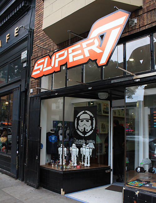
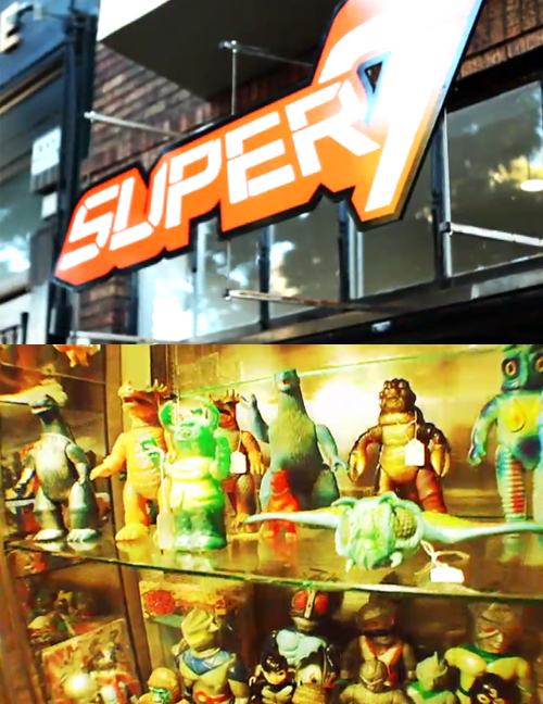
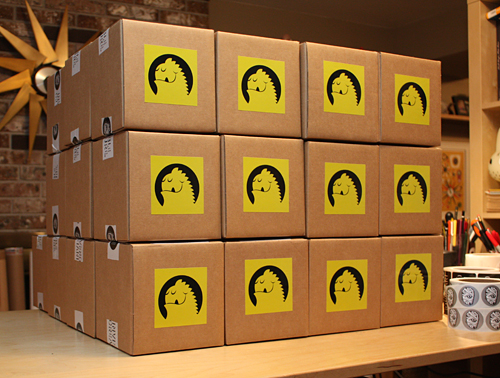
 It's official. We're dropping our first toy through the mighty
 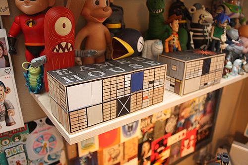 Charles and Ray just moved in. Thanks
  I gotta be honest, apparently I've been living under a gigantic rock and hadn't heard of the awesome
  Apartment Therapy just posted an
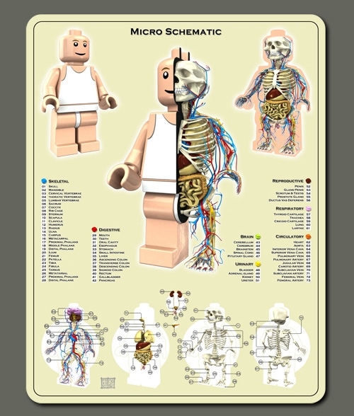 Growing up, Ryan and I were Lego FANATICS. I vividly remember the massive room-sized bag of Legos that my mom found at a garage sale for $8 - and the day she brought it home. Our jaws dropped. We dabbled in Transformers, G.I. Joe and He-Man, but the Legos got the most love - for years and years. Naturally, my own kids love them (what kid doesn't?!) and those days in the 80's of creating airplanes and robots out of blocks are ever-present in our house 20+ some years later. I still think it might be the best toy to actually spawn creativity and imagination. All that to say - I just love Jason Freeny's
  Bookmark time!