 I had the idea a while back to post about the perils of modern design, specifically in regard to rebranding, the evolution of a particular design and things of that nature. I've decided to finally pull the trigger and go for it. As my brother has begun posting a series dedicated to our grandfather, I thought this might be the right time. After all... the time period in which our grandfather was designing will often be the era in which my postings will refer to.
"The Way It Was" will be a study (and occasional pseudo-rant) about a particular design of the past, and a directly (or at least somewhat) related piece from recent years.
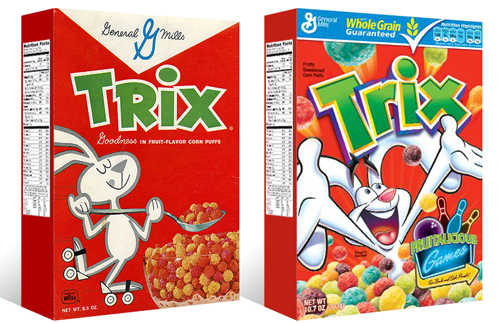
TWIW #001 is based on an email conversation I had with a few like-minded friends a couple of years ago. The subject in this case is a box of Trix cereal. Target had announced that it was re-issuing old General Mills cereal box designs for a limited time, (God bless design-savvy corporations) and in being reminded of that classic old box design, I couldn't help but dissect the modern design and suppose what it's trying to tell today's consumer. Here are my thoughts:
1. The logo, once simple and bold, is now 3-dimensional, has a white stroke, yellow bevel, and emboss. ALL of which have gradients. Somehow this "pops" more.
2. Since brand loyalty is dead, the nice big General Mills logo at the top of the box (which I'm sure used to assure people of the reliability and integrity of the product) is replaced by a very small GM logo, overpowered by a "whole grain guarantee" and a list of other nutritional values. Not that nutrition is anything to shrug at, but let's be real- this is Trix.
3. The cereal itself isn't enough anymore, so there has to be added incentive to buy. In this case, there's an ad for "fruitalicious" games on the back of the box.
4. The fun-loving bunny on cute roller skates is replaced by (honestly) what seems to be an INSANE rabbit, literally throwing Trix at you.
5. Lastly, and probably most importantly, the modern box has a disclaimer sentence that reads something like "cereal shown not actual size," because people are so stupid (or assumed to be so stupid) that they can't comprehend that the 1" macro-lens-photographed meteor puffs on the front of the box are bigger than they actually are.