Filtering by Category: Animation,Environments

cin_20_500

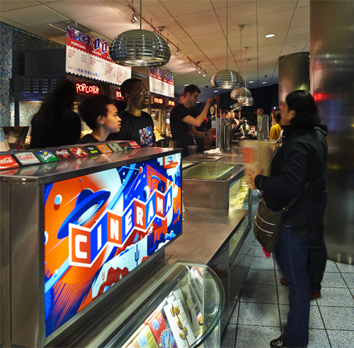
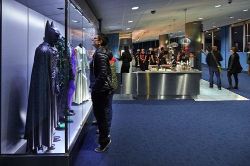
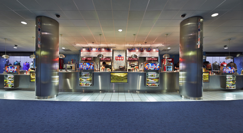
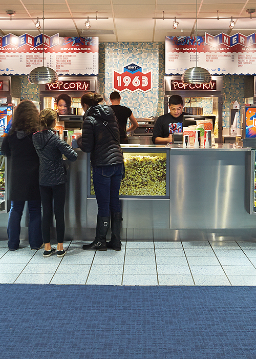
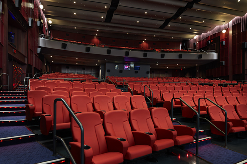
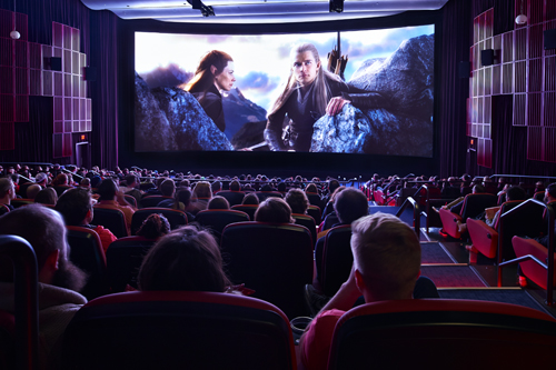
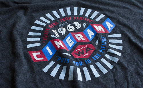
When we moved to the Capitol Hill neighborhood of Seattle in 2001, Cinerama immediately became our go-to theatre. The nostalgic 60's architecture and charm, the massive screen, the curated collection of movie props behind glass in the lobby, the chocolate popcorn - and yes, even that logo ... it had everything a designer/cinephile could want. From waiting in lines for Star Wars prequels (I wish I had those hours back) to seeing a film that sorta changed my life - it was our destination for the movies.

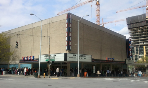
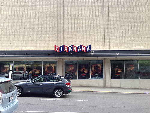
Fast forward 12 years - December of 2013 to be exact. Imagine my reaction when friend and Vulcan Marketing Director Josh Lackey asks us if we'd like to take part in their upcoming MAJOR technology and seating renovation that included ... well, taking Cinerama's giant 200' x 30' blank cream-colored brutalist exterior walls and covering them with art - art that undoubtedly would forever change the landscape of that busy intersection of 4th and Lenora in downtown Seattle.

I was shaking in my boots at the thought - Would that ruin the legacy of the theatre - and Cinerama as a whole? Would Seattleites hate looking at it? Worse yet, would moviegoers hate it? But before he could finish explaining the project brief, I was wholeheartedly in. Scared out of my mind - but in.

First, a little Cinerama 101 ...

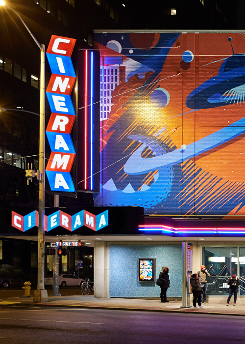
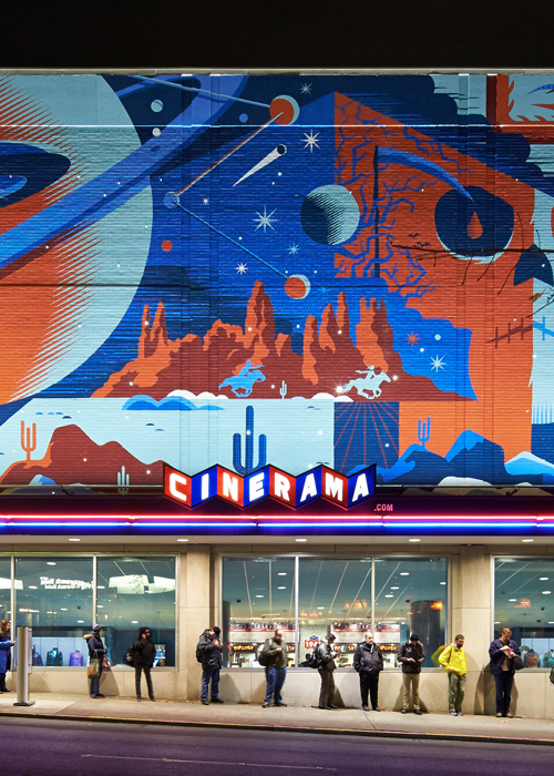
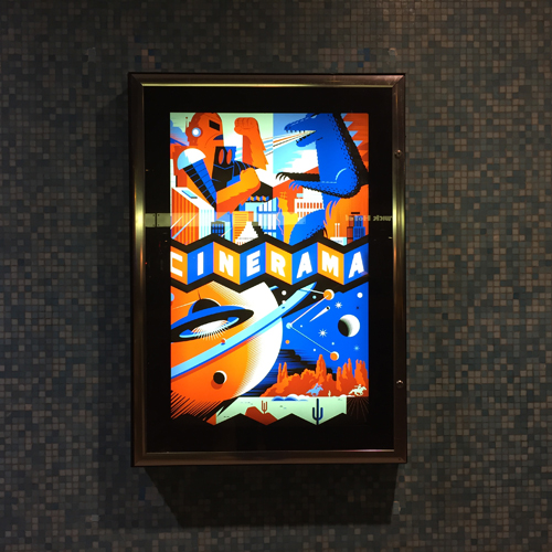
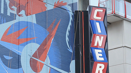
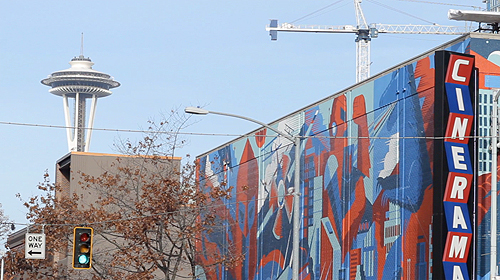
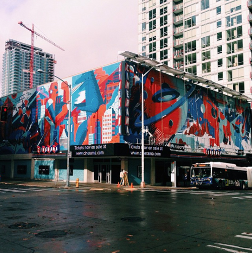
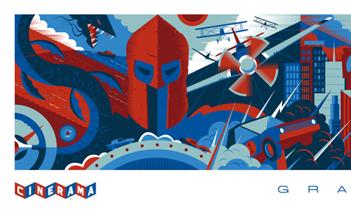
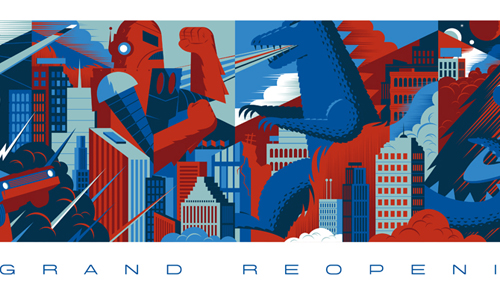
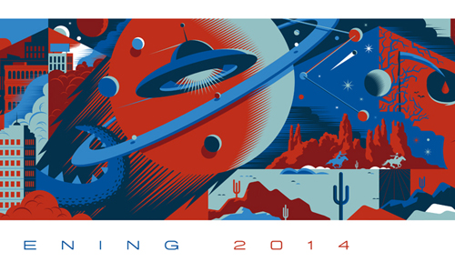
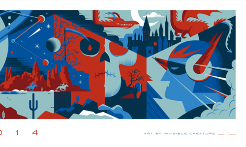
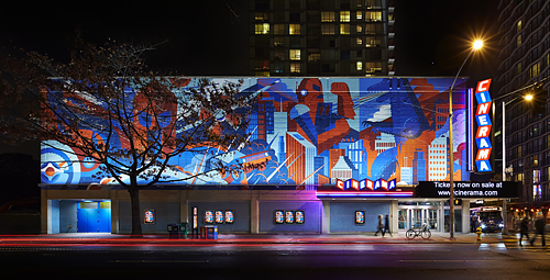
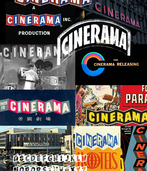
Above: Staring at the completed mural - and a tiny example of Cinerama's iconic logo, signage, theatre architecture, one-sheets and various ephemera above. Way more eye candy here.

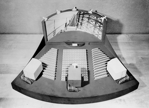
Below: A miniature of Cinerama's widescreen (and groundbreaking) 3-projector technology, developed by Fred Waller in the late 1940's and made commercially viable by Lowell Thomas in 1952. There are only 3 Cinerama theatres left in the world. Read more about Cinerama's amazing history here.
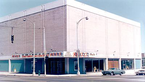
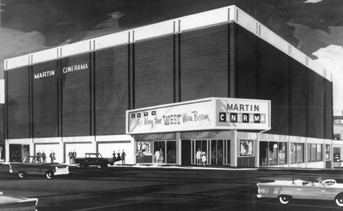
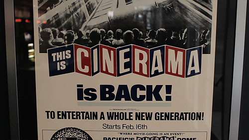
Below: Construction began on the Martin Cinerama Theatre in 1963, a year after the World's Fair came to town. It immediately became a cultural icon and destination for Seattle locals and tourists alike. However, thanks to urban sprawl and the rise of giant theatre multiplexes, ticket sales began to drop in the 1980's and 90's. Entrepreneur and philanthropist Paul Allen purchased the theatre in 1997 and began a series of renovations starting in 1999.
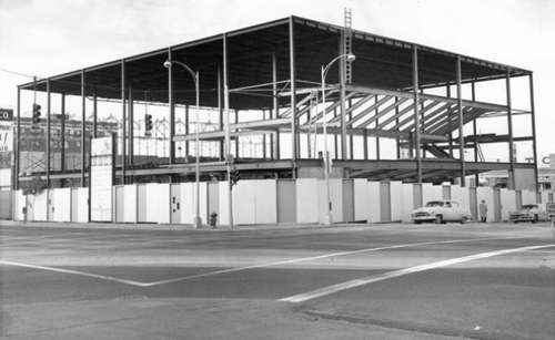
The blank canvas ... all 200 x 30 square feet of it ...
We presented Vulcan and the team at Cinerama with 3 sketched ideas. My design goals were simple - but maybe not so easy to pull off: I wanted to acknowledge and respect Cinerama as a whole - the historic technology, the beauty and charm of the era, the visual design of Cinerama (from the architectural significance of their theatres worldwide to the countless amazing ephemera produced over the last 50 years) and of course my beloved hometown of Seattle and the corner that this brutalist structure resides on - 4th and Lenora. But it was also important that we didn't dwell too much on the past. After all, this was a multi-million dollar renovation that pointed towards the future. The key was to aim towards what was next, while paying homage to what has come before.

Another important thing for me was recapturing that excitement of going to the movies. I obviously wasn't around in the early part of the century - or mid century for that matter - but I love the footage of movie premiers during those years ... it was an event! You'd wear your best outfit, grab that special someone, buy something at the concession stand and thoroughly enjoy a night out. I realize much of that is gone now, but there was something about this opportunity. We could, at least in theory, bring some of that charm and excitement back to movie goers.

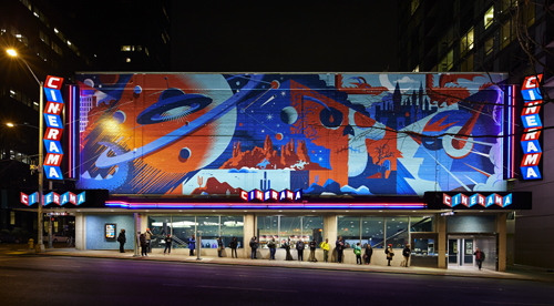
The team at Vulcan landed on one of our concepts: A visual scattering of cinema's greatest genres: Action, adventure, horror, sci-fi, fantasy and more. All integrated and seamlessly woven into each other like a story - with one genre leading to the next.

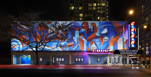
The color scheme: I wanted to stay true to Cinerama's classic red and blue. I added a lighter blue that matched the lower portion of the exterior's tile walls - as well as a few darker hues of the original 2 colors.

One important design element that I wanted to work into the mural was the angular lines of the Cinerama logo. In our original sketch, we actually had a cropped version of the wordmark visible as well - with the art woven throughout and around the type. That aspect of the mural ended up getting cut at the last minute, but we kept the overall angles of the mark visible.

Approved sketch below. As with most of our concepts and sketches, the final art evolves quite a bit from it's initial drawing - but the core composition remains.
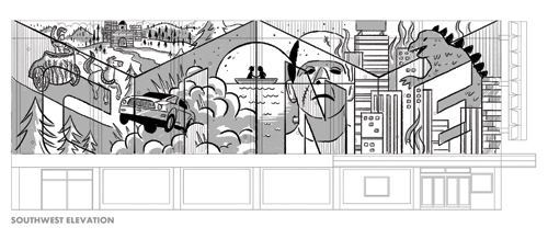
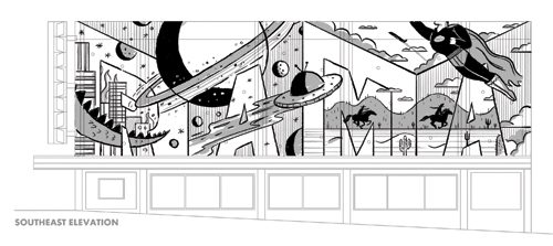
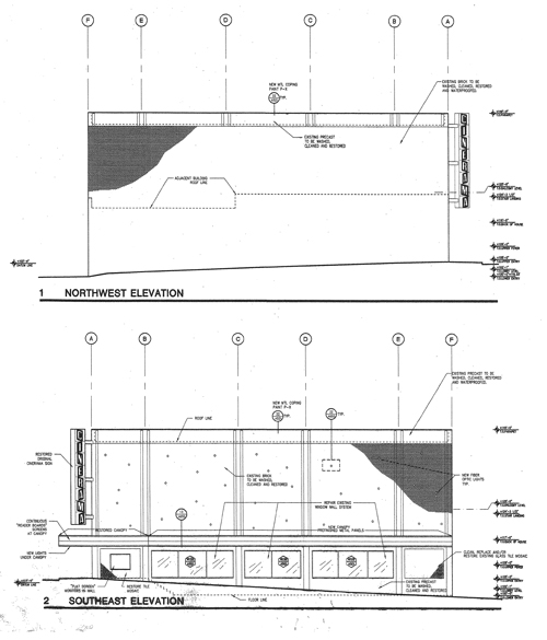
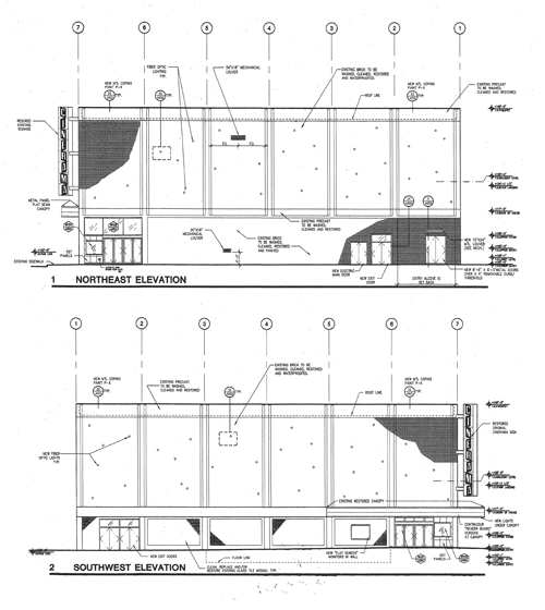
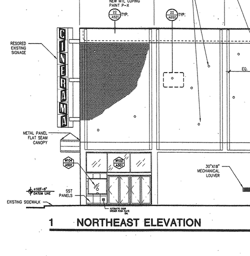
Below: Architectural blueprints from Boora Architects, 1998. We used these drawings as a template for our work. One of my favorite things about the structure's brick facade are the many small LED lights sporadically placed along each wall. I've always enjoyed that design element at night and was excited to see those lights create a subtle visual effect underneath our completed art. The result is a nice addition to the mural at night - further emphasizing the excitement and 'event' aspect of going to the movies.
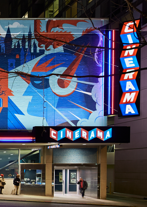
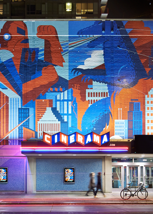
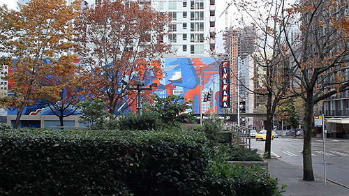
Below: All cleaned up, refined and colored. The finished mural and the grand re-opening of the greatest theatre on Earth. Photography by the great Benjamin Benshneider. Scroll (way) down to see the completed vector art. Also available as a print.
Cinerama Theater

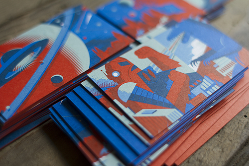
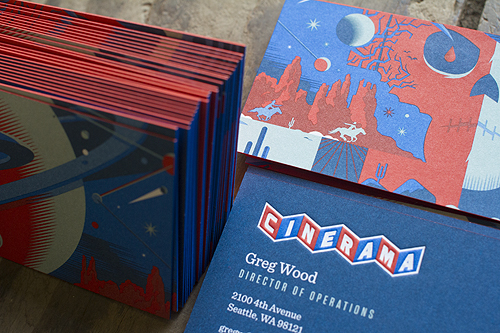
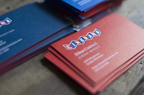
The reaction to the mural was overwhelming - and ended up setting the stage for an overall Cinerama identity overhaul. That translated into interior signage, employee T-shirts, business cards (Duplexed, de-bossed and features both red and blue edge printing on each card, printed by the pros at Evolution Press in Ballard), silk-screened posters and lots of upcoming merchandise ...

A few notable articles surrounding the renovation can be found here, here and here.
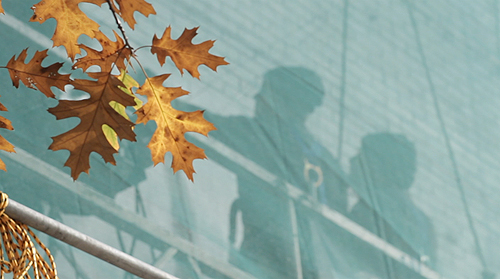
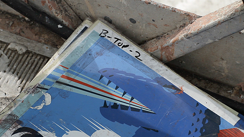
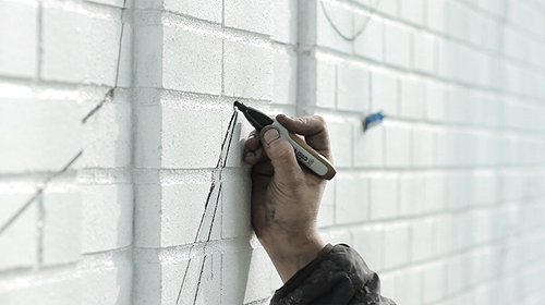
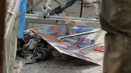
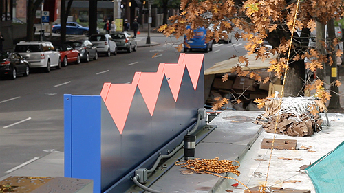
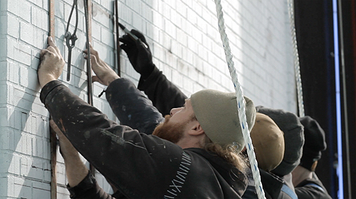
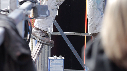
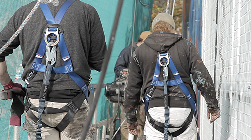
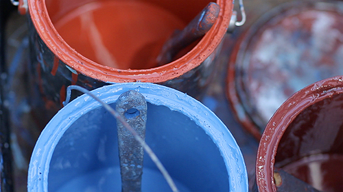
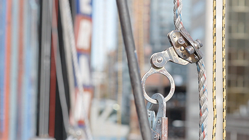
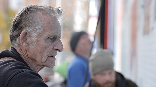
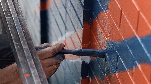
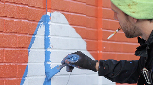
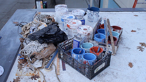
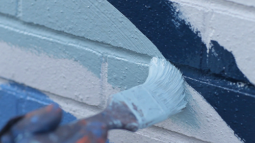
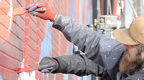
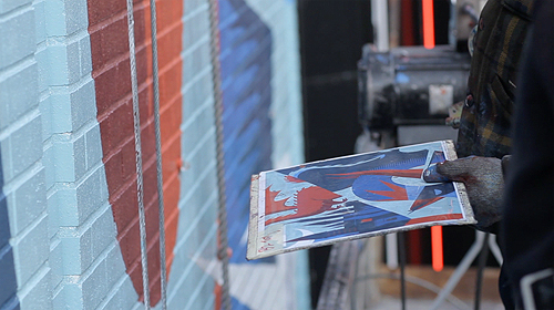
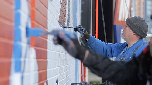
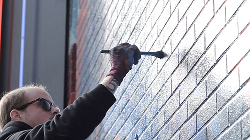
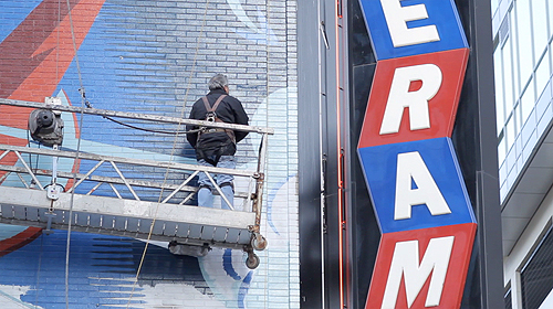
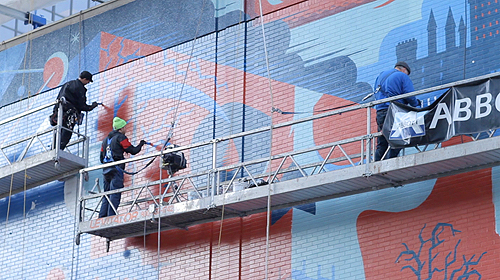
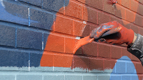
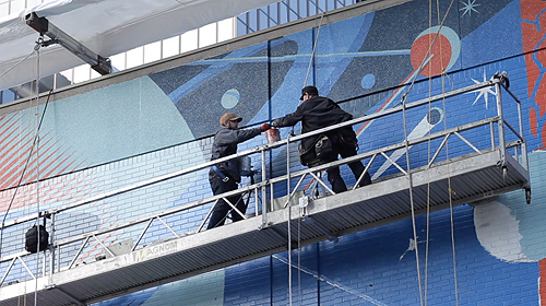
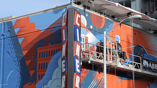
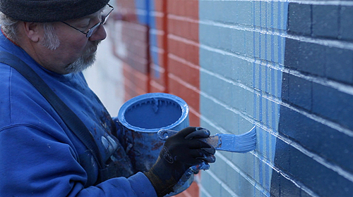
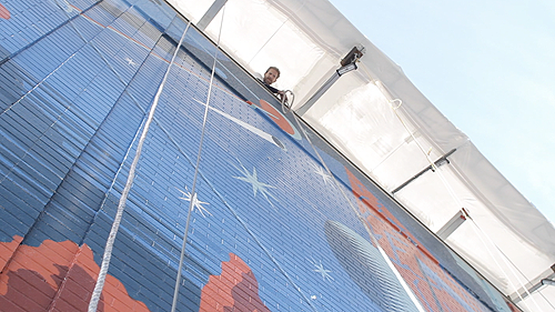
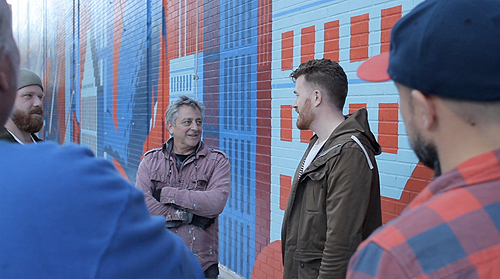
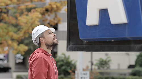
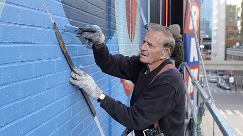
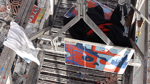
Below: The making of the mural - featuring our partner Don Rockwell and his band of brothers (Don and his all-star crew were able to start and finish the mural in less than a month) ... Btw, watch Sign Painters: The Movie. The film features a few members from Don's team.
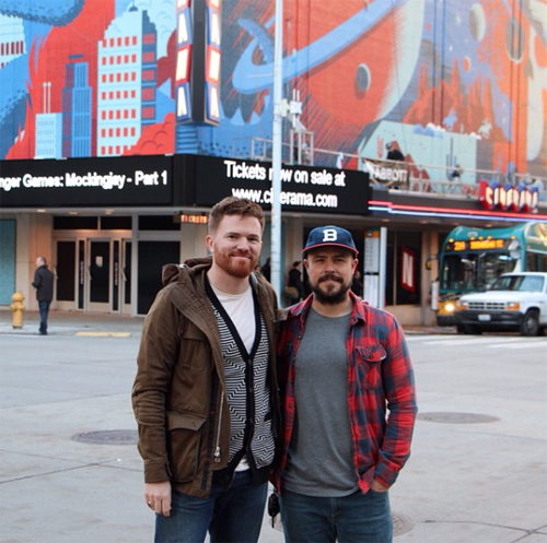
Below: The Don's - Rockwell & Clark ...

Below: The brainchild behind the entire mural project - Josh Lackey. This was (and is) a career highlight for me. I have Josh to thank for all of this.

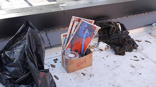
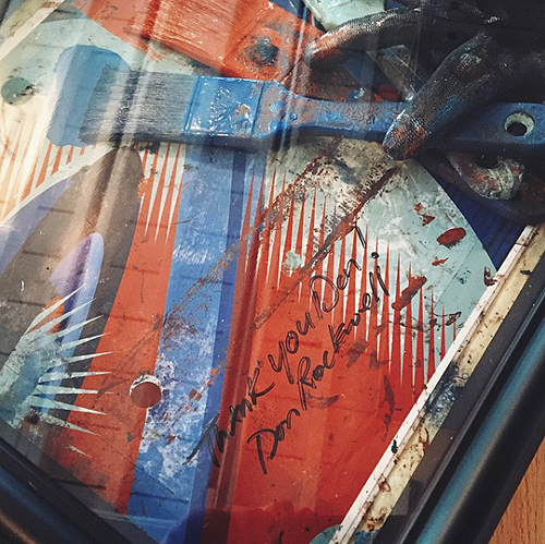
Don Rockwell presented IC with this amazing framed shadow box of used paint brushes, painter-worn gloves and on-site reference art. We have it hanging proudly in the shop.

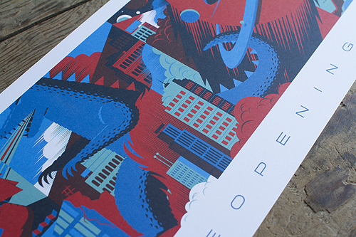
We also have a limited amount of prints commemorating the renovation from last winter. 100 were given out to Cinerama patrons and we have just under 40 left in our shop. Grab one here.

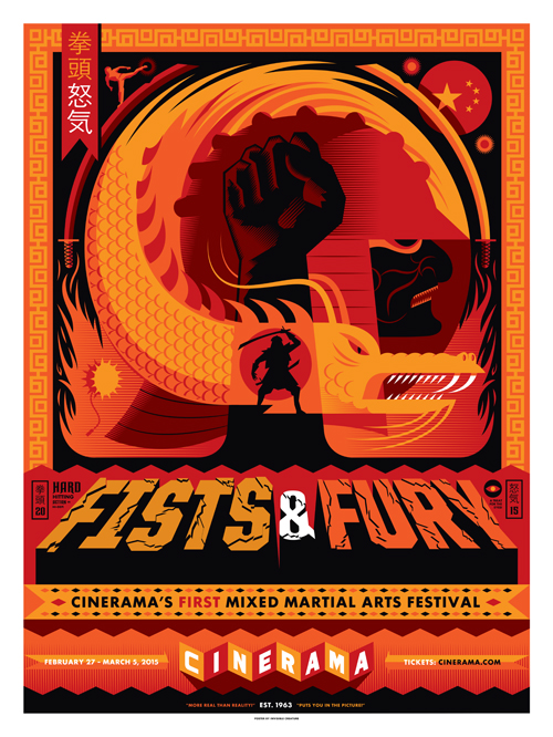
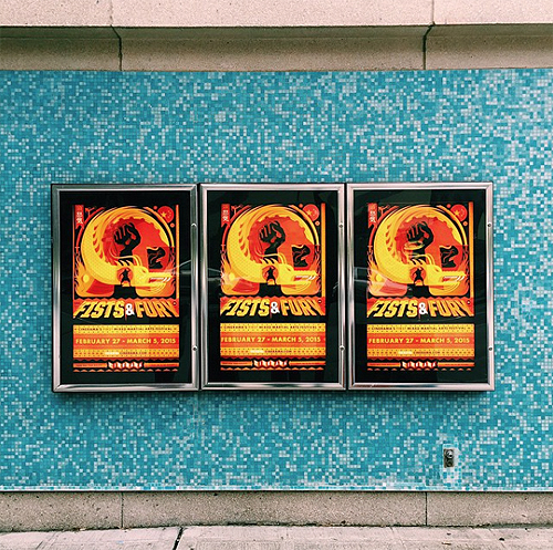
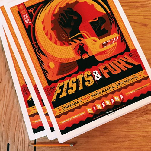
Shortly after the finished renovation in November, we were asked to design and illustrate the poster for Cinerama's first mixed martial arts festival, aptly titled Fists & Fury. Screen-printed by the pros at Vahalla and available in the shop now.

We're guilty. Guilty of relying on the quick and easy method of using social networking to update folks on what we're up to. You can see the cobwebs on this very site. I don't think we've updated our work section in over a year. But I can feel it in the air ... 2015 will be the return of the blog and long-form reading on the web. No? Well, we're going to attempt that when we can. Personally, I miss it. I miss putting together (and reading) content that you could spend more than 2 seconds staring at. We'll continue to Insta-tweet, but I don't want to rely on that ... To be honest though, we have been busy. Very thankful for that. But, now is a perfect time to wipe the dust off the site and let you guys know what we've been up to for the last 9 months - and we also want to share some new things we've got cooking.

1. Thanks to the VSCO Artist Iniative, our first documentary film about artists (specifically what drives us and connects us all) begins production in July! We will be hitting 6 cities and interviewing numerous artists from many different industries and walks of life. We're excited to tell this story ... more on that here. We'll be documenting and journaling the entire experience on our VSCO Grid.

2. Last fall, we had the opportunity of a lifetime come our way: To re-imagine the historic Cinerama Theatre in Downtown Seattle - our favorite movie destination since we landed here in 2001. We created 2 massive murals that completely altered the corner of 4th Avenue and Lenora Street. The mural art made its way into a re-brand of the theatre, inside and out. We are currently working on our short film, 'Re-Imagining Cinerama' that takes a closer look at Cinerama's grand re-opening last November - and the art that went into it. We'll also have prints of the mural (and more Cinerama art we created) for sale when we launch the film this summer. Photos above by Benjamin Benschnieder.

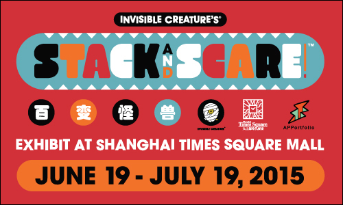
3. Stack And Scare! is coming to Shanghai in a massive way. The Shanghai Times Square Mall will feature a large Stack And Scare! exhibit next month. Giant sculptures, play areas, toys, posters, etc. Curated by APPortfolio. We are very excited for this - much more info coming soon.

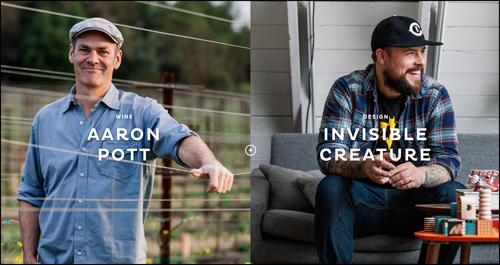
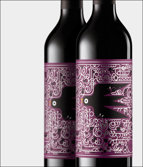
4. Wine Meets Design. We are thrilled to be the inaugural designers partnered up with the talented winemaker Aaron Pott for Bare Bottle's first release. We were first approached for this project a few years back from our friends Katie and Nathan at Eight Hour Day. We've had a blast working with them, Marta & Josh Harding - and Corey Miller, the man who dreamed this extremely cool idea up. A quick bio from their site -

Bare Bottle curates the pairing of winemakers + designers and provides them with a blank canvas through which to create. Each unique collaboration opens a window into our makers' creative processes, their inspirations, and their worlds.

The dedication to craft, quality and presentation comes across so clear with Bare Bottle. If you love wine ... and design ... it's worth every penny. I was floored when I saw the finished shipped piece ...

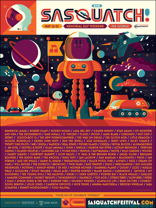
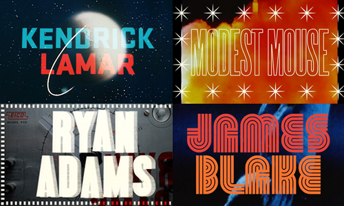
5. Blast Off! After a 2-year hiatus, we are back with our good friends at Sasquatch! Music Festival. We had the pleasure of creating all of the Festival art, merchandise and even the Lineup Video this year. As per usual, the lineup is amazing (Kendrick!) and happens to be going on THIS weekend. We'll have an in-depth look into all of the assets we created (including another collaboration with Ebbets Field Flannels and Theo Chocolate) soon ...

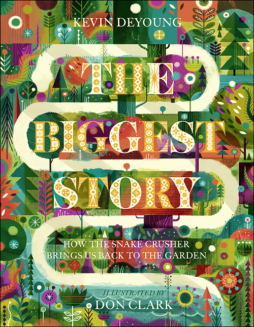
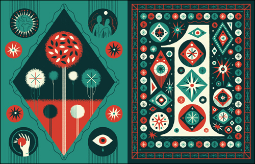
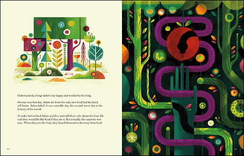
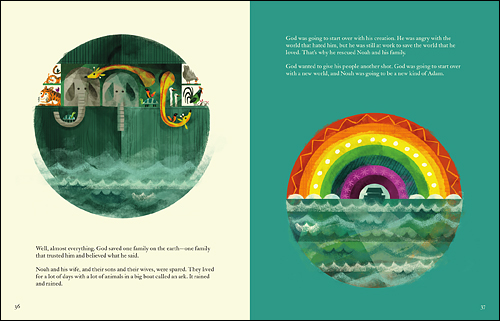
6. The amazing opportunity to illustrate my first Children's Book came up last September. We had gotten book offers in the past, but nothing quite felt right and some of the projects just plain fizzled out. When our friends at Crossway approached me about a Bible Story by Kevin DeYoung, it was a big decision. In the end, It was a project I wanted to personally see done right ... and one that I wanted to see on the shelves myself. The Biggest Story was the most intense project I've worked on to date, and also the most fulfilling - in ways I could never have imagined. I cannot thank Josh Dennis and Crossway enough for allowing me to run with my vision and aesthetic for Kevin's beautifully-written book. The Biggest Story is hardbound, 10 chapters and 132 pages. Available in August and up for pre-order on Amazon now. Below are a few sample spreads from the first two chapters.

2

5

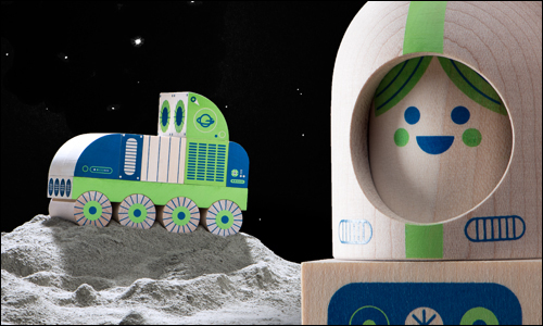
7. Our Odd Galaxy wooden toy line with Uncle Goose is finally in full production mode and will be released in the next few months. There will be 3 products to start: Cosmo Kid, Moon Rover and Lunar Rocket, each sold separately - but of course much more fun when you own all 3. We have some fun OG launch (get it?) projects that will be released around the same time, including a window display at our favorite space store ...

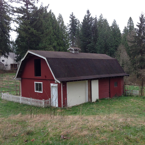
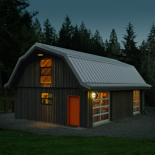
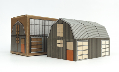
8. Two years ago, we bought a 10-acre ranch, turned a 50-year old barn into our studio and then made a toy out of it. OK, so that's the short version. We'll have a nice process post on this (way over-budget and panic-attack inducing) project on our new ... well, see #10. For now, you can check out some great photos of the shop by Joshua Harding over at Bare Bottle.

9. Last, but not least, we are finally working on a new website. One that we will update. One that will work nicely on your phone thing you carry with you. We promise.

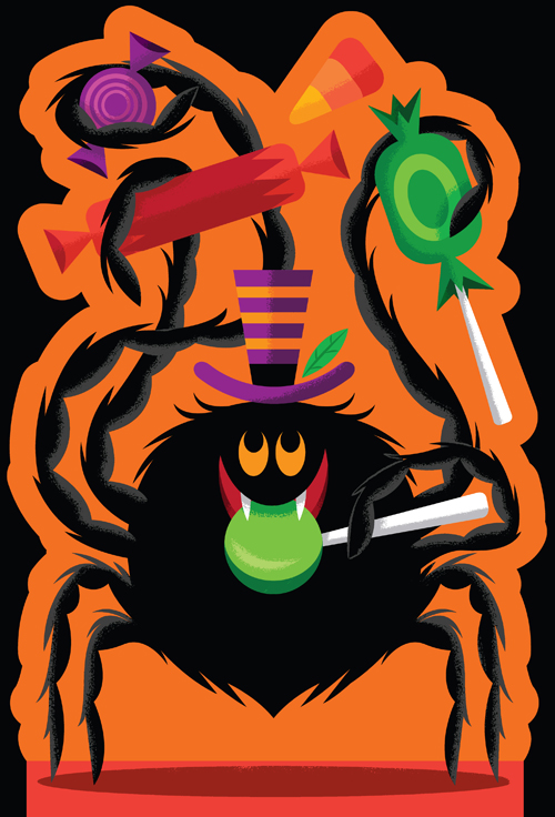
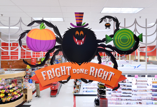
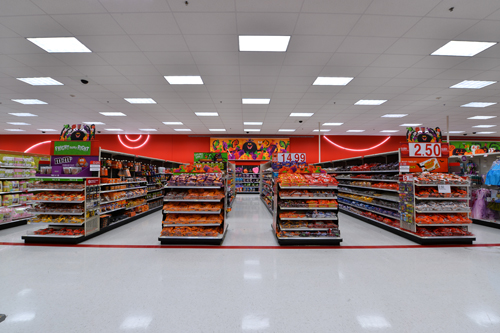
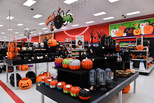
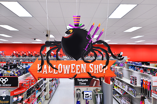
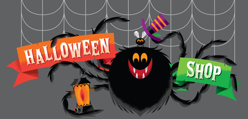
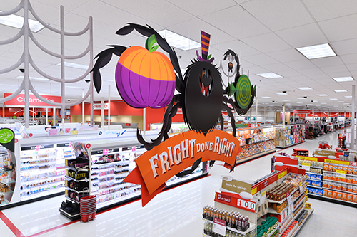
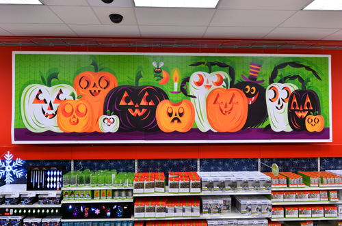
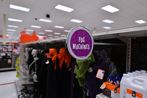
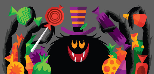
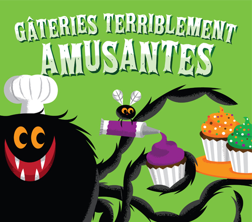
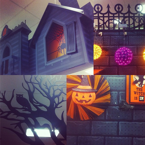
Trick or treat! We were tasked with an amazing opportunity earlier this year: Designing and illustrating the Halloween seasonal art for our favorite clients over at the Bullseye. Affectionately known internally as "Harry and Buzz", our dynamic duo of a spider and his fly sidekick were put in various fun and spooky scenarios throughout the store. Scroll down to see a sampling of what was created in the US, Mexico and France.

Target Credits: Eric Vermilyea — Creative Director, Kelsey Ciatti-Miller — Art Director, Mike Greenwell — Art Director, Jeff Barbian — Copywriter, Erika Bryant — Producer, Dave Daily — Creative Strategist, Philip Eggleston — Art Director

Huge, huge THANKS to the above list of folks that made this all possible. We had so much fun working with this team.
Today is the last day to see this all in-store - and remember - tonight is the ONLY night it's OK to take candy from strangers.

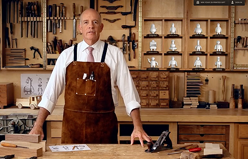
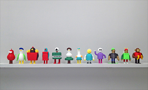
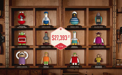
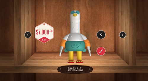
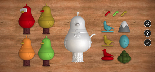
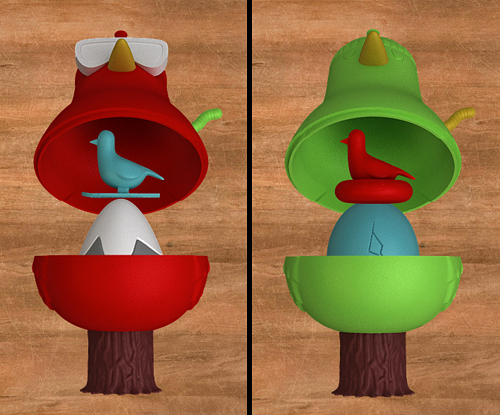
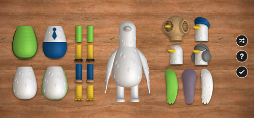
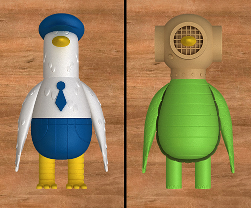
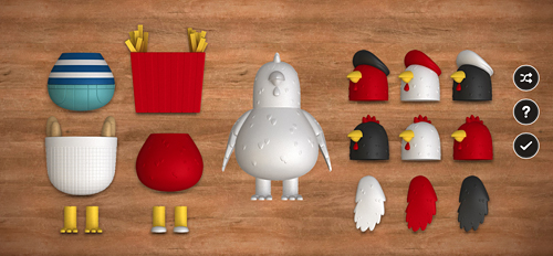
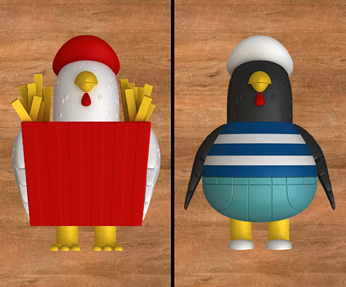
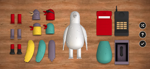
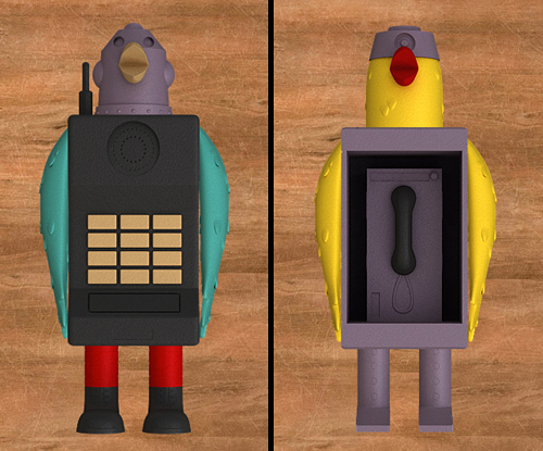
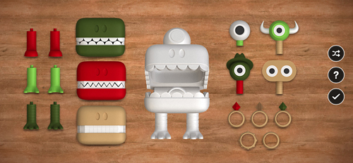
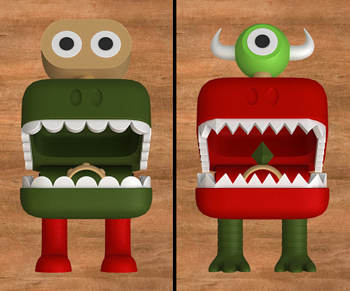
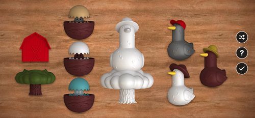
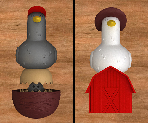
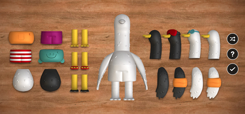
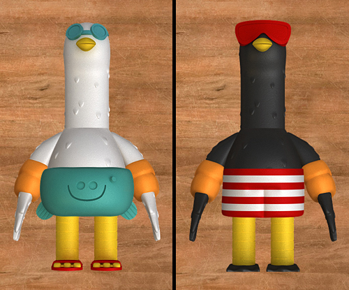
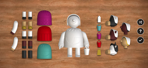
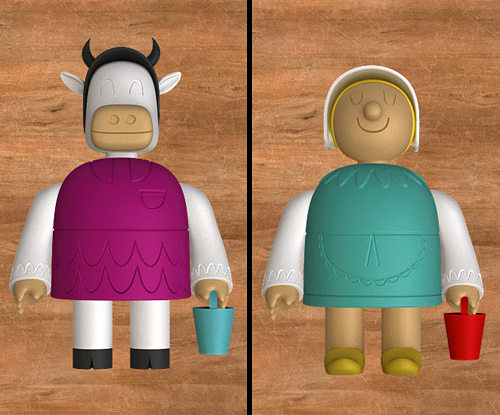
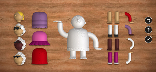
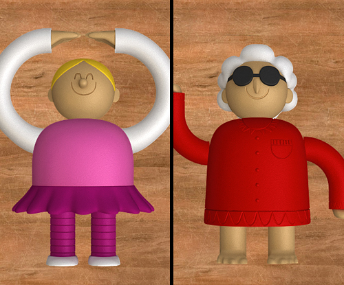
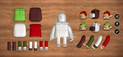
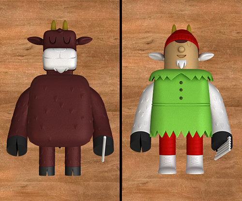
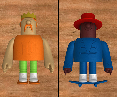
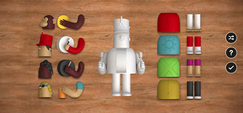
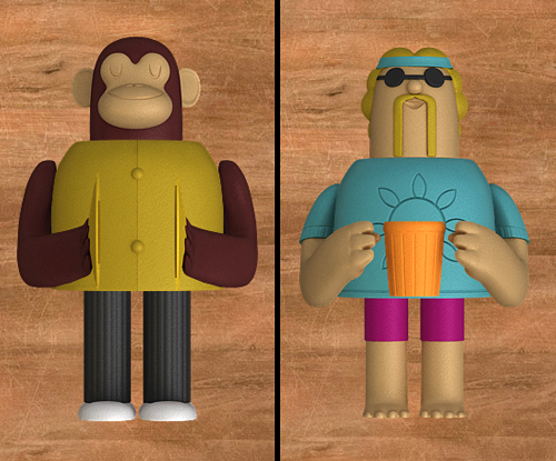
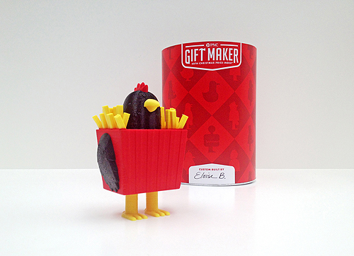
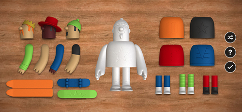
We are excited to announce the launch of a fun new project we just finished up with the kind folks at Deutsch NY. Deutsch commissioned IC to create 12 unique character toy designs based on the classic song "The Twelve Days Of Christmas" for PNC's infamous annual PNC Christmas Price Index. Beyond the task of creating 12 original characters based on the song, we also designed multiple interchangeable parts for each character - over 100 pieces in total. Partridge In A Pear Tree, Turtledove, French Hen, Calling Birds, Golden Rings, Geese-a-Laying, Swans-a-Swimming, Maids-a-Milking, Ladies Dancing, Lords-a-Leaping, Pipers Piping and Drummers Drumming.

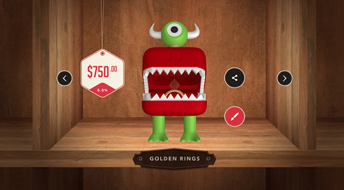
The PNC Christmas Price Index site is loads of fun and allows you to create your own toy by selecting various heads, legs, arms, bodies and accessories. When you are done creating your character, PNC calculates the total cost of what your selection would be in 2013, as well as how much it has gone up or down since 2012.

But the coolest part? For 12 days, PNC is selecting 24 lucky winners per day to receive a 3D-printed gift in time for the holidays! Using Makerbot desktop printers, winners will be chosen randomly and selected each day. The more gifts you build, the more chances you have to win. Read more about that here.

We had so much fun with this project, now it's your turn!

More about PNC Bank's Christmas Price Index:

The PNC Christmas Price Index® shows the current cost for one set of each of the gifts given in the song “The Twelve Days of Christmas.”

It began 30 years ago when the chief economist at PNC Bank decided to figure out how much it would cost to buy each of the gifts. Little did he know, he was starting a holiday tradition that continues to this day.

The PNC Christmas Price Index® is similar to the Consumer Price Index, which measures changes in prices of goods and services like housing, food, clothing, transportation and more that reflect the spending habits of the average American.

The goods and services in the PNC Christmas Price Index® are far more whimsical. And most years, the price changes closely mirror those in the Consumer Price Index. It’s a fun way to measure consumer spending and trends in the economy. So even if “pipers piping” or “geese-a-laying” didn’t make your gift list, you can still learn a lot by checking out how their prices have gone up and down over the years.

Deutsch Credits:

Partner/ Chief Creative Officer: Kerry Keenan SVP, Group Creative Director: Jeremy Bernstein Senior Copywriter: Matt Moyer VP, Creative Director: Qian Qian EVP/Director of Integrated Production:  Joe Calabrese SVP/Director of Digital Production: Suzanne Molinaro VP/Executive Digital Producer: Jennifer McBride Senior Art Producer: Hillary Jackson Producer: Jillian Cornette

Production Companies:

MediaMonks (creative digital production) Invisible Creature (toy design & packaging) 3D Printer Experience (3D printing the toys) ShootersNYC (intro/outro video production) Director/DP: Craig Needleman Executive Producer: Jim Huie Senior Editor: Anthony Marinelli Account Director: Amy Sweeney

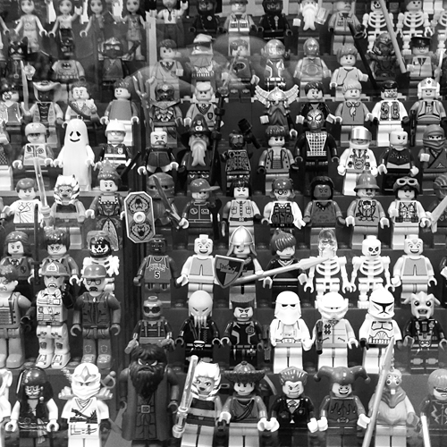
We had the great privilege and honor of speaking at LEGO's internal Design Camp last week - a day away from the office for the creative team in beautiful Enfield, Connecticut. Scott Decoteau, along with the talented and generous crew at LEGO, were gracious hosts during our time in New England. Highlights of the trip included the LEGO HQ tour (wow), dangerously delicious indian food, bowling and sharing sentimental stories about the infamous drawstring denim LEGO bag.

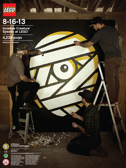
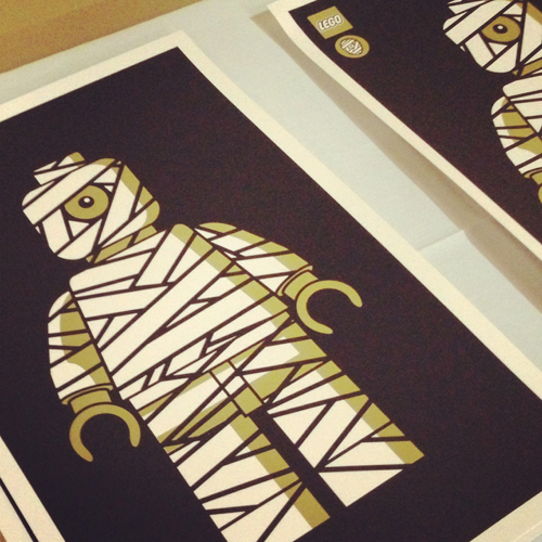
To commemorate our talk, we decided to make some things. One of them being a poster of us creating our new mark out of 4,236 bricks - flown in from all over the world. After 2 hot days, 1 broken mallet (don't ask), 6 iced coffees and 3 blisters, the mosaic came to life. Extra special thanks to LEGO for supplying the baseplates.

Unfortunately these posters and prints are not for sale, but who knows - we may throw some in future IC poster orders ...

LEGO_3

Our buddy Joby Harris, a visual strategist at NASA JPL, gave our Blast Off! pennant a tour of the facilities in Pasadena. Next time we'll accompany the pennant, but for now this is pretty freaking cool. Huge thanks to Joby for doing this! Above: The Mission Control Room.
The art studio:

At the Mission Formulation room:

At The Spacecraft Formulation Building:

The Mission Control Room lobby:

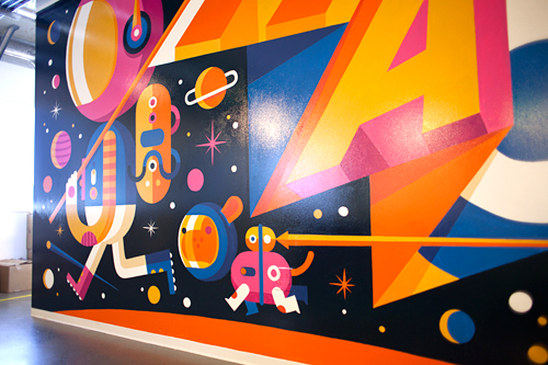
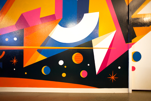
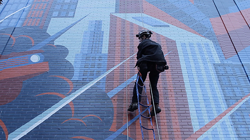
A few months ago we were approached by the kind folks at Facebook, asking if we'd be interested in creating a mural for their offices here in Seattle. It sounded like heaps of fun, so we signed up. They gave us a few keywords that represented the culture and atmosphere at Facebook. 'Making The World More Connected' and 'Hacker' got the most votes internally, so we dug into those ideas as our direction. Inspired by Ben Barry's in-house postings, we based our piece on combining both thoughts - the idea of going beyond the 'world' being more connected intrigued us. Facebook existing outside of planet Earth seems like an attainable goal, so that's where we landed. Once again we worked with our friend Don Rockwell on the application of the mural and it turned out pretty spectacular. See our quick and fun 'Making Of' film below:
Spacehack_3


We're excited to reveal our new cover for Minorville, the upcoming album from Nashville's finest: Derek Minor. With the help of Curtis Clark (or 'Dad', as we like to call him), we designed this from the ground up in approx. 2 weeks. With over 100 feet of basswood and baltic birch, Dad took our design and created an entire city in 50 hours. Each structure arrived safely in Seattle, ready to be constructed in the shape of Derek's profile. When we were initially presented with the challenge of creating this album cover, this was the first concept we pitched - Many thanks to Derek and Reach Records for sending us off and running. Stay tuned for a full comprehensive "Making Of" film coming in the next few weeks, but for now - enjoy the teaser (Processed using VSCO film emulation):

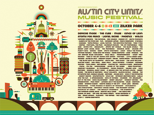
Last February, the kind folks at Austin City Limits Music Festival commissioned us to design key art and assets for their infamous 6-day event, which is happening October 4-6 and 11-13. We graciously accepted their request and the new look is now out in the wild. We had a blast compiling all that there is to love about the iconic festival, the city of Austin ... and even a little of their historic bat and flag culture. Oh, and Depeche Mode is playing?!
 

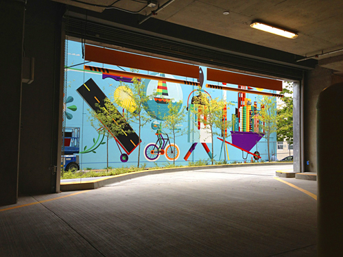
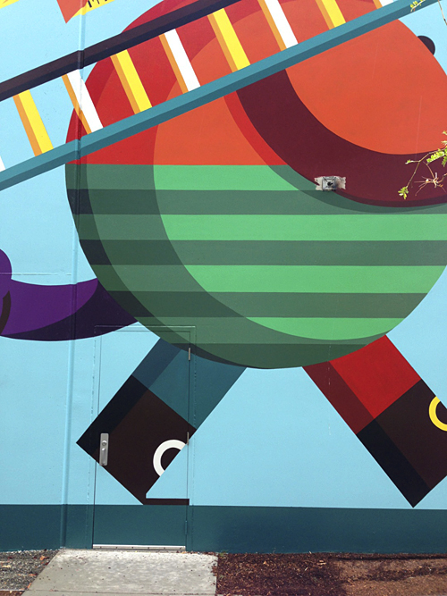
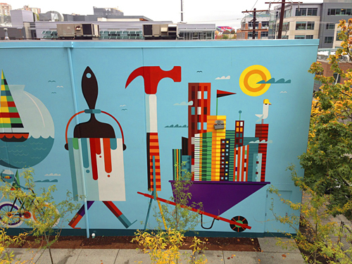
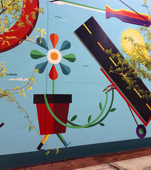
This past summer, our good friends at Vulcan Real Estate commissioned us to create one of the biggest jobs we've worked on to date - literally: A 100' x 30' mural that faces one of their new Amazon.com buildings in the ever-growing 'city-within-a-city', South Lake Union. Home to Amazon HQ, fine dining, upscale living & shopping, South Lake Union is full of life, culture and color. Our job was to reflect that with a vibrant and whimsical take on what 'building a city' could look like.
This project presented a fun challenge: Taking digital art, scaling it way up and painting it traditionally without compromising quality and its original style/intent. Finding the perfect partner to bridge the gap was important to us. To do that, we teamed up with artist (and mural pro) Don Rockwell and Foley Sign Company, which has served the Pacific Northwest sign industry for over 85 years. A huge thanks to Don, Mark Metcalf and the team at Foley for bringing our creation to life.
The process between IC and Foley was so fascinating to us, we had to document it. 'Keys To The City: The Making Of A Mural' is embedded above for your viewing pleasure. Special thanks to Alex Goose and Jake Troth for supplying the instrumental version of their amazing song 'Alexandra'.

But c'mon ... this is just the internet. See it in person on Thomas street between Boren and Terry. More specifically, here.

And of course, none of this would have happened without Josh Lackey and Vulcan. Thank you. We can't wait for the next one.

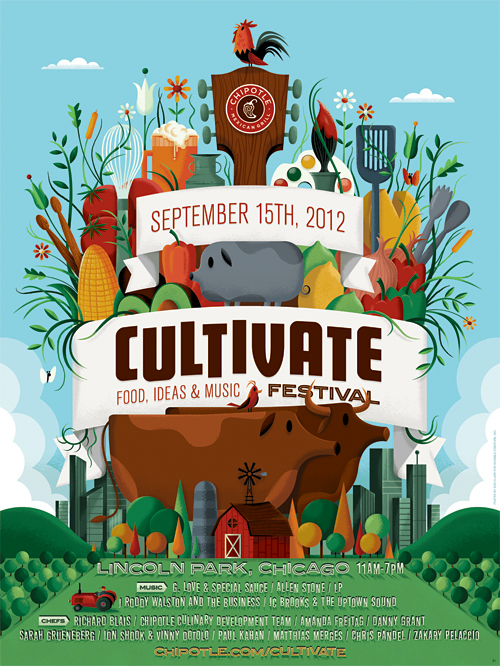
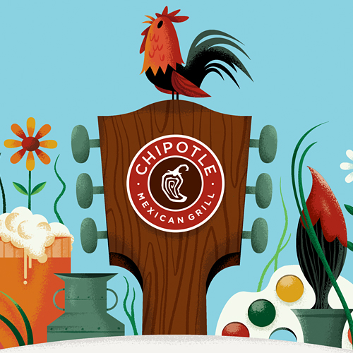
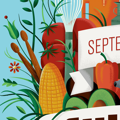
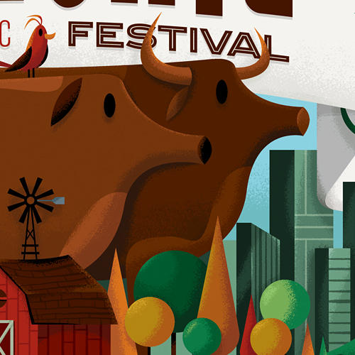
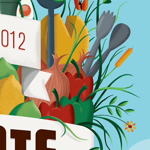
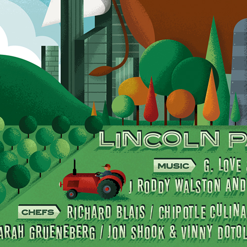
Last year we had the pleasure of helping our friends at Chipotle launch their first-annual Cultivate Festival. Bringing together food, farmers, chefs, artisans, thought leaders and musicians from around the globe, the festival was a resounding success. So, naturally we were thrilled when they asked us to come back this year. Our mission? To create a fresh and fitting sequel that continued the Cultivate brand we established in 2011.
This year it's twice the fun with Cultivate happening in Chicago on September 15th and Denver on October 6th. See you there!

What is Cultivate?

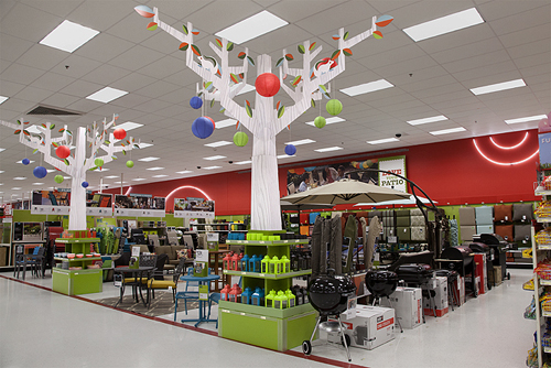
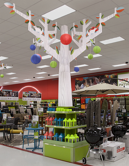
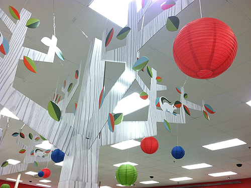
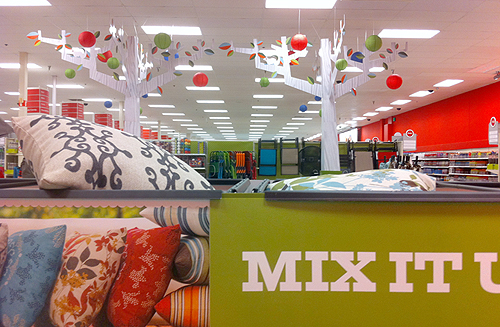
Spring has sprung! Well, maybe not quite yet ... but the 2012 Lawn & Patio seasonal display at Target has. These ginormous faux birch trees were a blast to create  -- and definitely worth checking out in person. As usual, this project wouldn't have been possible without the amazing design team at Target, lead by our talented (and hilarious) A.D., Jon Erickson. Oh, and please don't attempt to climb the trees, unless you plan on feeding the squirrels. Typefaces used: Giza and Neutraface.

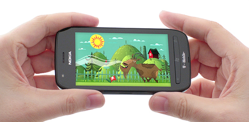
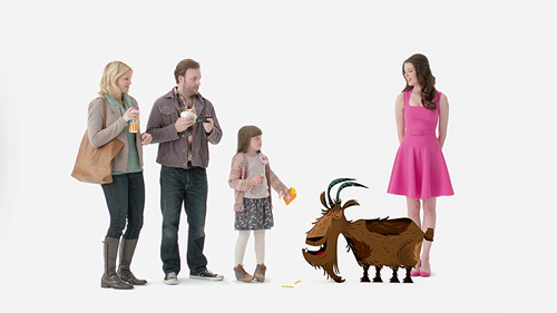
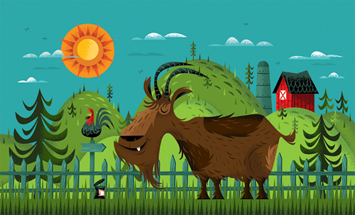
Goats, phones & fries. The best part about our job is we never know what's coming next. Here's a fun piece we recently finished for the fine folks over at Publicis and T-Mobile. We were asked to create character and BG illustrations for this 15 second spot while the talented peeps at World Famous handled the animation/post. OK, now I'm hungry.

Credits/Publicis: Kristi Flango: Art Director, Jenn Maples: Copywriter, Marisa Schoen: Executive Interactive Producer, Todd Bois: Creative Director

Well, we've been hard at work for over a year on this next project (and have many more months to go), but we are excited to preview the logo and name of our first interactive children's book The Uproar!, arriving on iPads everywhere via the Apple App store this fall. Lots of fun announcements coming in the first half of 2012, but for now - a quick synopsis:
"Journey into a world of sound and wonder in the interactive musical story The Uproar! Join a bizarre band of misfit monsters to explore a sprawling story from the mind of Invisible Creatureʼs Don Clark."

We are honored and proud to be working with our new favorite publisher + partner: Space Dog Books. Please do yourself a favor and download Space Dog's first chapter book Treasure Island, illustrated by the amazing Matthew Cruickshank.

It's going to be a fun year. Much more soon ...

The Totoro Forest Project is a 'A fund raising exhibition/auction to support the national trust Totoro Forest Foundation that Oscar winning film maker Hayao Miyazaki has been helping over the years, featuring original art created by internationally acclaimed artists in the fields of animation, comic books, and illustration.'

I did notice that many of these pieces were created by Pixar illustrators, animators and directors. The work is absolutely stunning and I just love the concept.

A book featuring all of the pieces should be available on September 6th.